Brief
The dStor’s team approached me with a unique challenge. They needed a logo wordmark, website, flyers, email templates and a pitch deck designed in a month. I worked closely with the marketing consultant, opperations director and CEO to complete these tasks on-time. To do this we had to adhere to a strict time schedule with limits on review rounds. We are all very proud of what we accomplished in a month.
Discovery
I had to learn a lot about this startup’s niche, goals, objectives, personas, competition and technology in short order. I learned a lot about block-chain technology and how dStor was going to use that network for their service. The dStor team decided they didn’t need a logo symbol but a wordmark only.
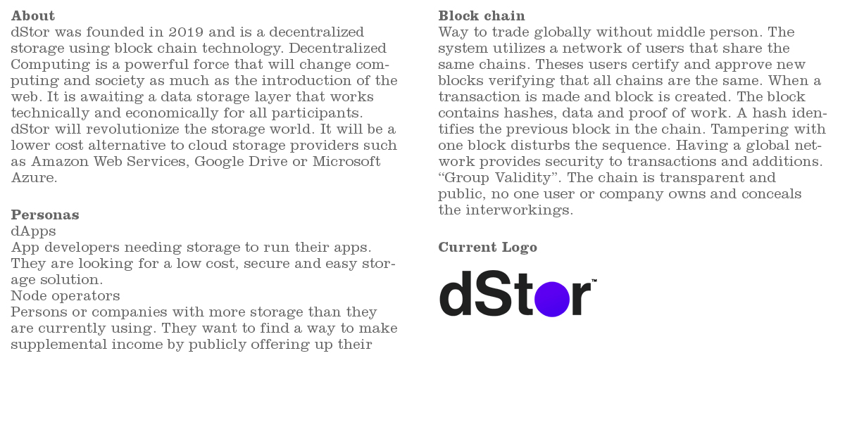
Competitive analysis
Next, I needed to learn about the competition in their space. I checked out all their sites from a messaging, offering and design perspective.
Research
When designing a logo, I need to research other technology companies. I’m looking at color, fonts and layout.
Inspiration
Even with this truncated logo process, I still needed to look at inspiration. I knew if I was only to have a wordmark logo; I needed to pick a base font that was unique and then perhaps dissect the characters in an interesting way.
Concept 1
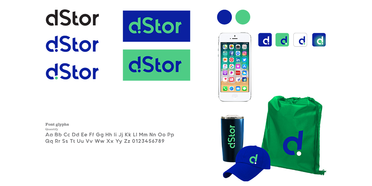
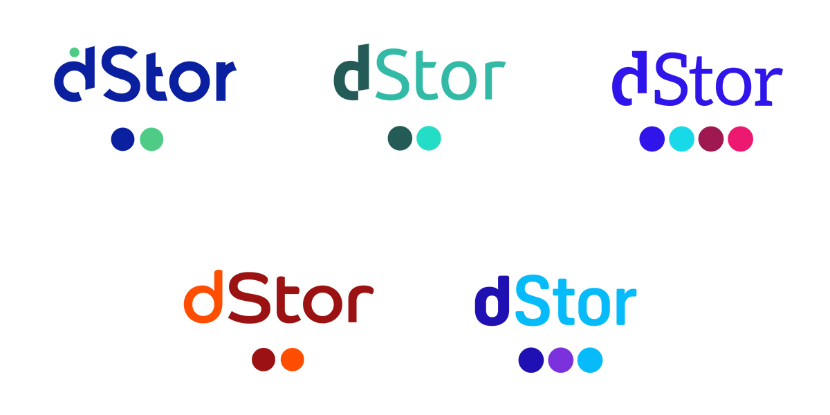
Within a weeks time I discovered, researched, inspired, analyzed and presented these 5 concepts to the dStor team. The goal was to get the team to select a wordmark and color pallet to refine in the next round. To make these selections quickly, I wanted to show the team the mark within many use cases. I liked the idea doing something unique to the d character.
Concept 2
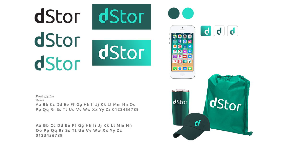
Here is a teal option using a slanted san serif font. Removing part of the “d” was to embellish on the idea of “decentralizing.” The team liked this wordmark but not the color choice.
Concept 3
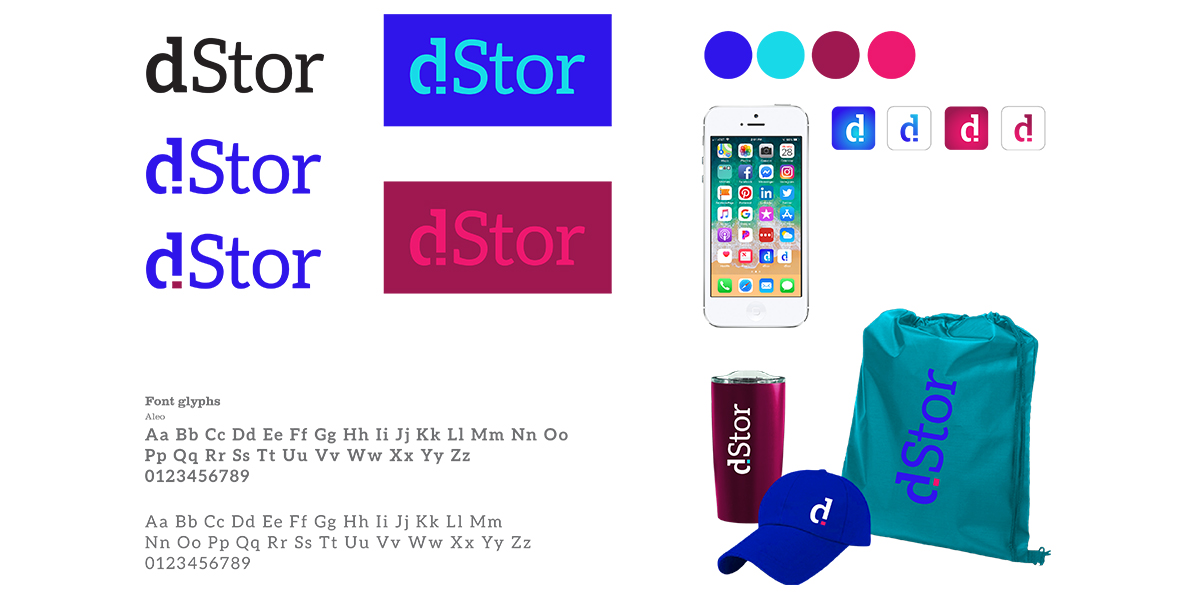
It was worth a look to consider a serifed font choice. I felt it would set them apart in a sea of san serif font choices for technology companies.
Concept 4
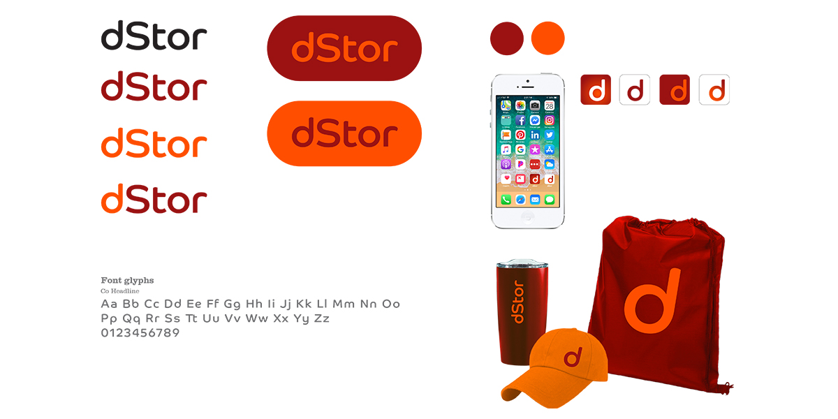
For this concept I choose a “throwback” 1980’s color option with a futuristic space feeling font choice. They appreciated the colors and really liked the font.
Concept 5
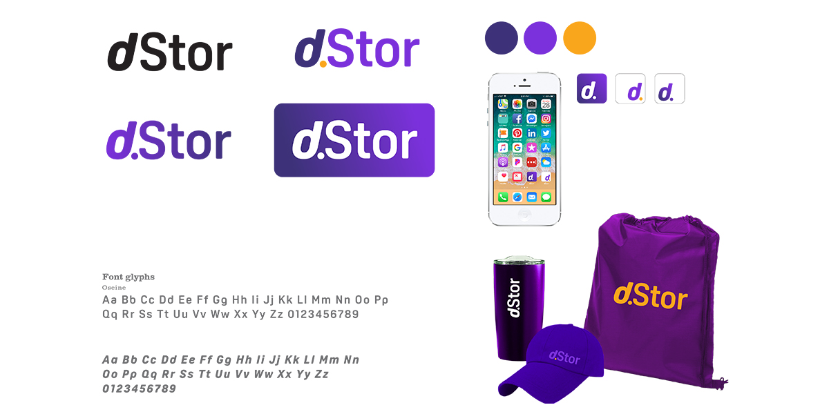
The team liked the form factor of the “d” but disliked the UW husky colors and “period” between the “d” and “Stor.”
All Concepts
Refinement
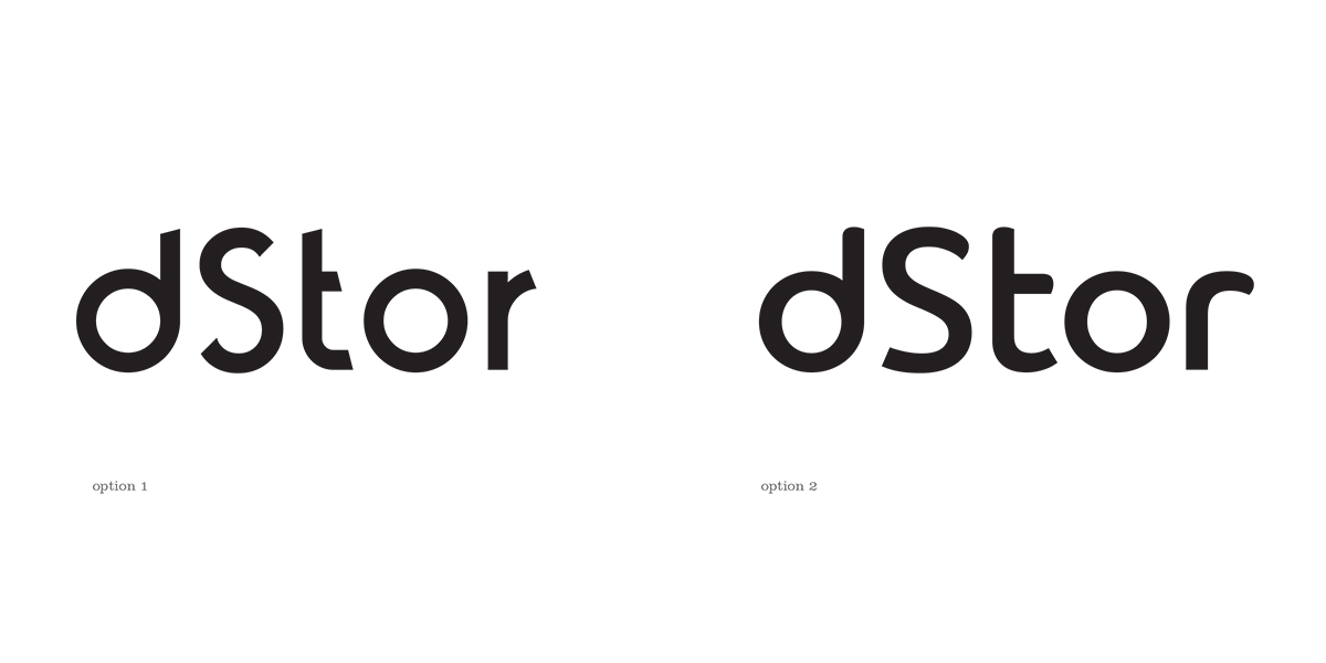
I tend to steer away from showing form and color in the same round as humans are very influenced by color. The team selected these two options to refine. The “d” style was the determining factor.
Refinement 1
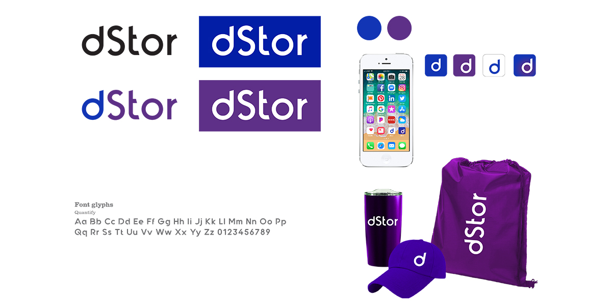
Using the unique san serif font base of Quantify, I customized it to make it special to dStor.
Refinement 2
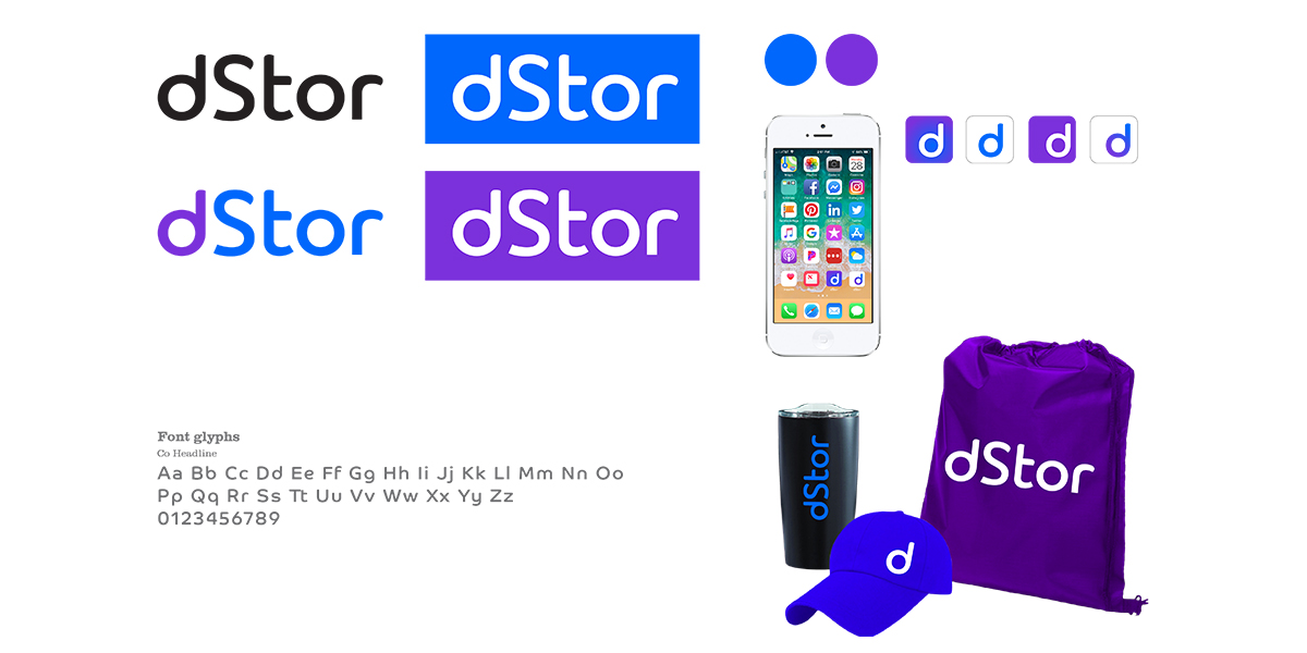
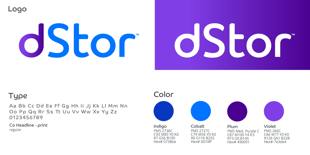
Using Co Headline as the base font, I customized the kerning and created a new “S” that fit the wordmark better. The brighter purple and blue resinated with the team better.
Final Solution
We finalized the wordmark, added a “tm” and combined color pallet to create this unique identity for dStor.
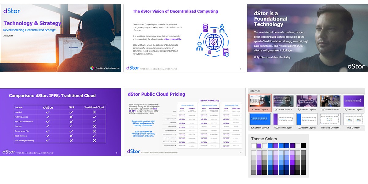
PowerPoint Pitch Deck
Next, my job was to beautify the CEO’s pitch deck for investors. I needed to create a template that could be used beyond as well.
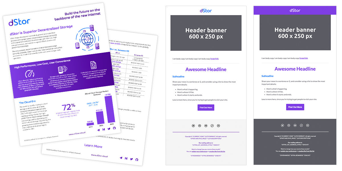
Marketing Collateral
Then, I created a sales flyer to developers and investors and created MailChimp email templates for their team to use./p>
Website
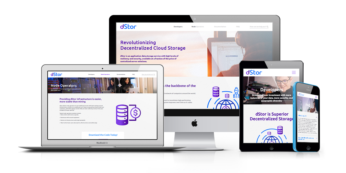
Finally, I worked with a great team to design a simple website for investors, developers and node operators. The marketing consultant worked tirelessly to create the pages flows and finalize copy with with dStor team for me to use in layouts. I worked with an awesome bootstrap dev who built and awesome website in short order. We rocked this responsive site out in a couple weeks.
