Brief
On Call Nanny was founded in 2006 and provides on-going or last-minute childcare to families and corporations. They want to be a resource and support system for women and families in their communities. They want to reduce absenteeism in the workplace by offering trust, safety and convenience in their service for placing vetted and qualified care-givers.
Original Logo
On Call Nanny’s original logo uses the iconic Mary Poppins umbrella in a less than creative sort of way. The colors are dated and the brand identity could use some love.
Research the Competition
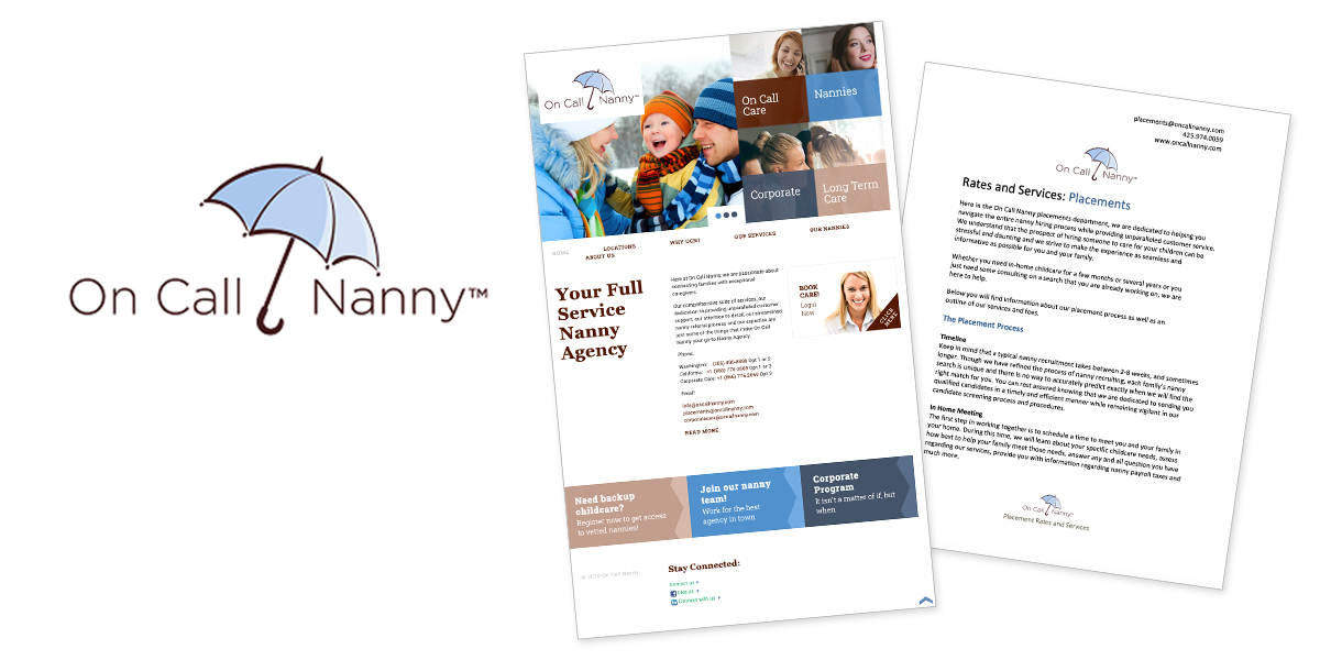
I checked out the top local and national nanny and childcare services. I wanted to cherry-pick or to stay away from their elements.
Logo Activity
To help focus my logo solution efforts, I ask my clients to play a logo activity.
Discovery
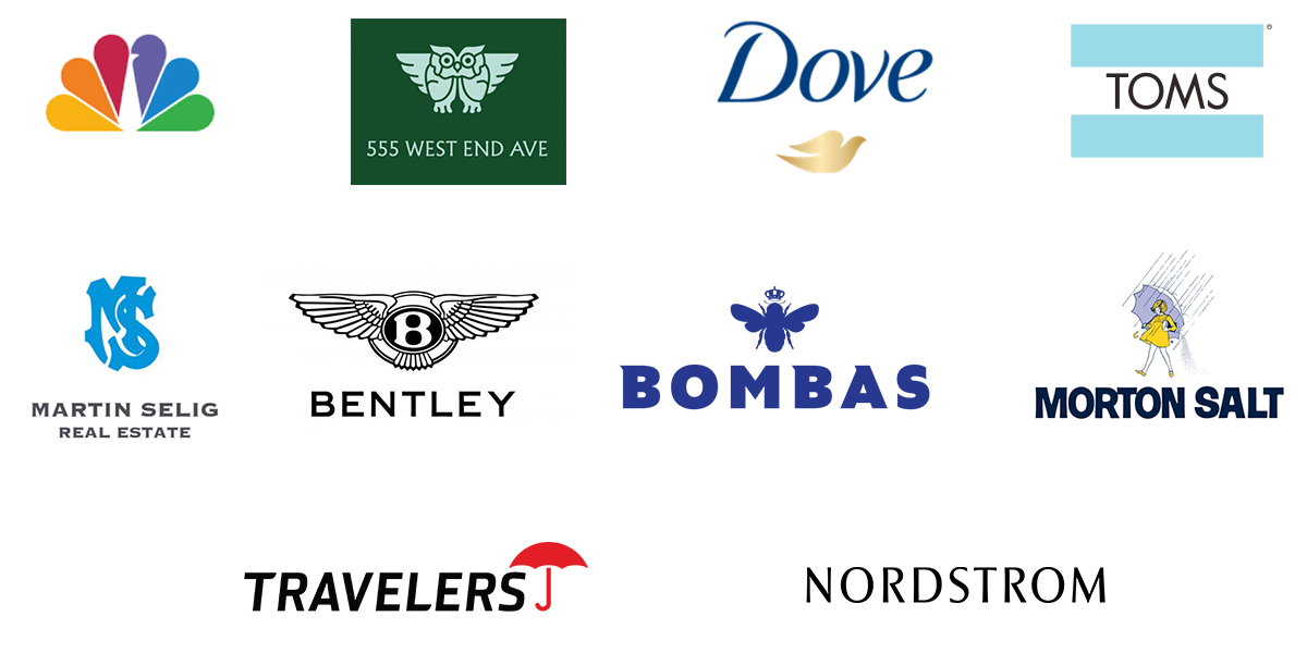
I wanted to veer away from creating a logo that might look like something within the industry so I discovered umbrellas and Mary Poppins themed logos in and out of the childcare industry.
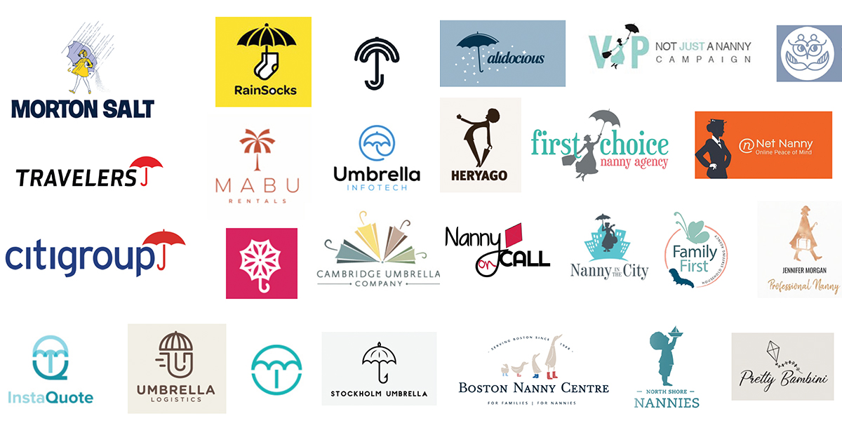
Discovery & Inspiration
Because our target demographic uses and shops luxury brands; I needed to take a peek at them for inspiration.

Inspiration
Finally, I went out into the world to get inspired.
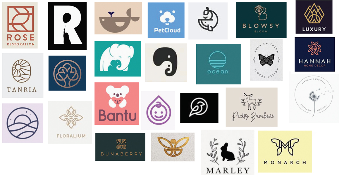
Sketches
With the thought of a logo refresh in mind, I presented sketches within the 1910-1950’s feel. I went into the direction of phones, umbrellas, heads and wings. Unfortunately after looking these over; they didn’t hit the mark.
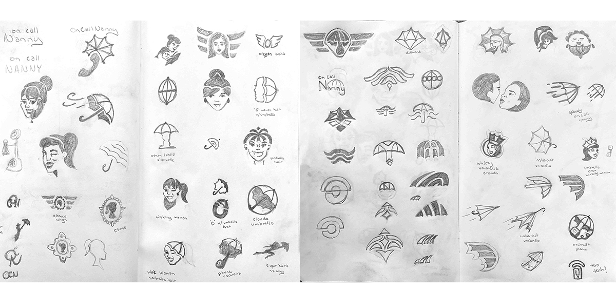
Redirection
After some collaboration and feedback, we decided a logo update was best. I continued my inspiration with word maps, modern icons, fresh logos and London store-front direction.
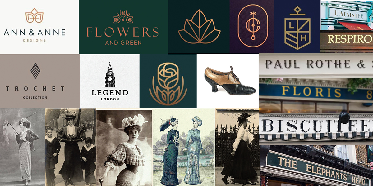
Sketches
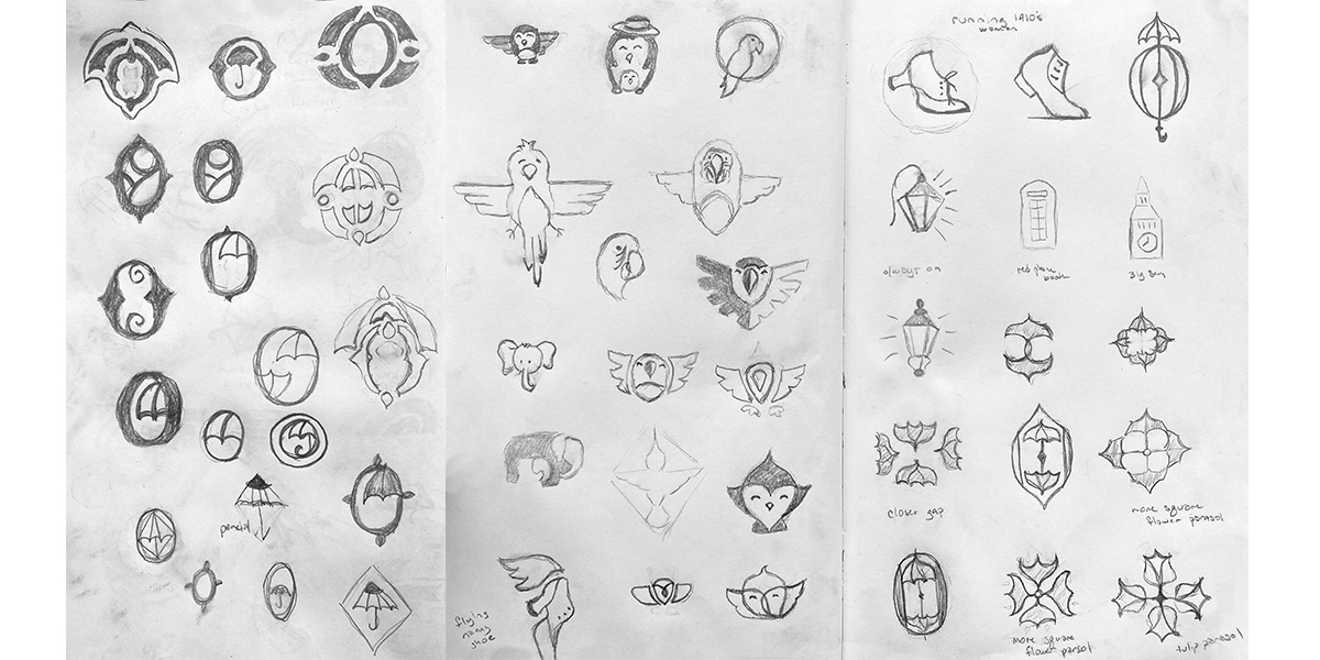
We explored monogram, baby, umbrella, animal, shoes, lights and compass options.
Digital Options
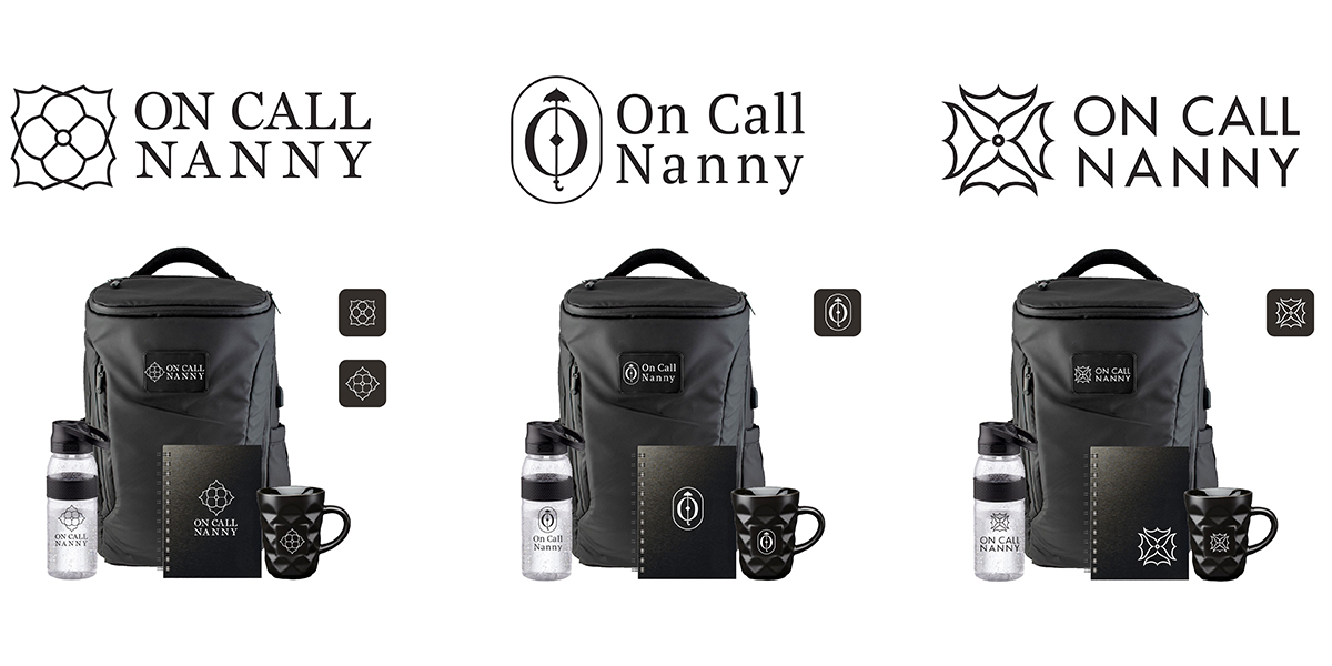
The owners picked a few options for me to digitalize.
Refinements
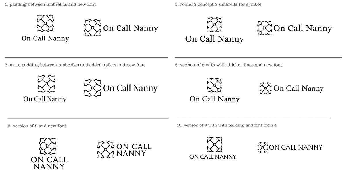
We liked what was happening with options 1 and 3. As much as they liked option two for its monogram “O” and iconic umbrella we decided it wasn’t wearable and didn’t have a luxury brand feeling. We continued to refine the symbol and explore other font choices..
Symbol Selection and Color Options
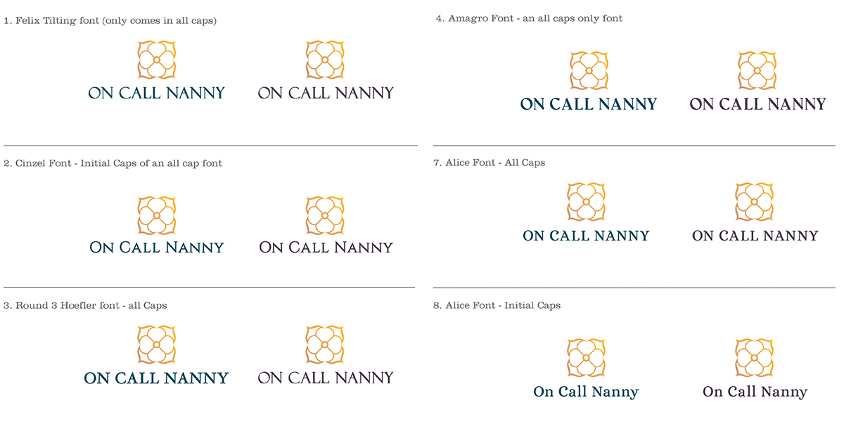
We selected a beautiful symbol and moved on towards a color option. I shared many that suited their personal and target demographics’ tastes.

Refinements
We selected the color palette but still wanted to explore other font options. We looked at more unique font pairings to match our luxurious symbol.
Logo Solution
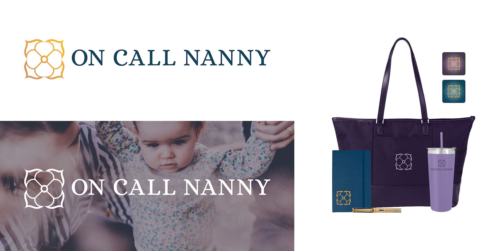
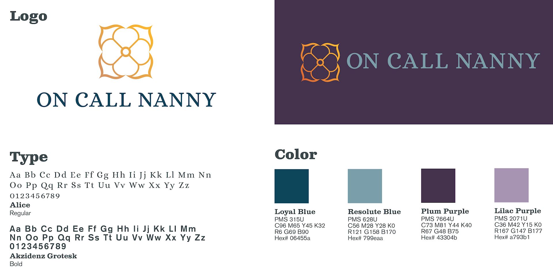
We are ecstatic about our solution. We have a beautiful logo that is lavish and wearable with a color palette that anyone would want to wear. We can’t wait to put it on tumblers, notebooks, marketing materials, social media and a website.
Sales Flyers
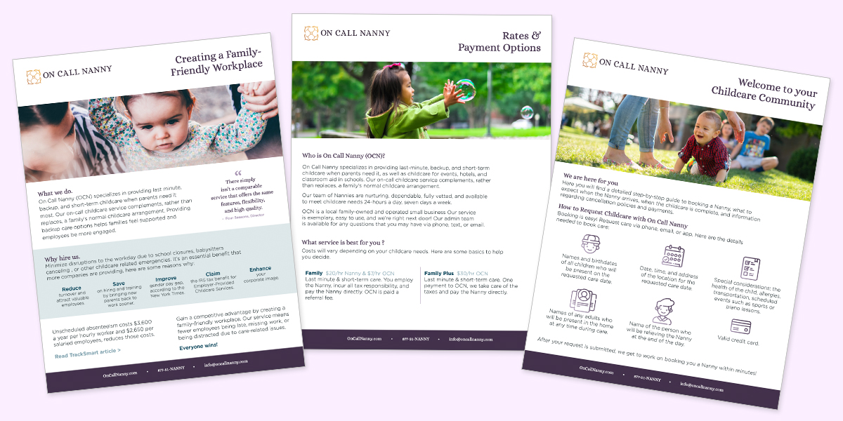
The next order of business was to update their flyers for their target prospects. We needed to create something the owners would be proud of to send to a home operations manager or human resource director.
Website
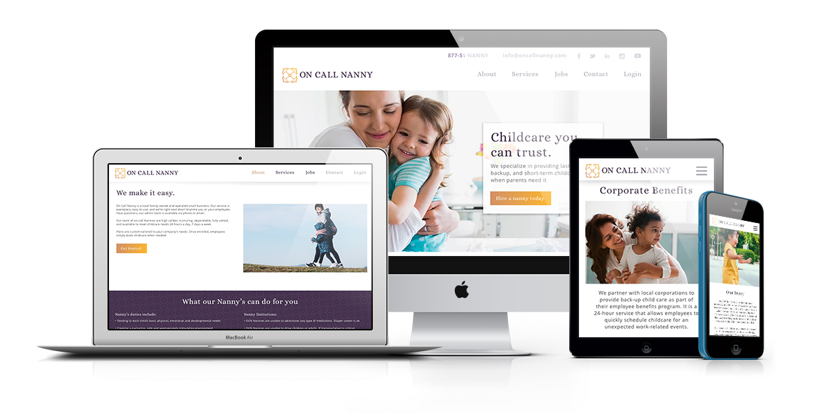
We collaborated to create a beautiful and charming responsive website that follows marketing best practices to help book more nanny appointments and find great talent.
Our Solution
We created a combination logo mark that feels timeless and luxurious. The symbol uses the classic umbrella nanny symbol and uses it in a clever way. A stylized umbrella repeated four times as directional arrows. On Call Nanny wants to be your go-to care anywhere you are.
