Brief
WooDate is a website that lets you easily plan out customizable, memorable dates. Planning a creative date is time consuming and stressful, so people end up falling into the same dating routines. WooDate believe dates should be more fun with less stress to plan. They do this by providing an easy, one-time search for full date experiences based on a few inputs. Think of it like the Kayak or Expedia of looking up date experiences.
Original Logo
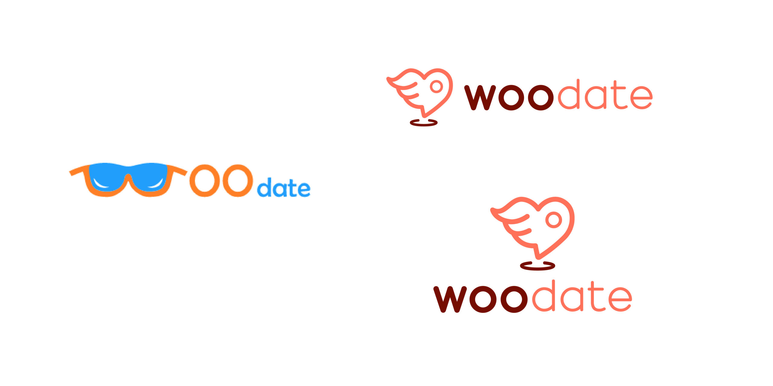
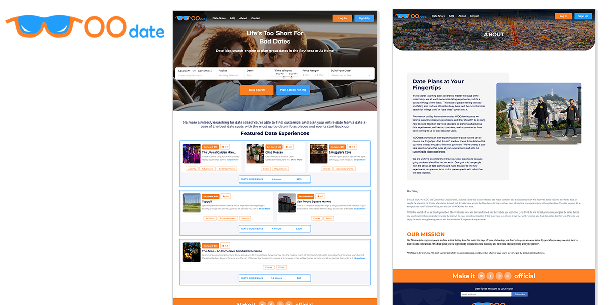
WooDate’s original logo uses sunglasses to spell out the “WOO” in a way that doesn’t quite flow together with the word “date”. People miss-read the name. The sunglass was used to symbolize you were going to shine in your date-planning and eluded confidence. Sun never sets on cool. Unfortunalty, that sentiment didn’t work with the users.
Competition
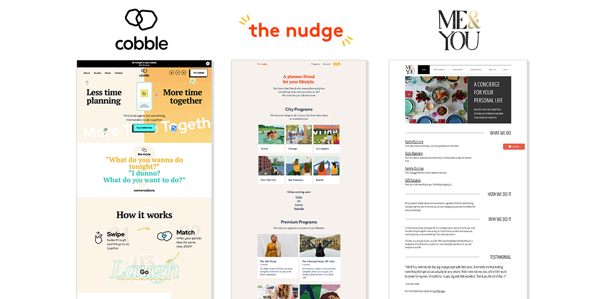
As part of my discovery process, I took a look at WooDates’s competition; other date planning sites and apps such as those pictured below. In order for WooDate to stand out from their competition we knew they needed something unique, fresh and modern.
Logo Activity
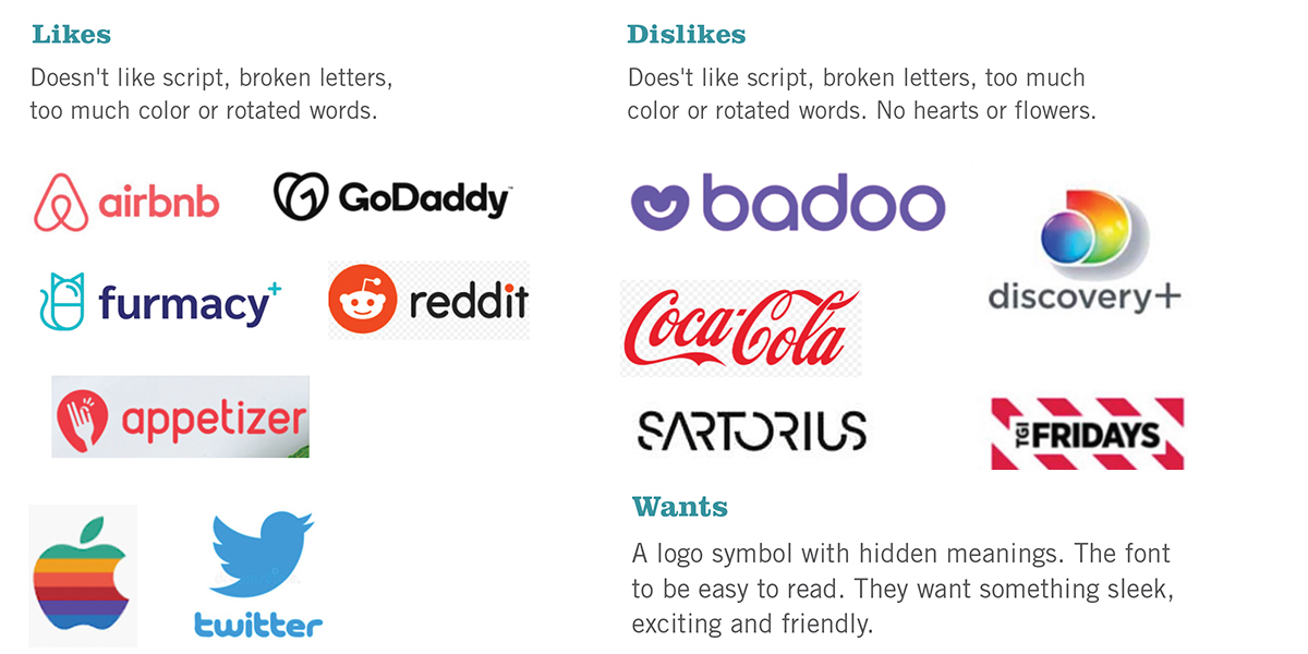
Next, I had my clients do a discovery activity. I asked them to show me logos they liked and ones they disliked and to tell me why. The client liked the idea of having a logo with a hidden meaning. They wanted something with a font that was easy to read with an icon that was sleek, friendly and exciting.
Inspiration
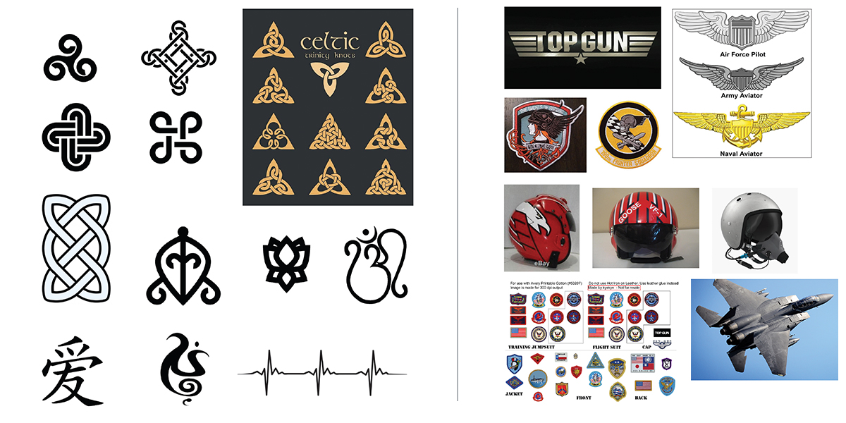
The inspiration we wanted to draw from for the new logo came from non-heart “love” symbols, fighter pilots and wings, birds, and map icons.
Sketches
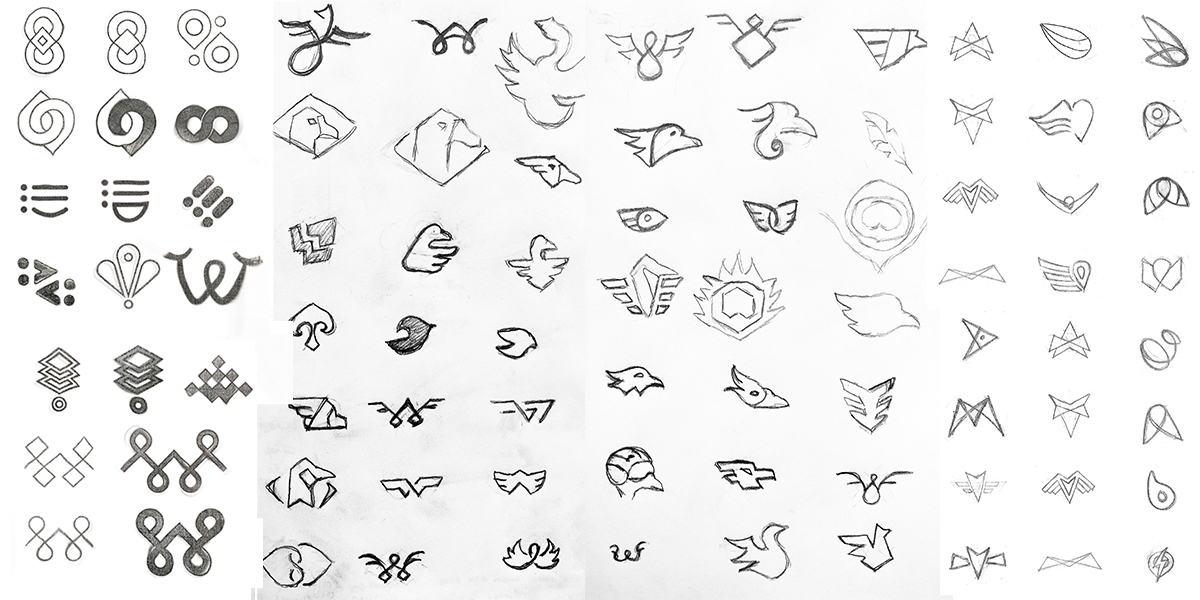
After looking at our inspiration photos and icons and gathering the intel collected during discovery, the sketching process begans focusing on the symbol.
Digital Concepts
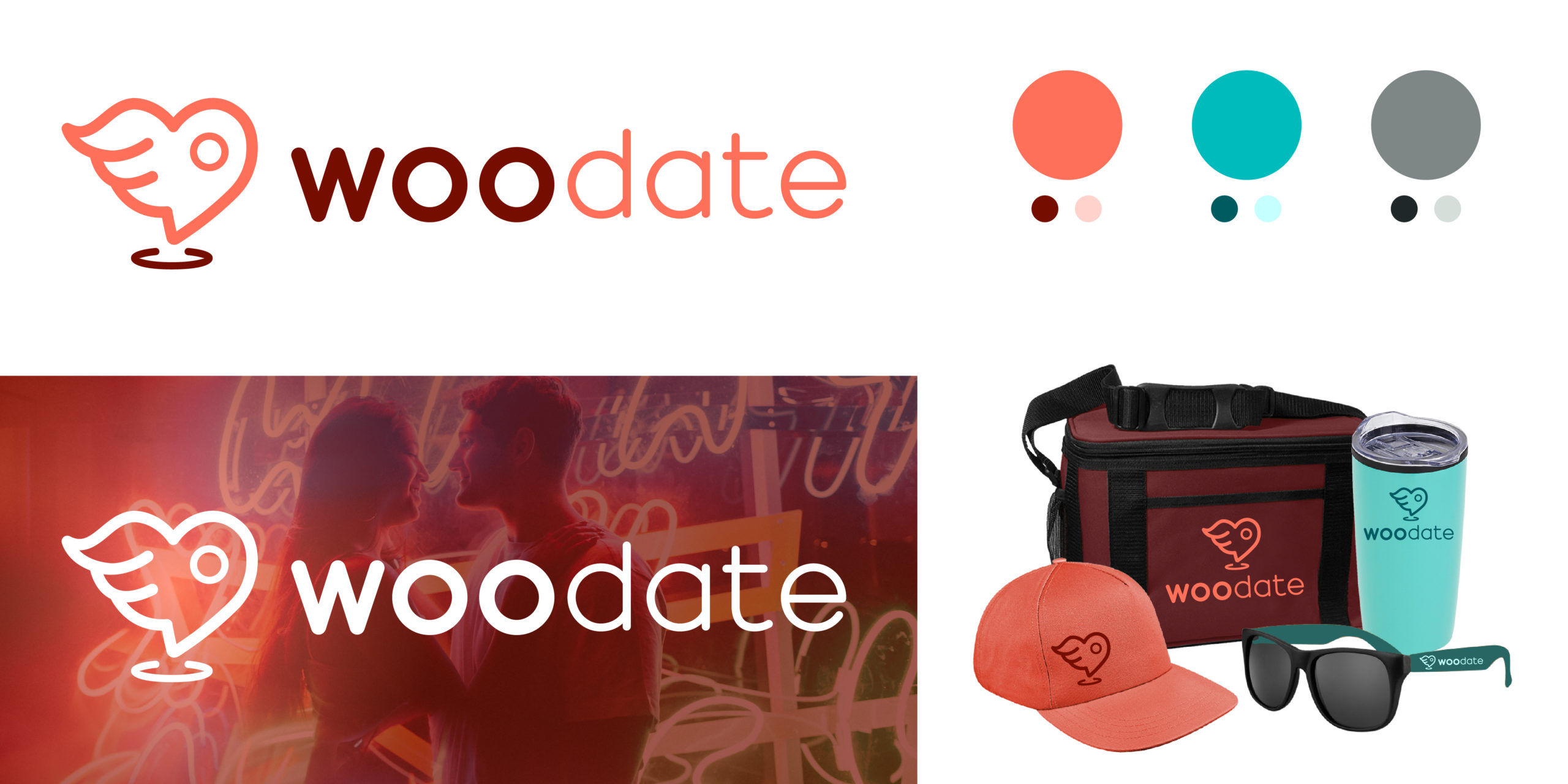
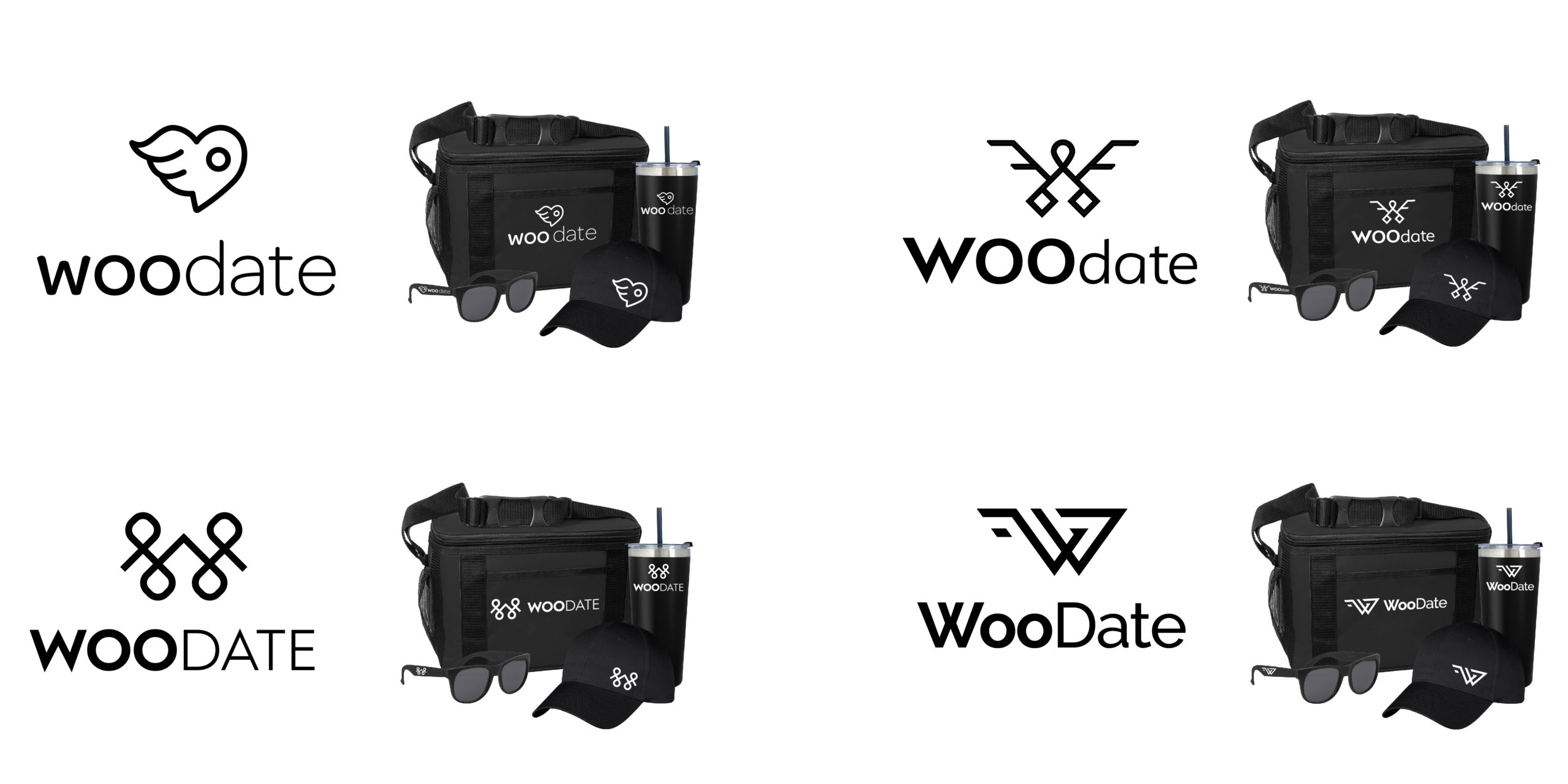
Using the sketches the clients liked the best, digital concepts were created and placed on some swag images in order to visualize the logo being used in the real world. They chosen symbols will influence the custom fonts we pair them with. We also do this in black and white so the client focuses on the forms and not influenced by color.
Color Exploration
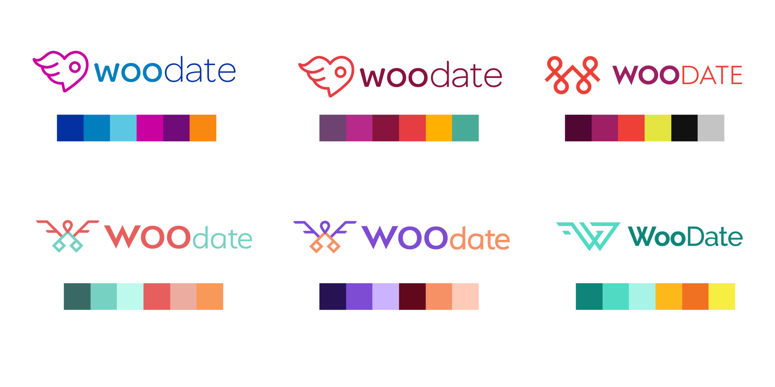
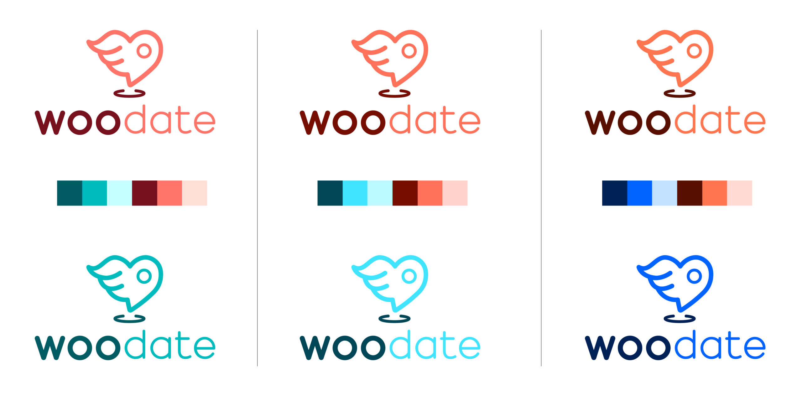
Colors tell a big part of the story with any logo and brand identity. The goal for WooDate’s colors was to create a palette that was modern and on-trend, romantic and whimsical. We looked at various color combinations with the different logo concepts.
Refinements
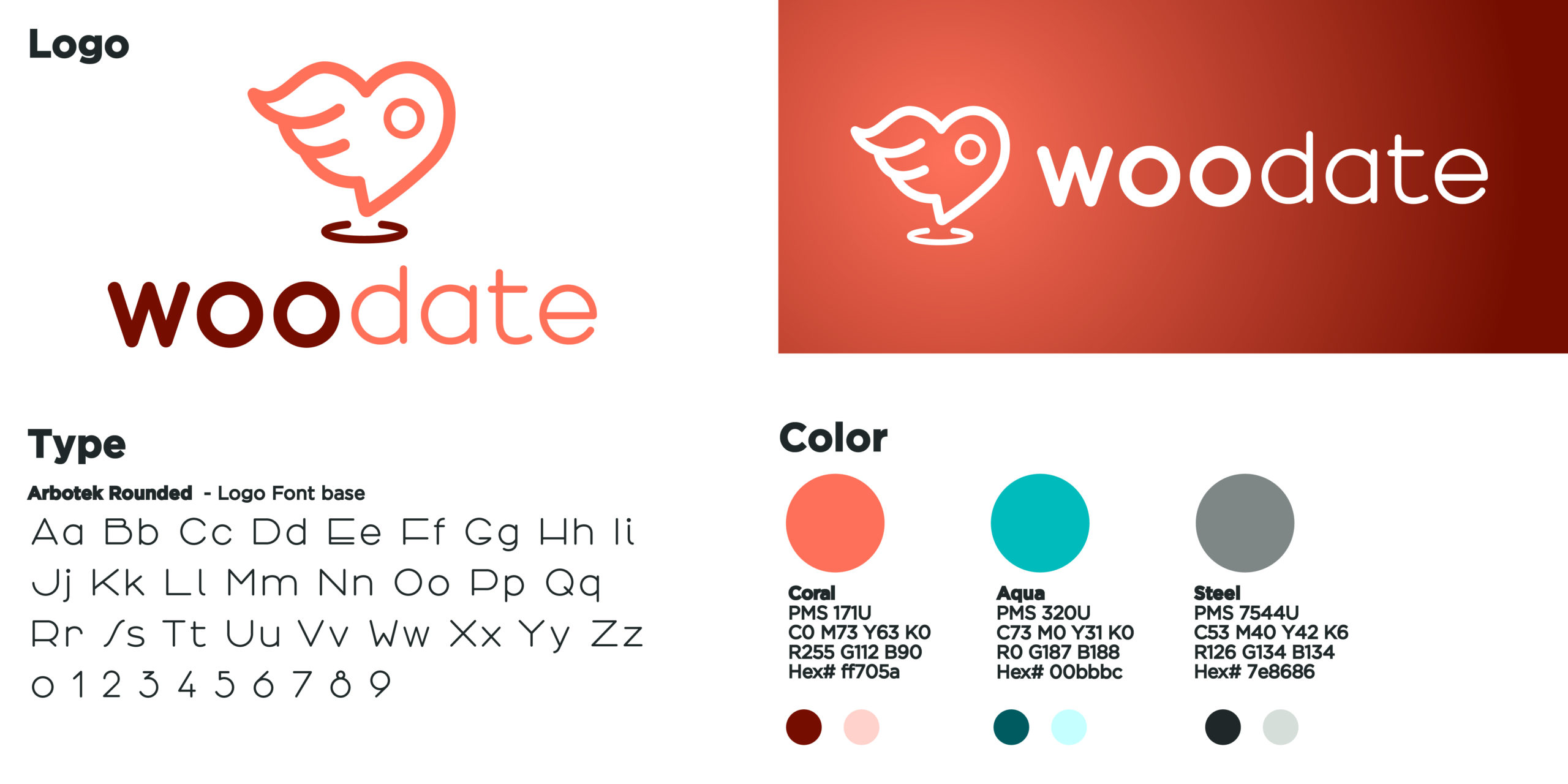
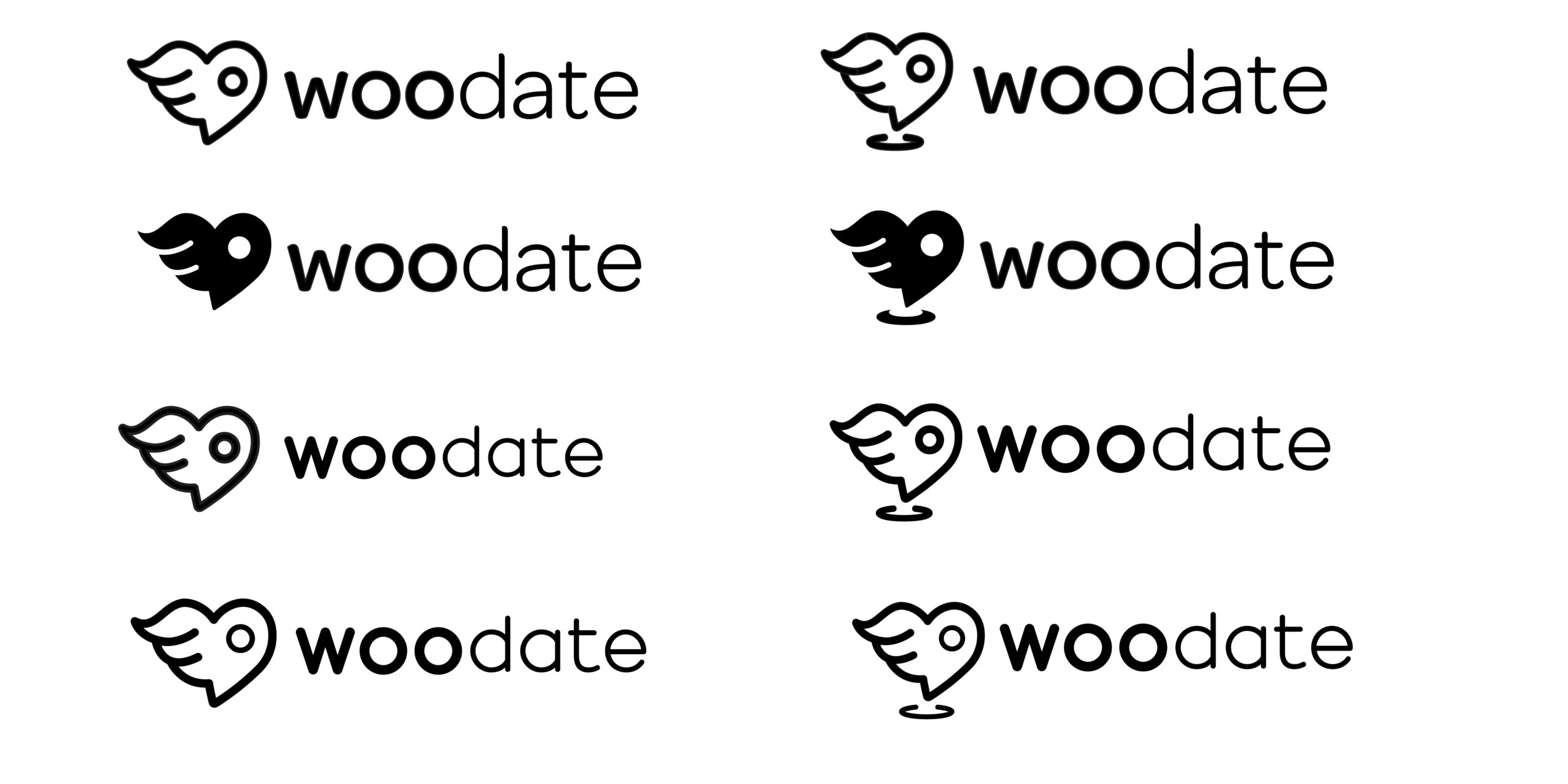
Once the client landed on the half-heart half wing map pin icon, we played around with font thickness and size in black and white. After a choice was made on the exact icon and font, we added back in the color for a final look.
Color Refinements
The client settled on coral but couldn’t decide on teals or blues. So we took a peek at thoese options.
Logo Comparison
The WooDate team selected a beautifully fresh color palette to go with their new logo. They didn’t waste any time sending it live on their website–out with the old, in with the new! They can’t wait to show it off to investors.
