Brief
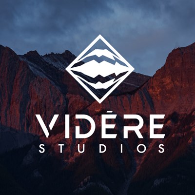
Videre Studios offers outdoor lifestyle landscape photography. Their mission is to inspire exploration of the natural world. They came to me wanting a new logo but being creatives themselves they had an idea of what they wanted along with color. We worked together to create a balanced, modern and timeless logo that combines Mt. Fuji and Videre which means “to see” in Latin.
Original Logo
Videre Studios’ logo needed to look more premium and professional. They also wanted a symbol for watermark usage. They did not want the typical or expected photographer logo with any camera pieces.

Client direction
The client gave me Mt. Fuji, Videre which means “to see”, some fonts, colors and logos as inspiration and direction for me to begin the modified logo collaboration.

Research
With these elements in mind; I still wanted to research how a camera and human eye works as it might inspire some concepts.

Inspiration
I wanted to look at other logo symbols that use topographical, nature and mountain elements as inspiration.

Concepts
I was inspired by how the camera and human eye works. The reflections and mirroring that both use. I was also interested in using a non-typically or expect view of Mt. Fuji and use a topographical map instead.

Inspiration
Because they construct, consult and survey the earth for various construction solutions I wanted to explore “precision in nature”.

Color options
The client liked many of the font options. They selected a symbol and we paired it with a couple other wordmark options. The client went with a unique customized wordmark. They also gave me color direction, so I provided a few other variants based off it.

Final Solution
This logo encapsulates everything the client envisioned; Mt. Fuji and reflection combined in a strong diamond shape with a unique wordmark.
Final logo
Together we created a logo they are very proud and excited to use.