Brief
Sunshine Properties was founded in 1977 for real estate investments and love the Pacific Northwest outdoor activities. They take pride in their properties and the tenant relationships they build through long-term ownership and loyalty – good Investments and good people. Sunshine wanted a classic, professional and timeless logo that instills luxury and friendliness.
Discovery
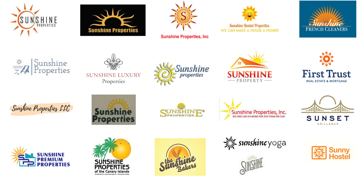
When creating a logo with the word “sunshine” and “property” you instantly think of a sun and land combination. I wanted to make sure not to copy anything in the market. To my discovery, I realized there are a lot of “cheesy” sun logos and wanted to avoid that at all costs.
Research
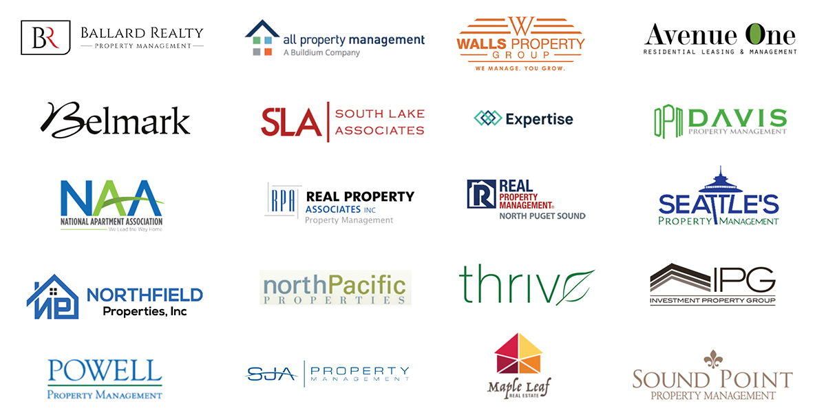
Being that Sunshine Properties is an investment and property management company – I wanted to research other companies locally and nationally that offer similar services. I do this for inspiration and avoidance.

Inspiration
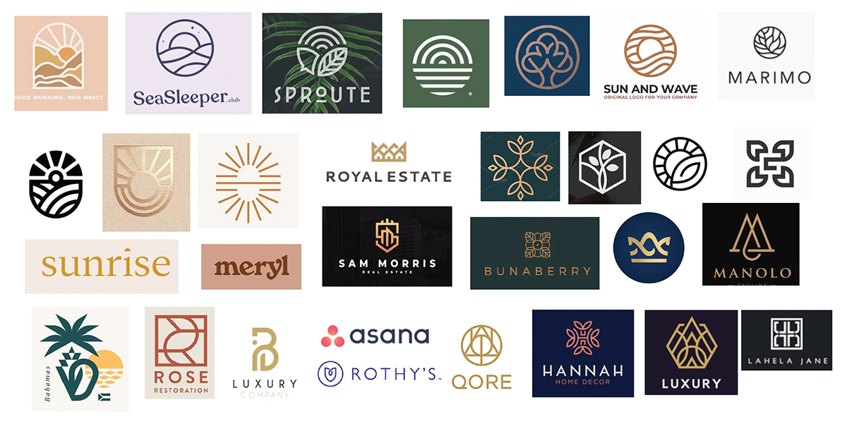
I wanted to look at other up-scale properties for inspiration.
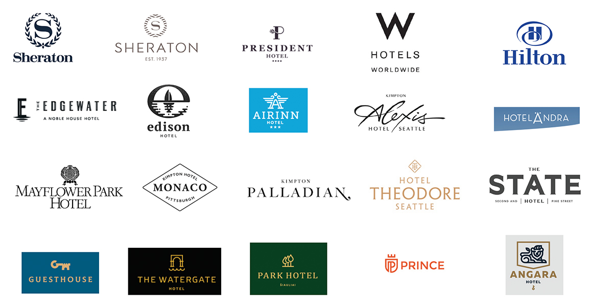
I did the same with luxury logos.
Inspiration
Finally, I went out into the world to get inspired.
Sketches
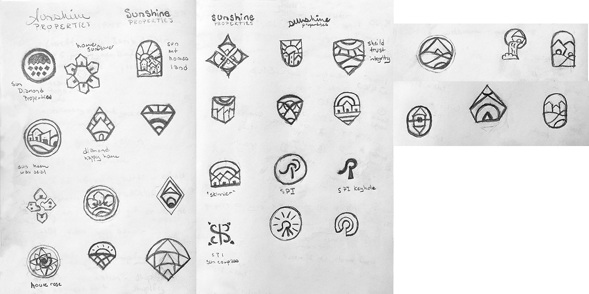
I take everything I’ve learned in my discovery, research and inspiration phases to sketch ideas and concepts for the client to choose from.
Option 1
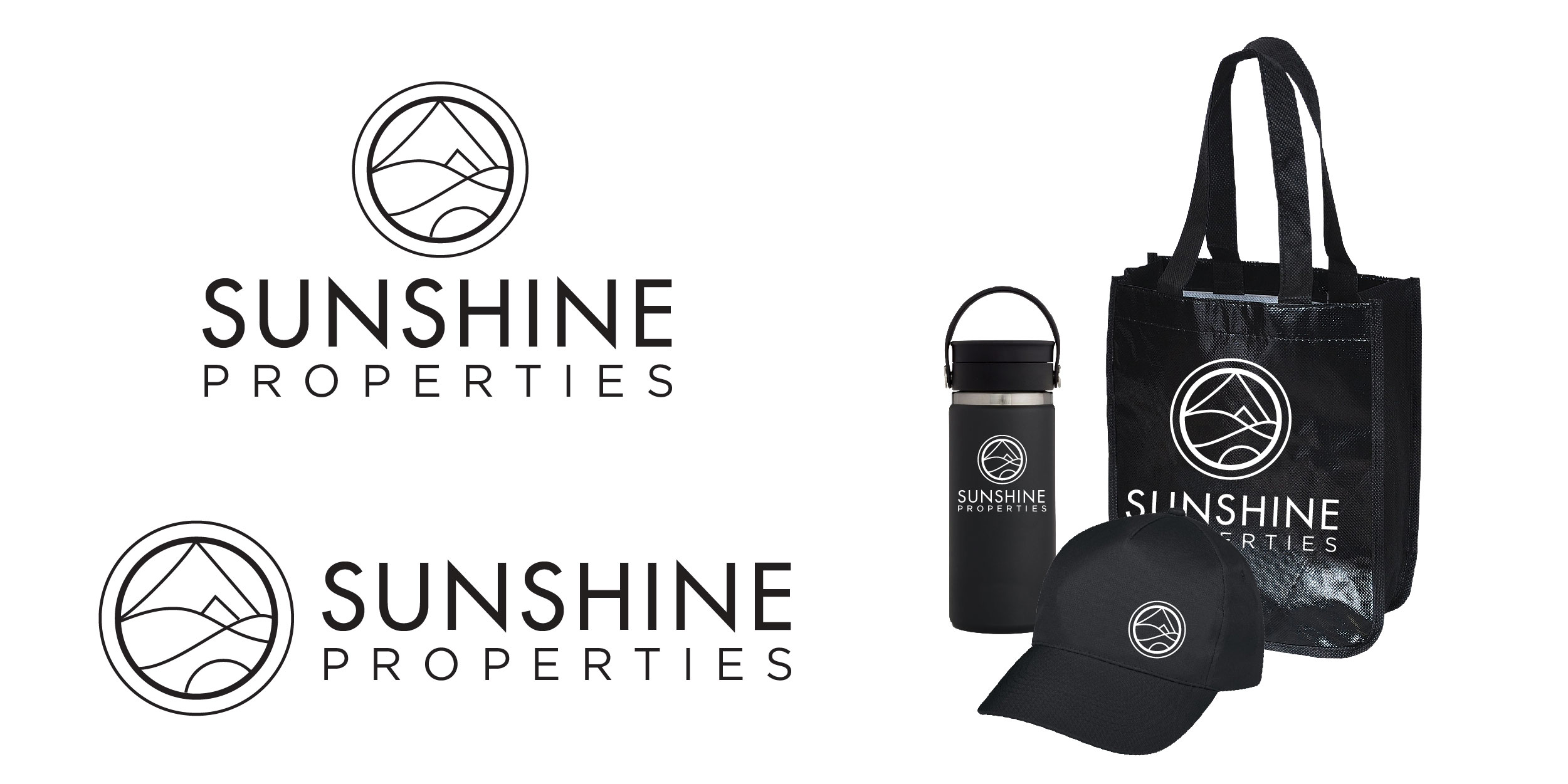
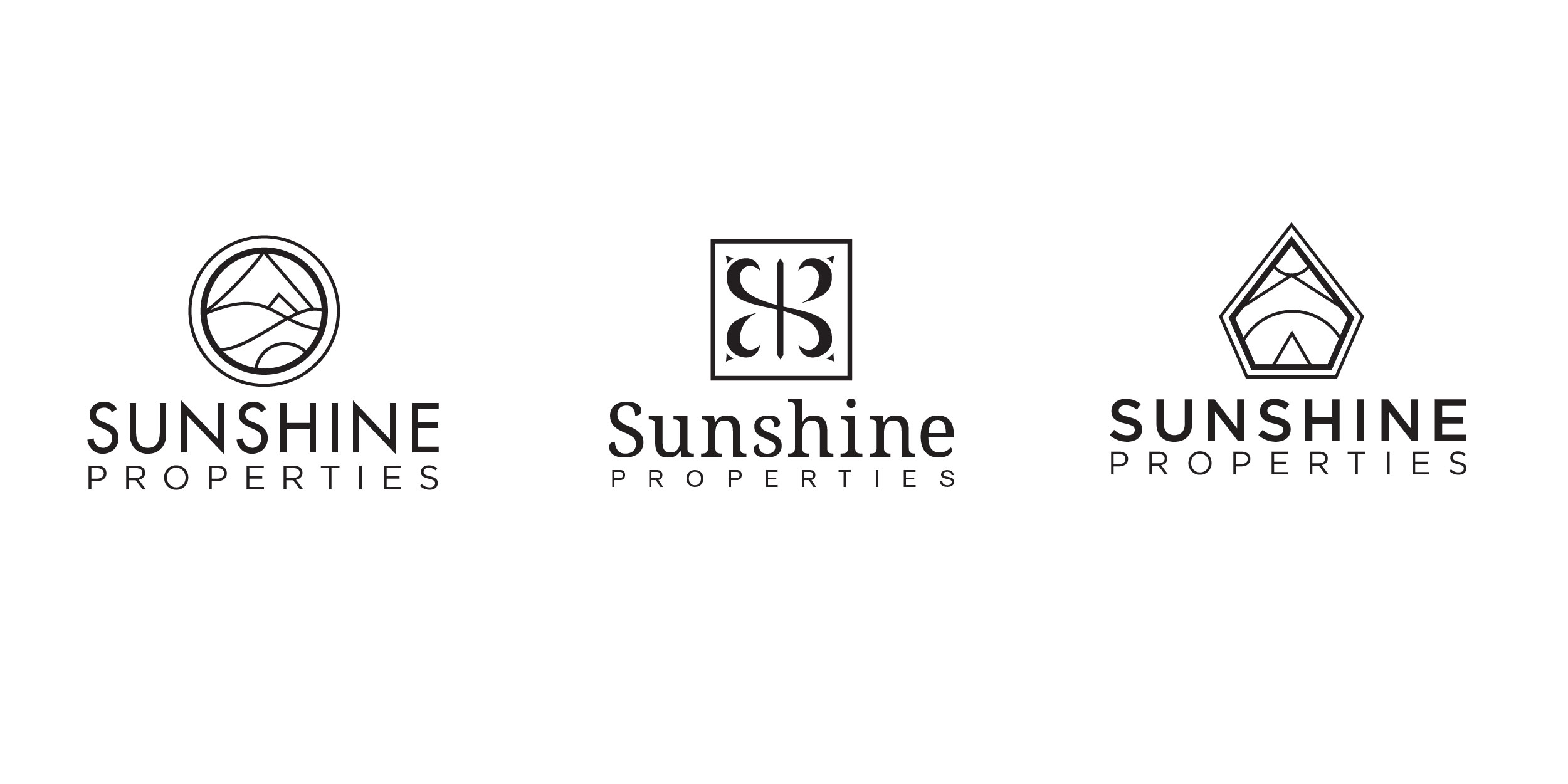
In round 2, digital phase round 1 I purposely present logos in black and white since human are commonly influenced by color. This option displays an abstract mountain/home and sun seal symbol with a modern san serif font pairing. This combination feels up-scale and “spa-like”.
Option 2
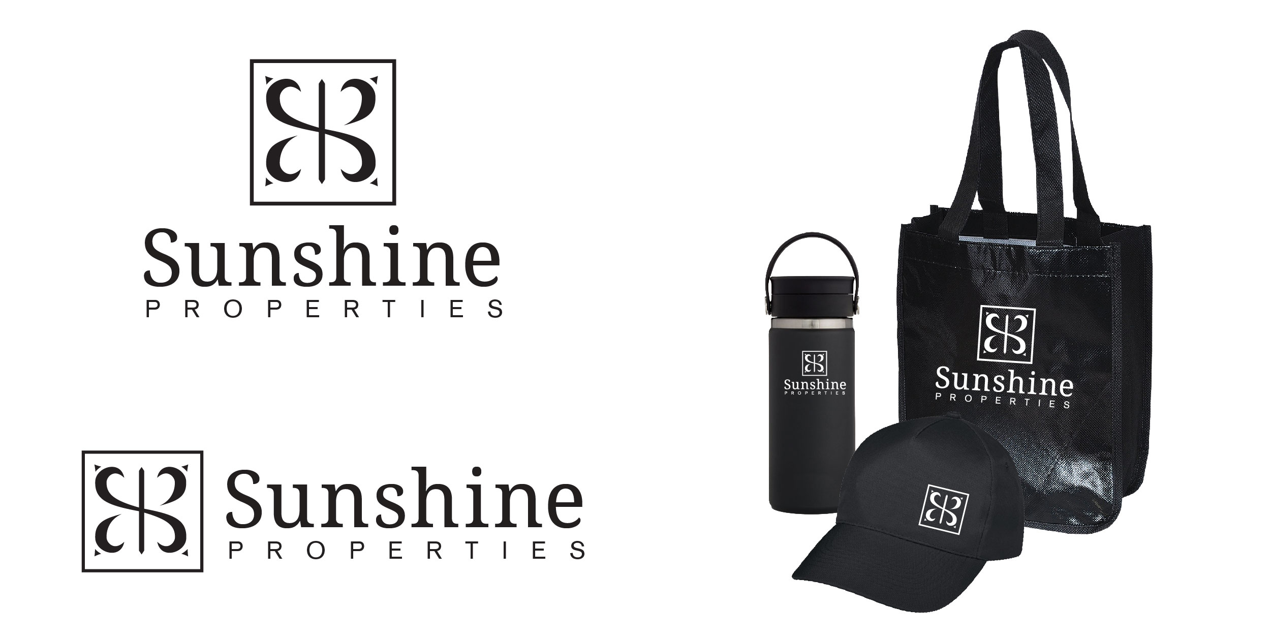
This is a concept inspired by the client by using the letters “SPI” to create a symbol that feels like a hotel and paired it with a serif with similar characteristics.
Option 3
This depicts an abstract home, mountain and sun inside a shield that instills trust and friendliness.

All options
It’s always nice to see the options side by side to notice their merits.
Color options
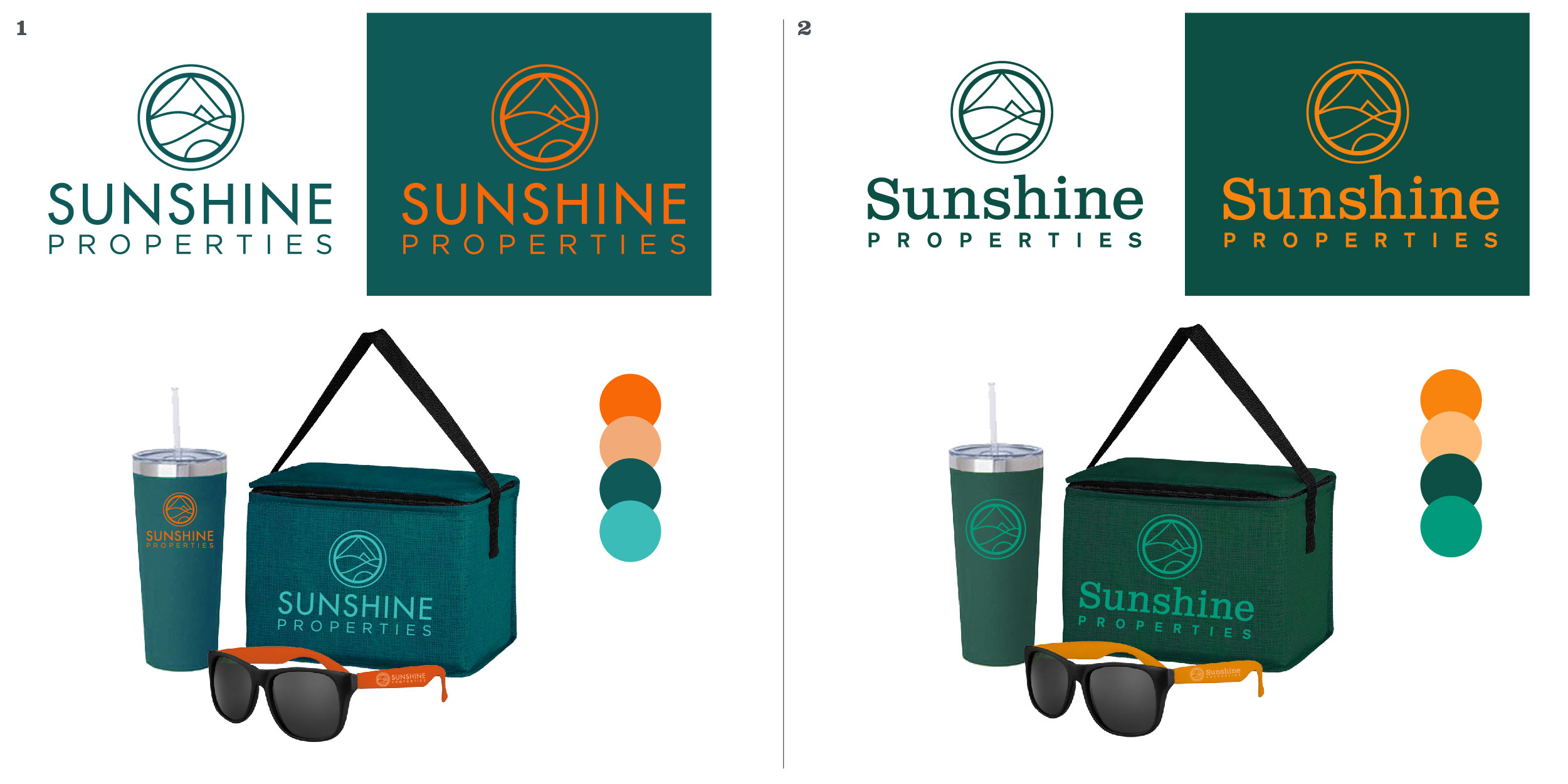
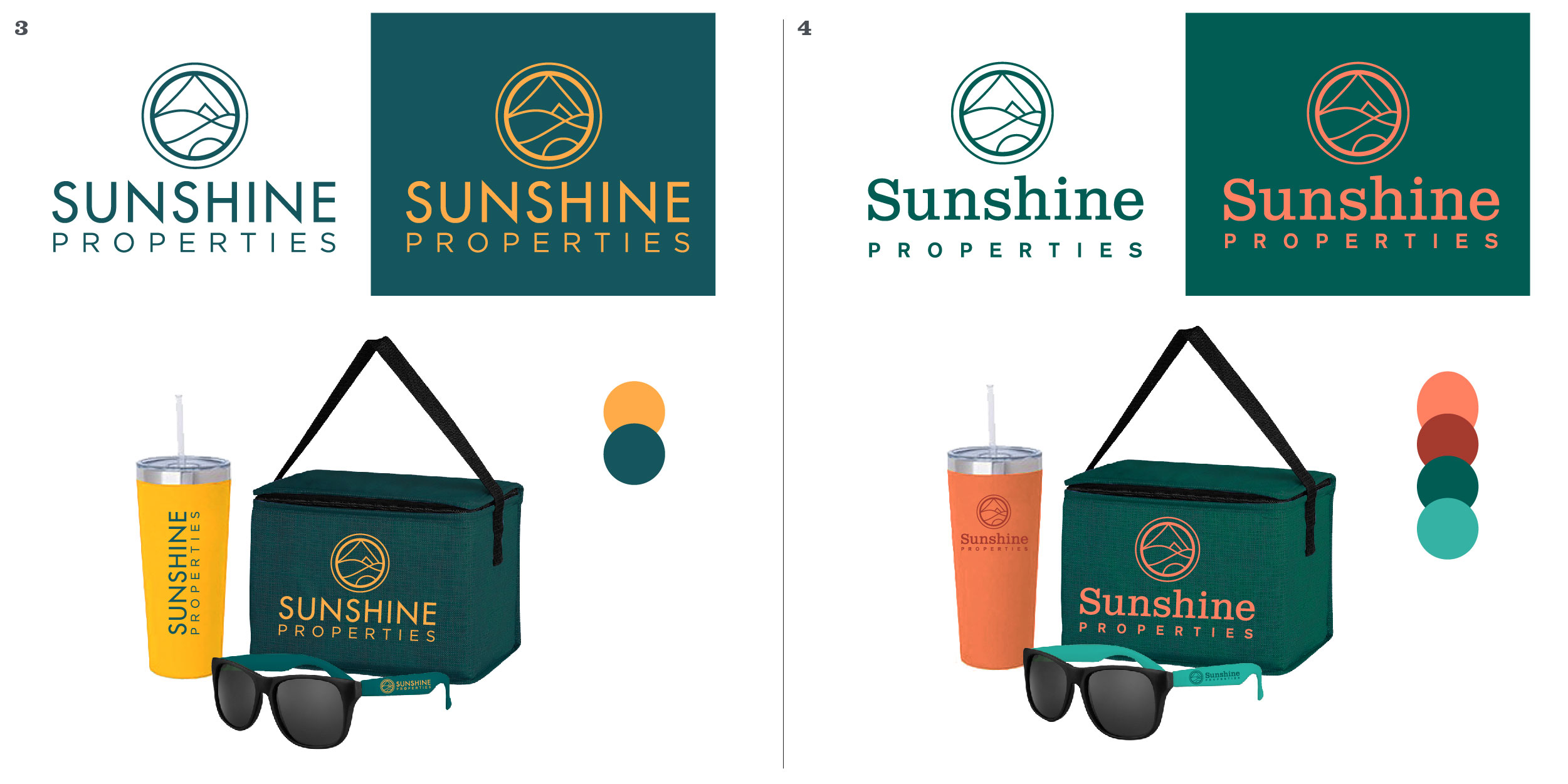
I provided color palettes with in the yellows and oranges for the word “sunshine” and green and teals for “properties” spectrum. We were also deciding between a modern san serif font and a more friendly serif font.
Solution
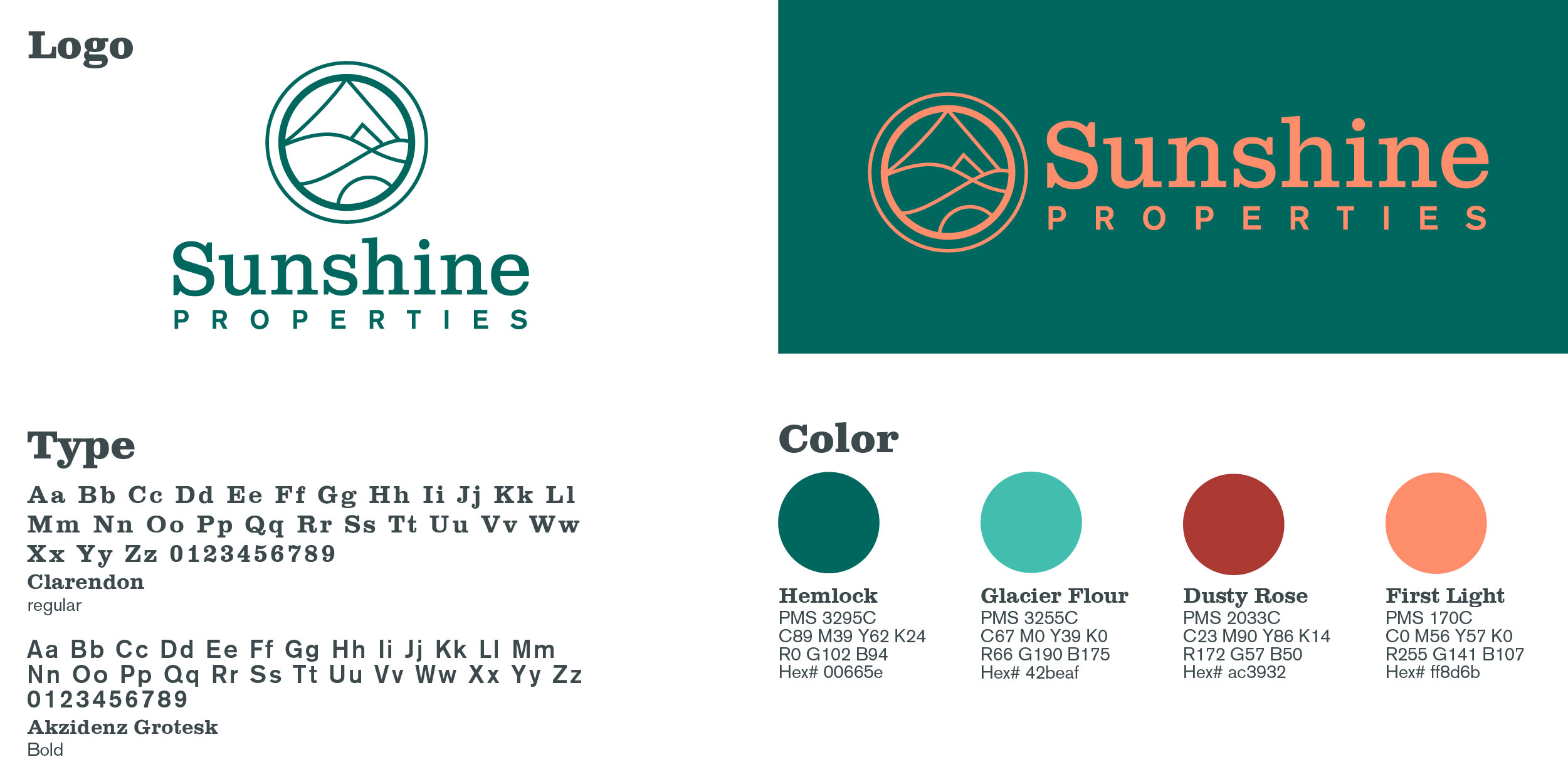
I was thrilled when the client selected this luxurious jungle green and dusty rose color palette. It’s modern, timeless and unexpected.
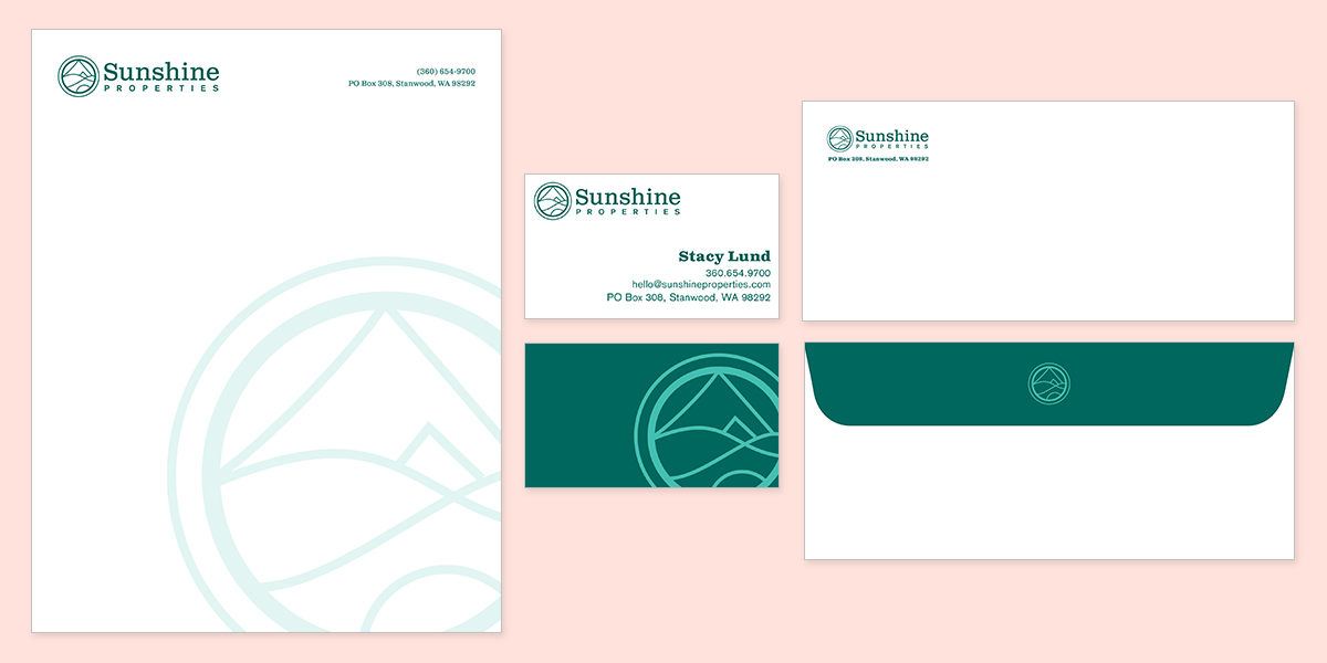
Stationary
The owner couldn’t wait to get new letterhead and envelopes on “pretty” paper. I provided several options and helped her get print quotes.
