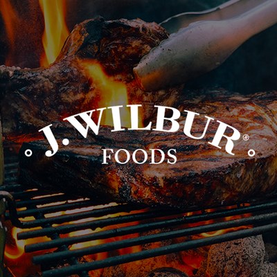
Brief
The J. Wilbur Foods line includes gluten-free barbecue sauces, spice rubs and bloody mary mix flavoring. They are committed to using only the finest ingredients and offering the highest quality products. The owner came to me wanting to improve the shelf recognition. They originally had a two-label system per jar which is more costly and wanted to move to a wrap around label. We worked together to refresh their label to make it easier for consumers to read at a glance and drive more sales.
Original Label
These are the original labels. They are beautiful but use decoration, colors and fonts that don’t make it easy for consumers to read and notice in a sea of other options on a grocery store shelf.

BBQ Sause Recon Work
I went to a few local grocery stores to take pictures of the shelf and the competition. I’m looking for shelf “pop” and recognition. I use my recon work to educate myself and the client.

Bloody Mary Recon Work
I did the same for bloody mary flavoring. Noticing the shelf and competitions bottles.

Discovery
Then I walk the store looking for other dark contents products with labels that stand out. I’m noticing colors and amounts of items on the front of label.

Inspiration
Then I look to get inspired. I’m looking at best practices and ideas to make his label stand out more on a dark shelf.

Round 1
Based on my recon, discovery and inspiration I shared with the client that a white label with a cleaner front would be best for shelf pop. I cleaned up the front of label by only having the logo, flavor, gluten-free, wt and a more legible font for barbecue sauce. These I felt were the most important things. I took inspiration from “best in class” labels and added some fun things to J. Wilbur’s such as “try on” and social. I also cleaned up and organized the back of label. I felt what his label was missing was a good story. I suggested we add a little history about the company and how it got started.

Round 2
J. Wilbur decided on the black label option. We also needed to add his father’s signature and get more flavor color on the label. I also suggested adding his father’s photo.

Color Exploration
In my opinion, the colors chosen were to subtle and dark. I suggested brighter and more bold color options for shelf pop.

Feedback
J. Wilbur loved the new colors but had an idea of their own. We collaborated over his quick mockup to redirect me a touch. This was helpful in getting to a solution we both loved more quickly.

Round 3
This round was a big round. We used his direction, color updates and font suggestions to create clean and bold labels. They include a clean and easy to read front, a brand story with his dad’s photo and signature and an organized back panel.

Final Solution
I think we defiantly improved the shelf visibility to consumer. Better bold font to read the flavor, a more legible font for “barbecue sauce”, better colors and a single label to get production costs down. All wins. View the process book >

Rub Labels
J. Wilbur Foods came up with their own blend for Texas and Memphis rubs. Following the design template we created and the new shaker die line we developed these labels.

Product line

Sales Flyers
To look more professional, I was asked to makes sales flyers to help buyers and distributors market J. Wilbur Foods’ products.

Lifestyle Product Photoshoot
The owners of J. Wilbur Foods, Bluewater Distillery and I worked together to conduct this photoshoot. I created moodboards that I shared with J. Wilbur for approval and edits before going on site to capture lifestyle, product lifestyle and studio shots of the bartender, patrons and products creating and enjoying J. Wilbur’s unique Bloody Mary Flavoring recipe.