Brief
Be Well Balanced provides nutrition services in order to guide people on making lasting changes to their health. Feeling and looking good is a combination of providing our mind with nourishing thoughts, fueling our body with healing foods and moving our muscles. All must be in balance for optimal health.
The client wanted a logo, brand and website refresh/redesign. We collaborated together to create a beautiful brand that resonates with their target customers.
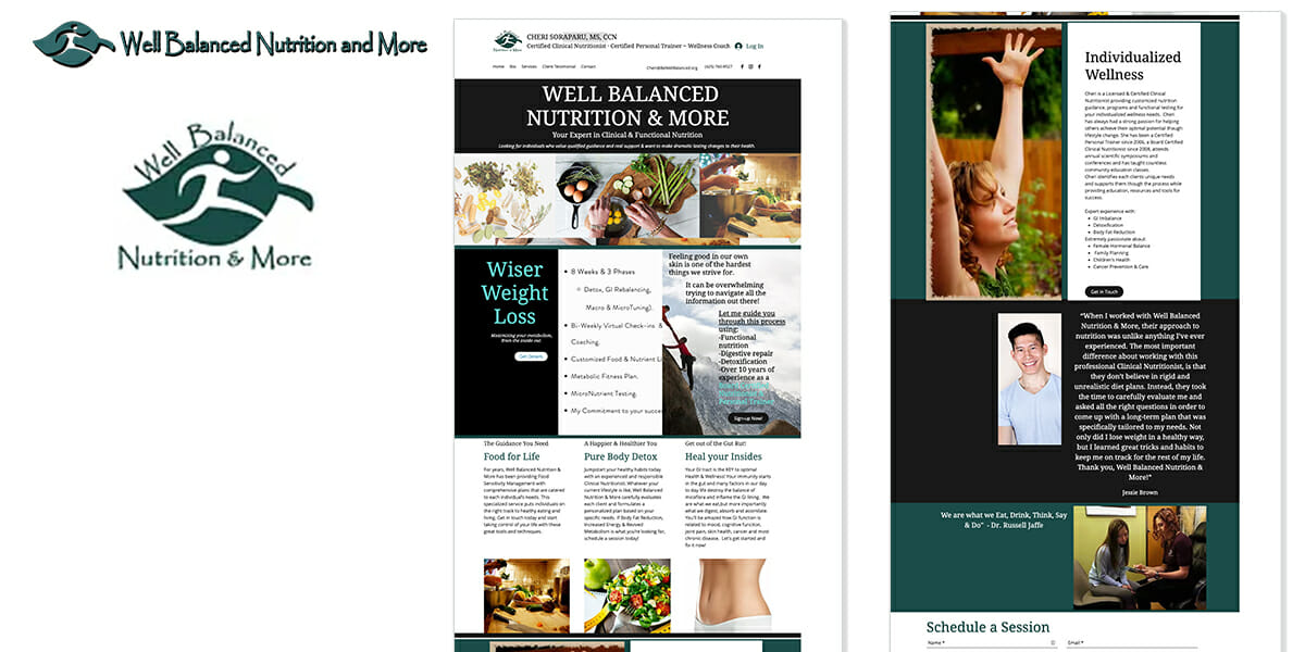
Original Logo & Website
Be Well Balanced original logo was a little dated and lacked a modern feel. It needed to feel more empowering, elegant, sophisticated, and wearable.
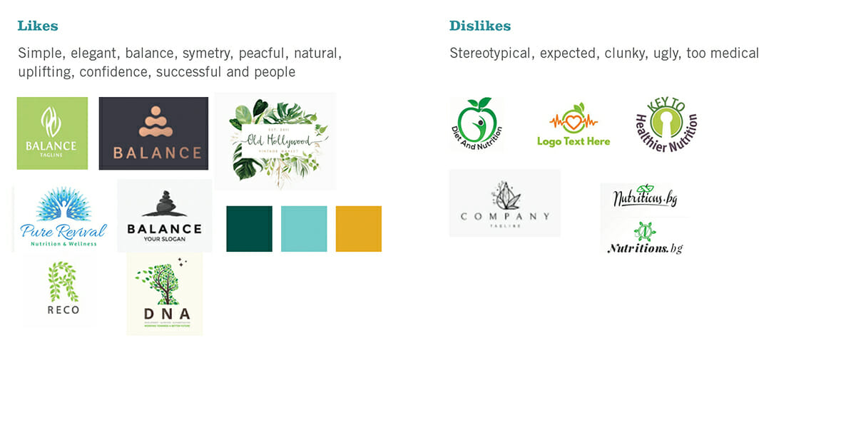
Logo Activity
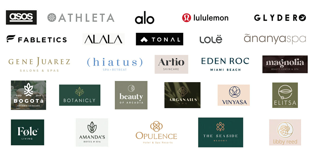
To help focus my logo solution efforts, I ask my clients to engage in a logo activity where they show me their likes and dislikes within their industry.
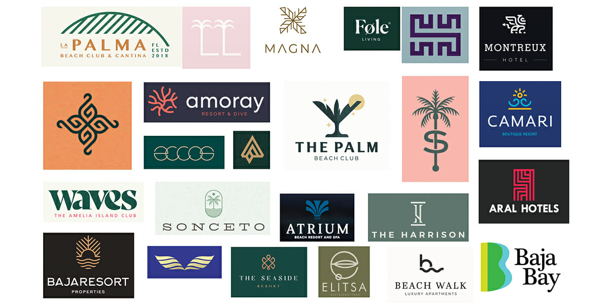
Research – Competition & Logo Inspiration
I have to get an idea of the industry before I can create a logo for them. I looked at the logos and branding of competition and similar brands in the fitness, health and nutrition industries to gain inspiration.
Black & White Logo Options
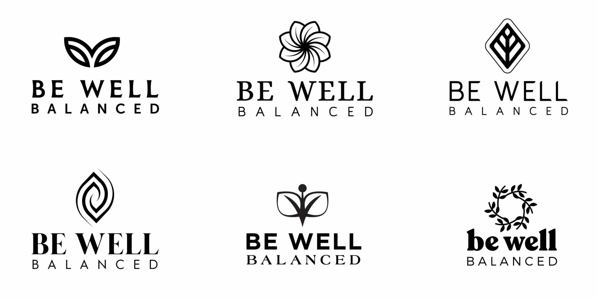
Be Well Balanced wanted to stay with their original leaf motif so we provided them a few options with various font options
Color Options
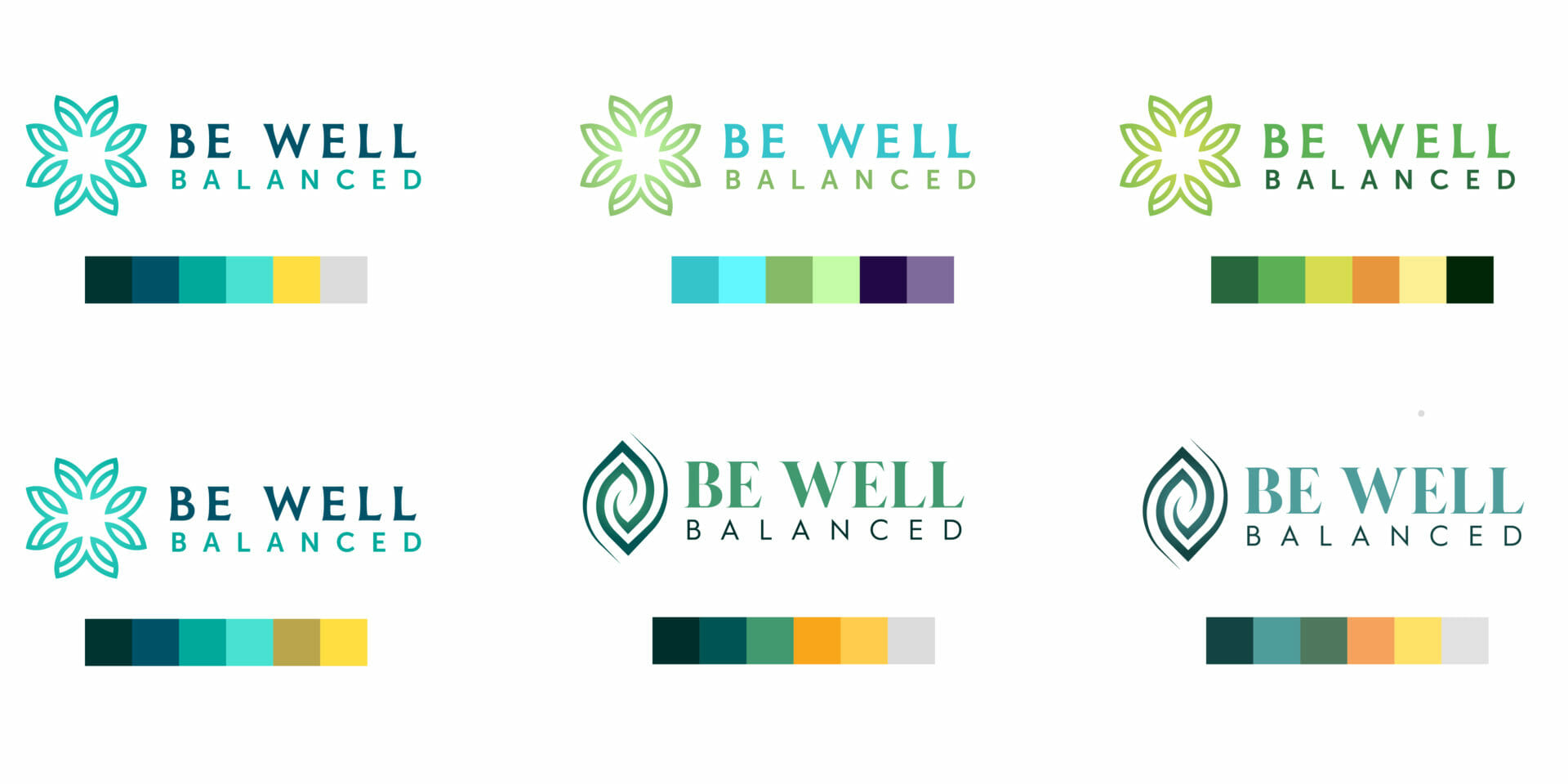
I picked colors based on the knowledge of their target demographic. I wanted to pick options with a friendly and sophisticated feel. I looked at earth, water and sun inspired palettes.
Refinements
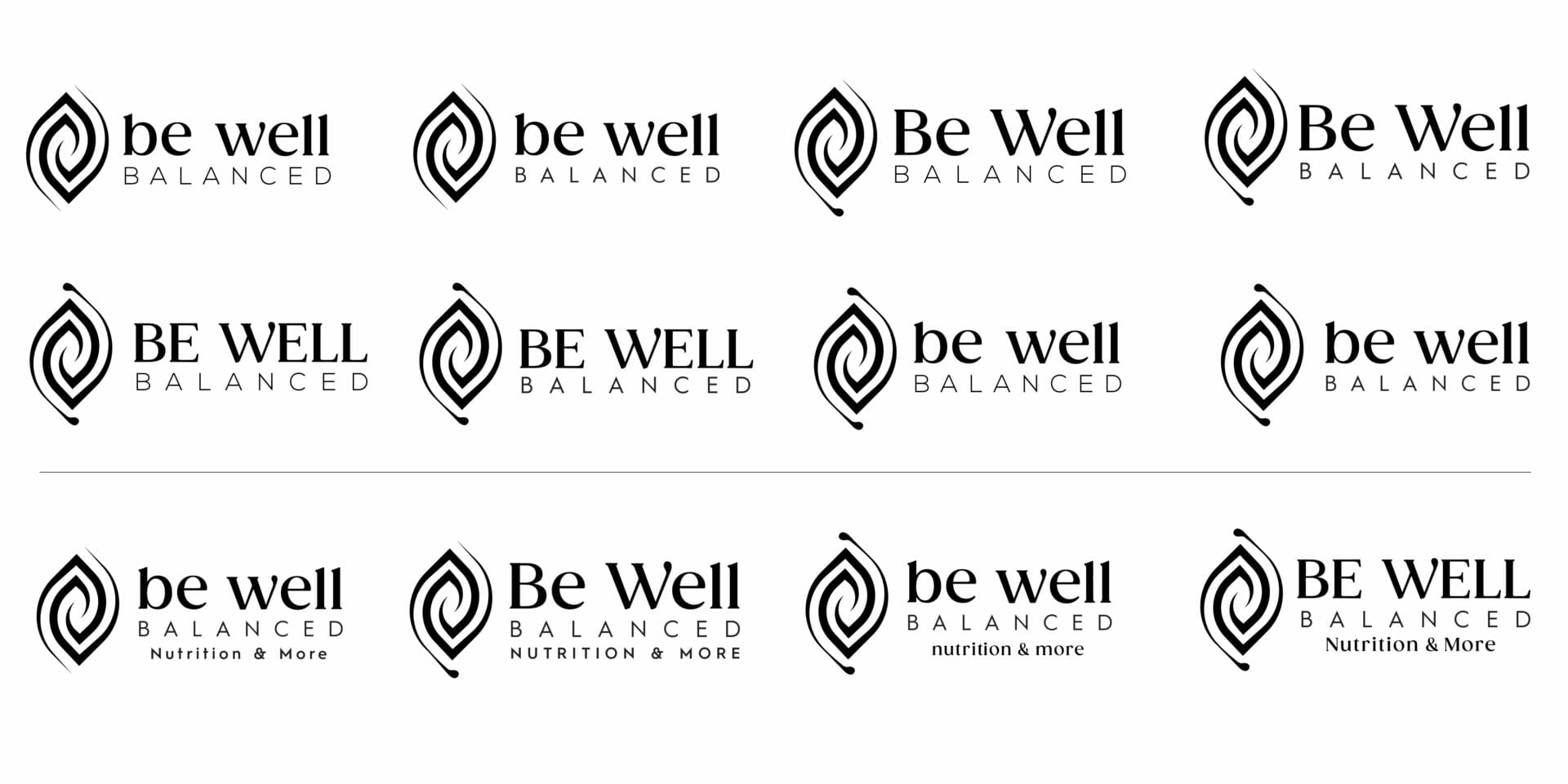
The client settled on a single logo idea. Next we took color back out of the equation in order to focus on which font choice was best.
Logo Solution
Together Be Well Balanced and the Amber Design Team created a beautiful logo we will be proud to show off for years to come.
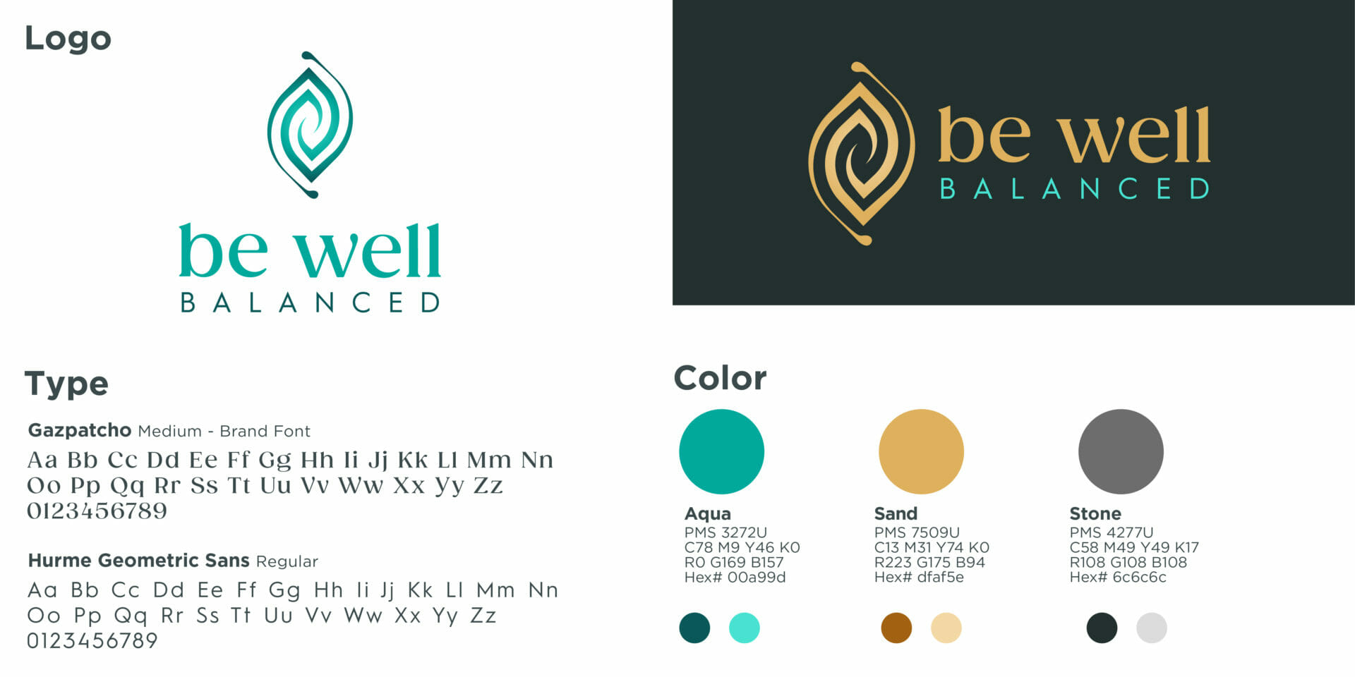
Before & After
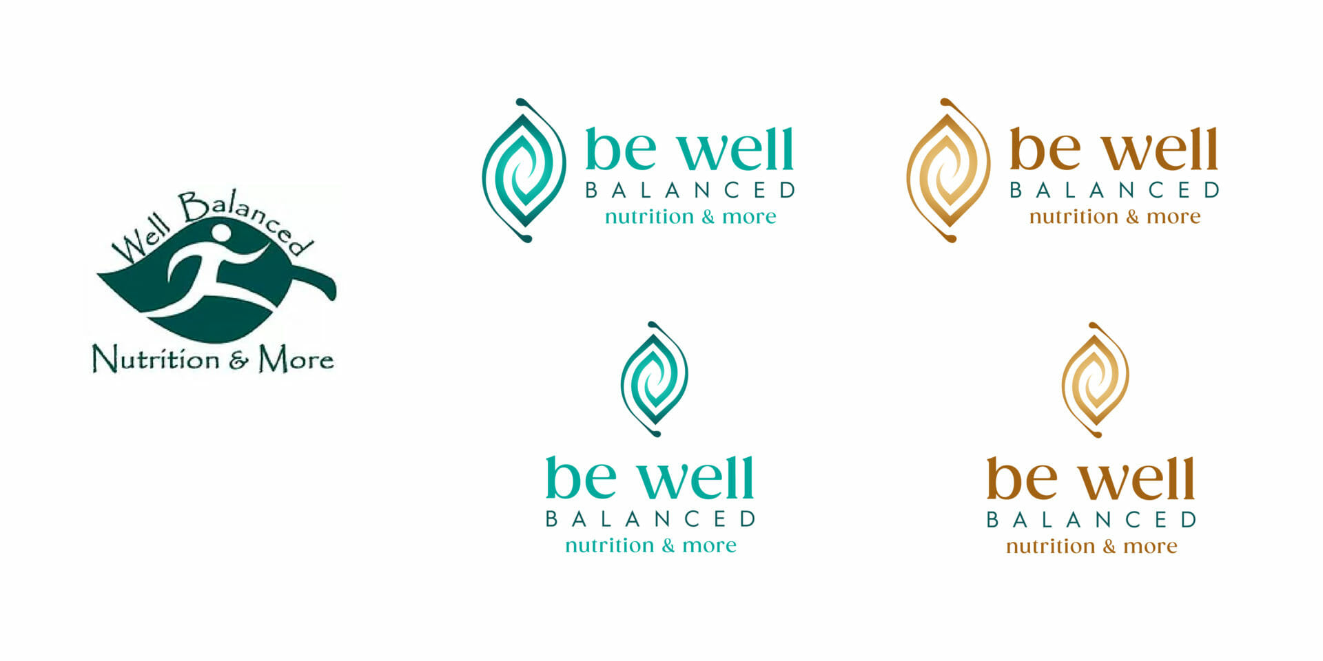
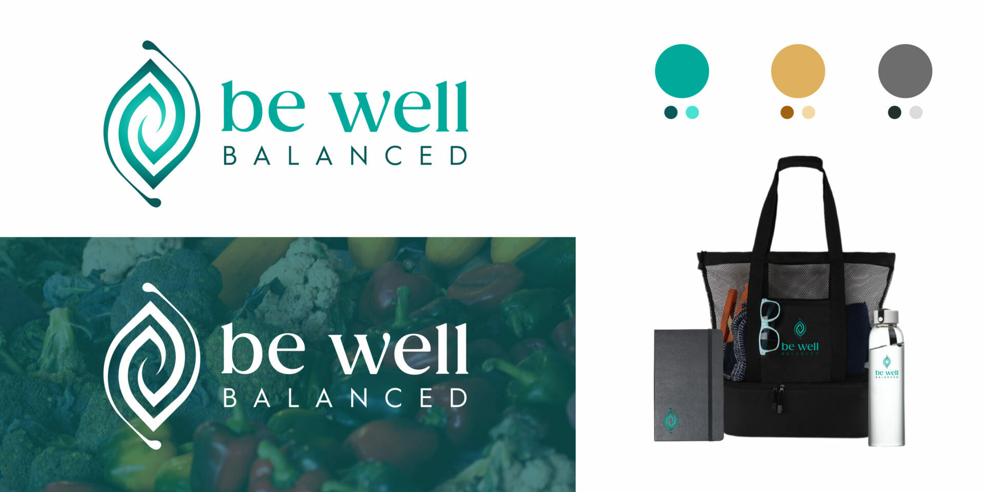
Final Logo
The logo mark is an elegant and modern swirled leaf symbol. The font pairs well by feeling friendly and grounded. The color palette feels sophisticated and luxurious.
Website
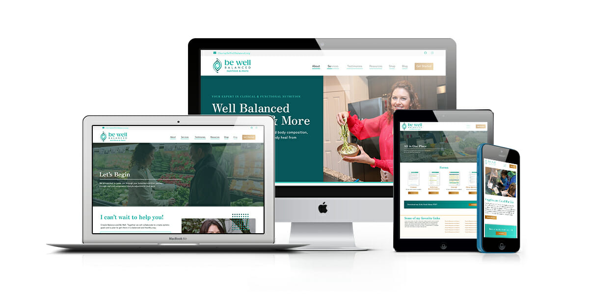
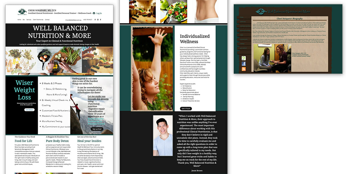
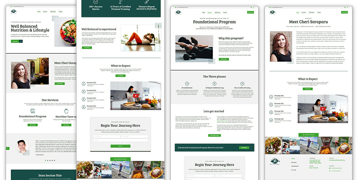
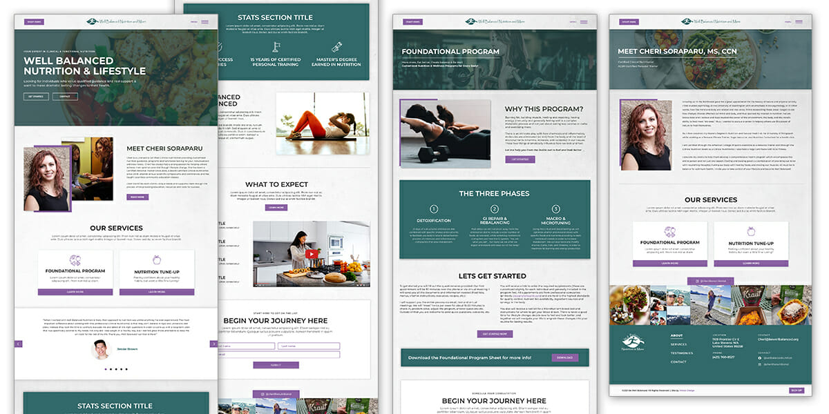
We wanted to take their old website and create an elevated, modern and responsive version of it on WordPress with updated photos along with their new color palette and logo.
Old Website
New website
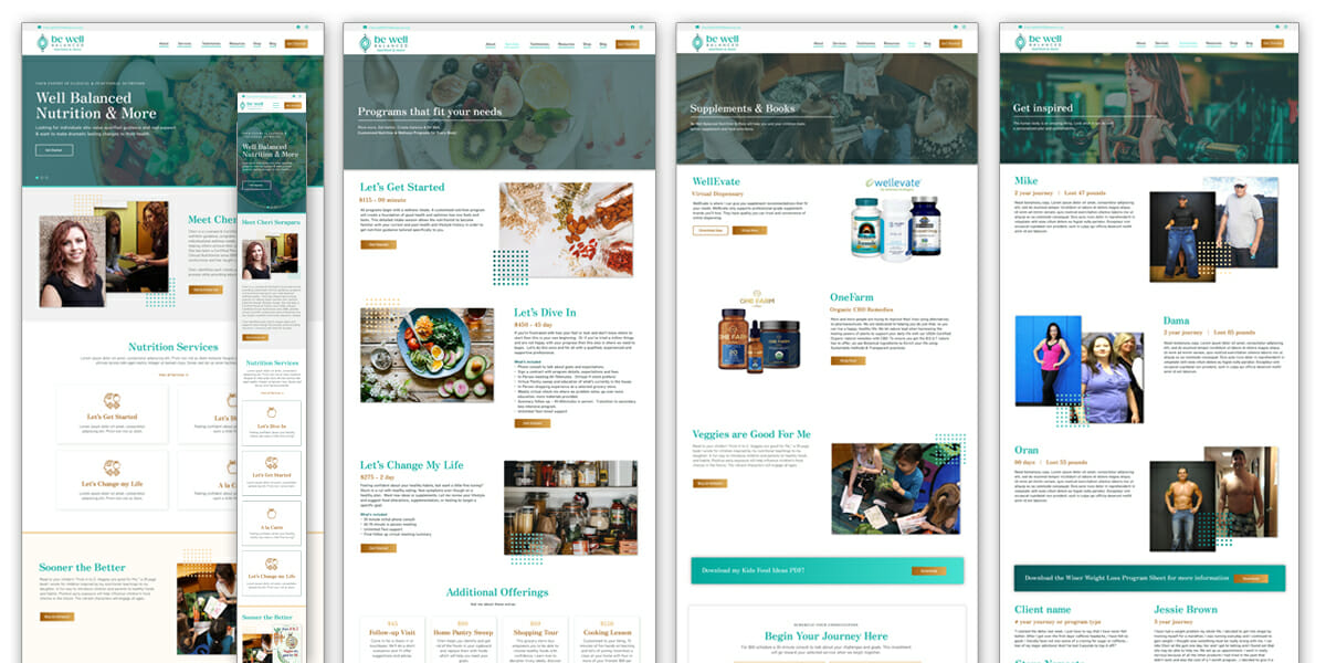
We worked together to select a WordPress template to support their needs, update the site map, sales funnel and page flows. FizzPop Media developed the site for responsiveness and functionality to make the new branding stand out! Check it out >
