Brief
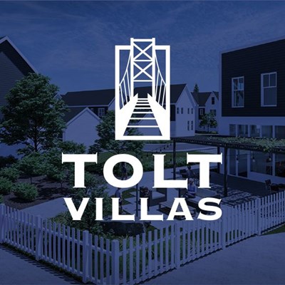
Fortwest was founded in 2011. They build and remodel homes in the greater Seattle area. They take pride in designing beautifully crafted homes that make happy customers. Tolt Villas is a 43 townhome community Fortwest is building in Carnation, WA. Fortwest wants a logo that fits the charming country community. They want a warm, welcoming, modern, vintage country logo that appeases a technology customer. The logo will be used in community signage, flags, maps and flyers.
Company Discovery
With every client I walk through a discovery phase. I want to learn and understand the company’s goals, services and uniquenesses. I also take a peek at local competition.

Understanding the project
Then I needed to understand their project. I was able to review the permit documents to the city that included location, blueprints and building renders. I really wanted to understand the target demographic(s) of this community.

Carnation, WA
After, it was time to dive into the history and geography of Carnation, Wa for inspiration. It is nestled between the Snolqualmie and Tolt Rivers and has a rich dairy and Native American stories. I knew some of my concepts would come from this.

Vintage Country Farm Logos
As I researched and discovered, I was noticing a couple directions we could take the logo. So I made a couple mood boards to share. This one uses strong vintage fonts and bold symbols.

Wistful Farm Logos
The second mood board was a lighter “Pottery Barn” feel and is directed at the target demographic. Moms or future moms with household incomes of $100k+.

Inspiration
Finally, I went out into the world to get inspired. I also “played” a word game for visual inspiration. I looked at other hospitality and tech logos as well.

Sketches
I knew I wanted to look at several historical and geographical landmarks as logo symbol inspiration. But after reviewing the mood boards with the client, I realized this logo would be heavily impacted by the font choice.

Round 1 – Digital Options
So I decided to present black and white concepts in round one as well. I wanted the client to look at several font and symbol pairings that fell within the vintage farm mood board.

Refinements
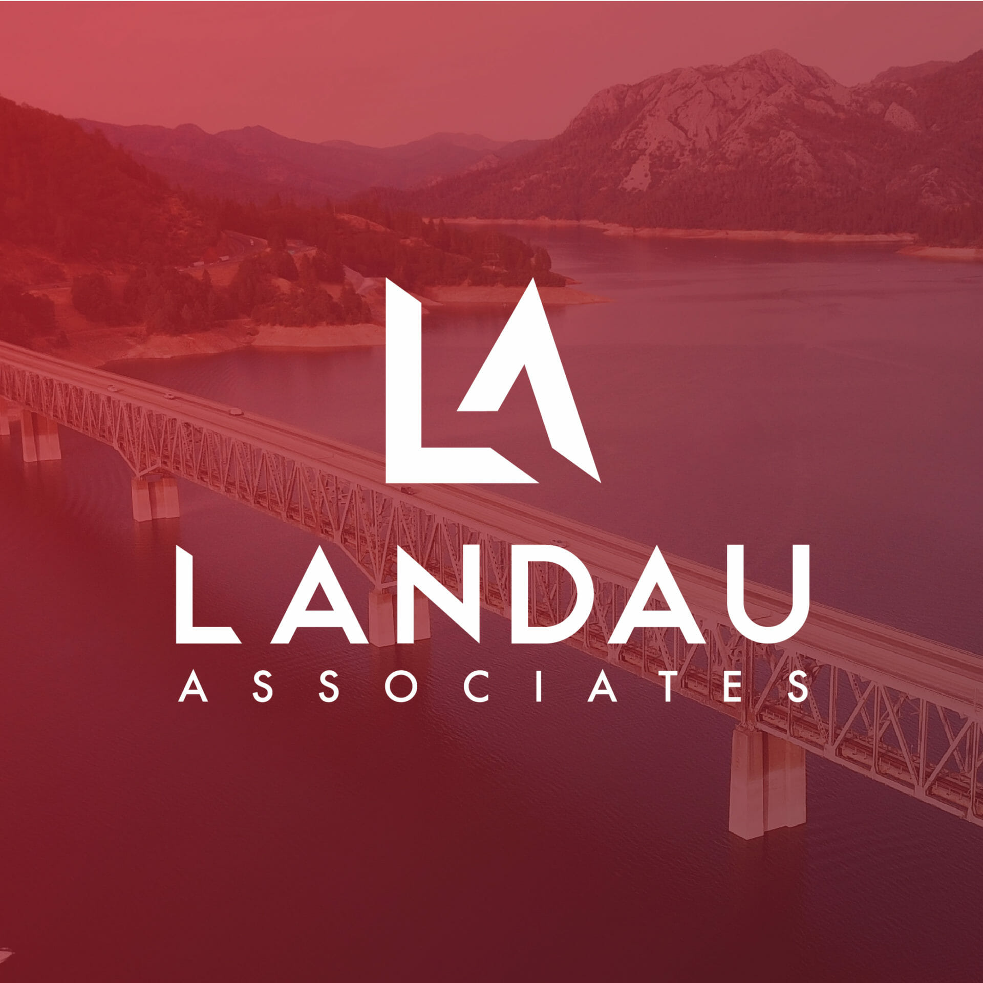
The client like many of the options but ultimately decided to move ahead with option 6. They wanted to see more variations using the bridge and layout.


Responsive logo set
The client liked the rectangle bridge that protruded out of the box. In production, I produced a set they can use in any use case. I created three stacked and horizontal options and even created a min symbol size so the bridge wouldn’t look so “buzzy” when small. We decided they didn’t need color palette since they’d use their Forwest colors and it would predominately be used in black or white.