Brief
Crowd.Cloud is a digital entertainment company that uses a mesh network that connects crowds to venues through a mobile app. As they were talking to venture capitalist they knew they needed to look more professional and have a modern logo.
Logo Activity
When I engage with a client I ask them discovery questions and participate in a logo activity. I ask them to find 5 logos they love and connect with from a business perspective and tell me why then I ask them the same for logos they dislike.
Discovery
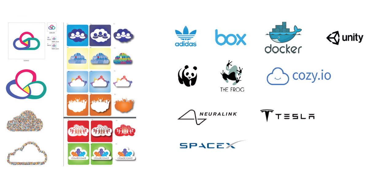
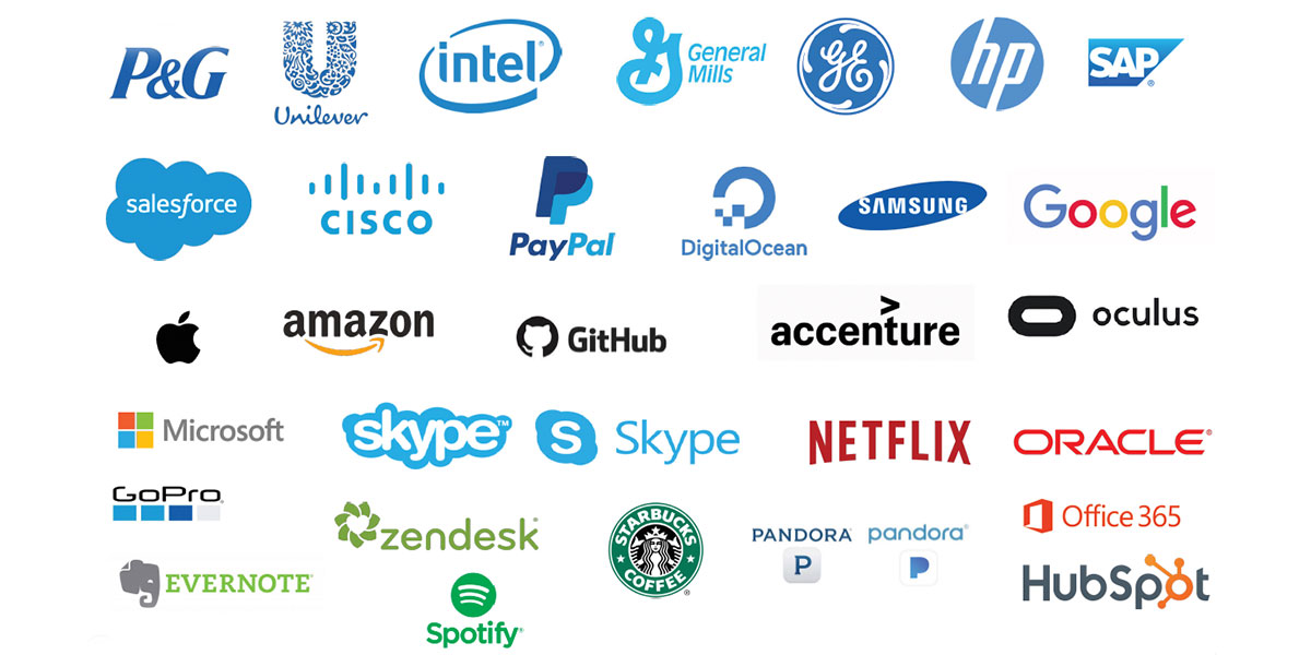
Next I went to look at tech companies large and small to get a better sense of the lay of the land. I made a lot of observations.
Research
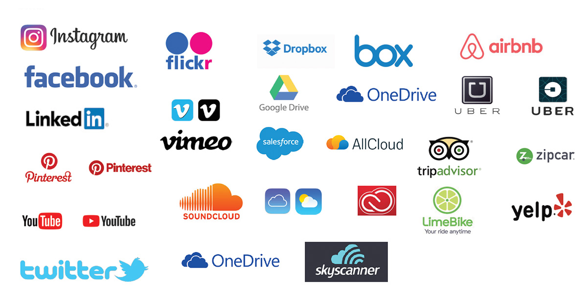
After thinking more about the apps function I knew I needed to look at social and travel apps.
Education
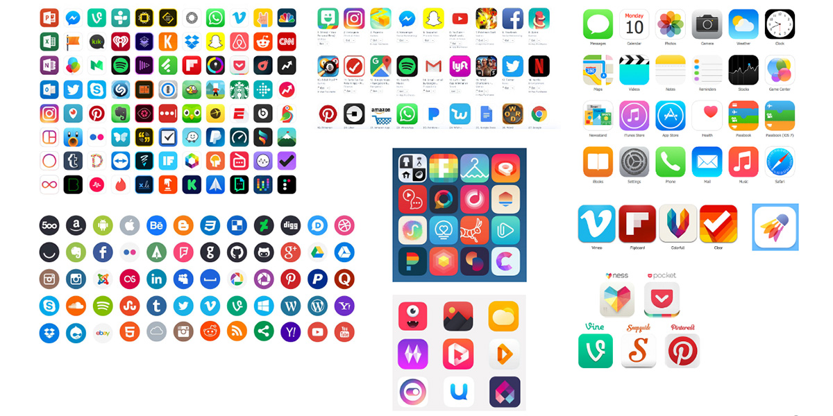
This was where I got a “ah-ha” moment out of my client. I educated them that whatever logo symbol we come up with, it needs too look good as an app on your phone. This got my client extra focused.
Inspiration
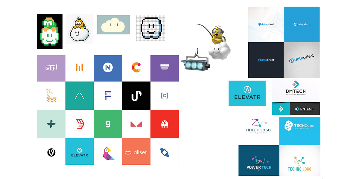
I wanted to take a moment to look at a few modern logos.
Sketches
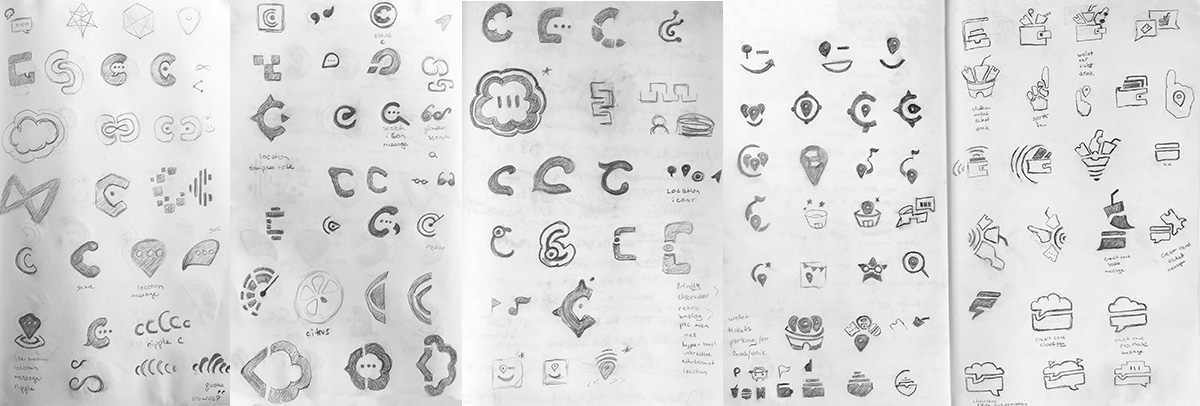
After I’ve done all my discovery, research and inspiration I now take a few sessions and sketch out some ideas.
Concepts
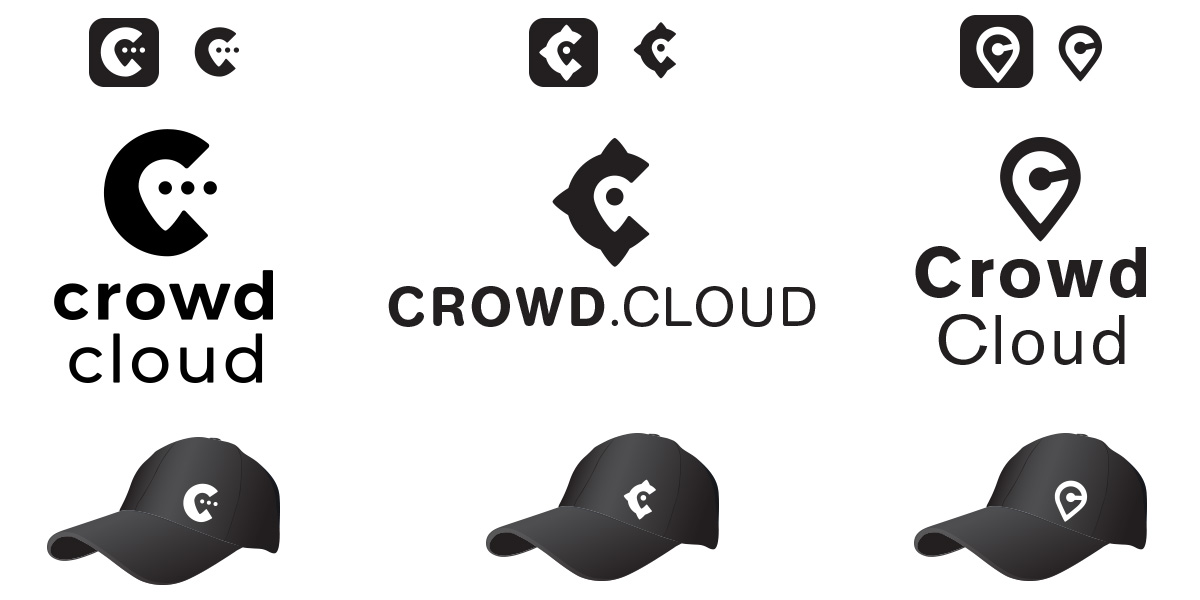
Based on the previous phases, sketch selections and some collaboration with the client, I transformed the ideas into logo layouts. I wanted to provide the client with three symbol and type treatment options. I was inspired by the message conversation indicator, the compass rose and location icon. I also wanted to get them excited about seeing their logo as an app and on a hat.
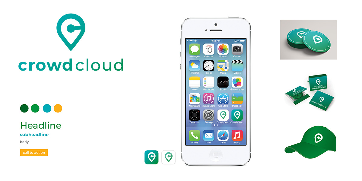
Super Sonic color opiton
They had mentioned Seattle Super Sonic green and gold at some point in our conversation and wanted to present that as an option. Again, I want them to begin visualizing how they might use their logo right away in UI and as a phone app as well as some guerilla marketing.
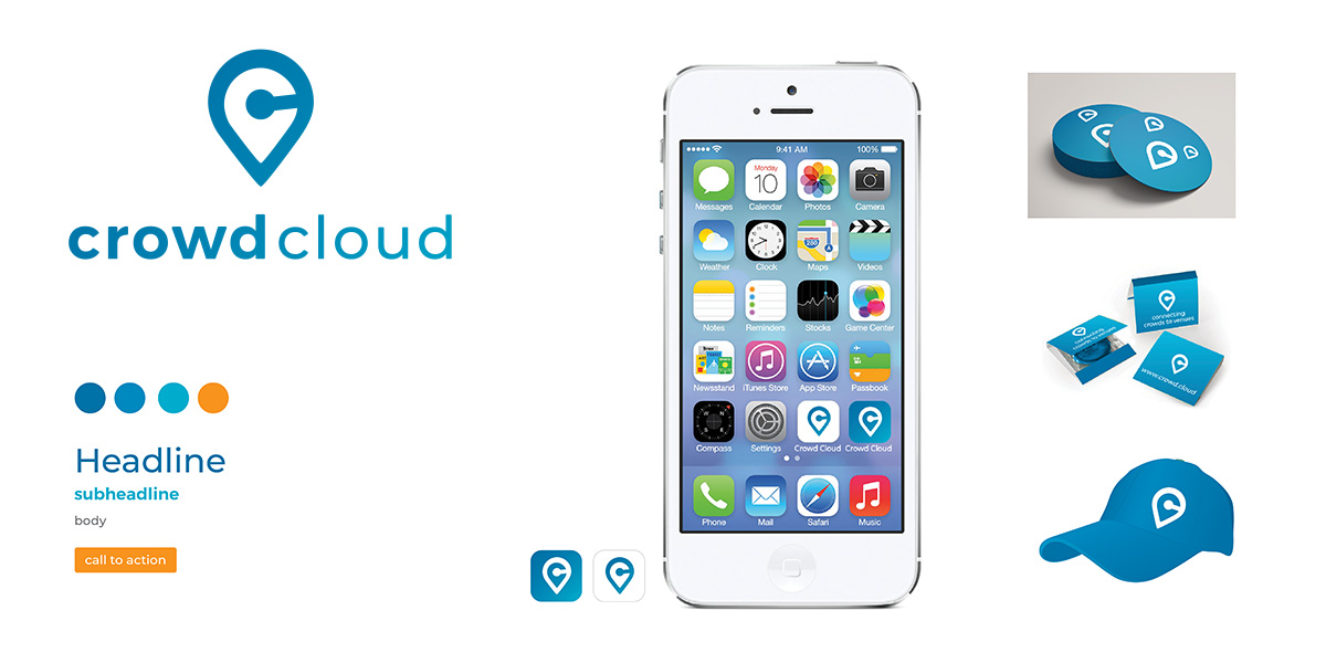
Blue color option
Blue is a common color to use for tech and cloud companies. I wanted to make sure I provided this as an option.
Blue & Raspberry color option
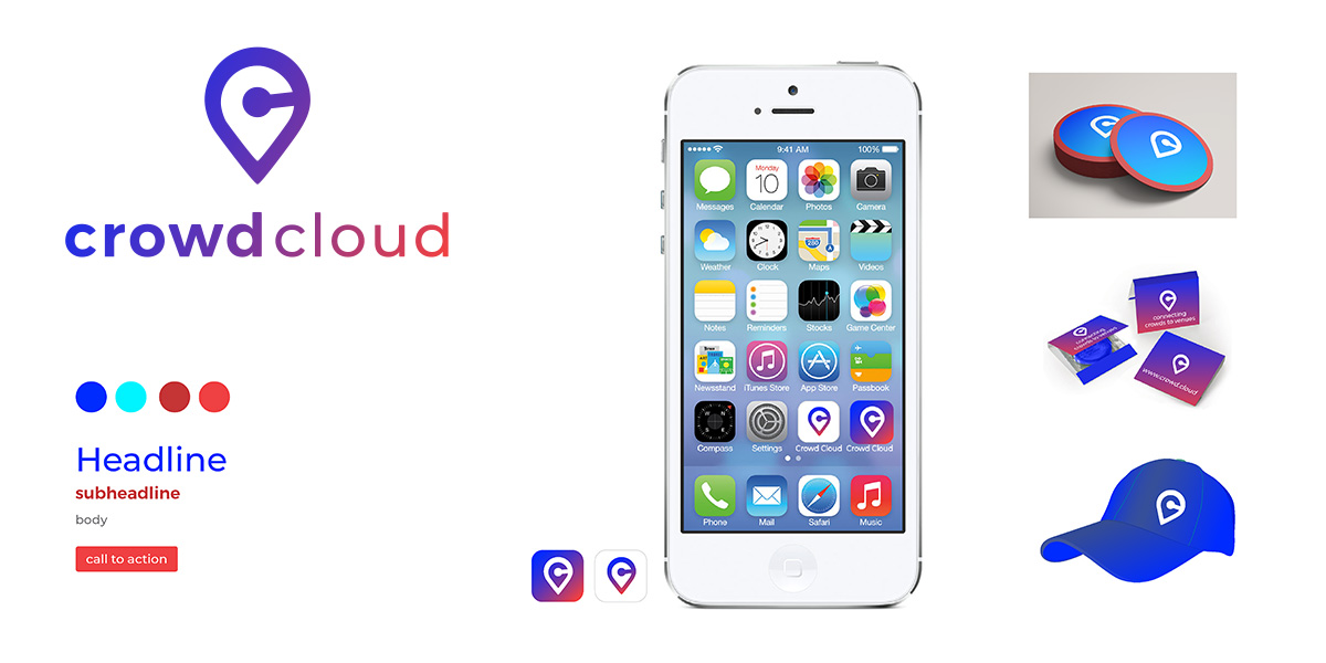
This was my favorite direction. With the demographic of being nearly anyone who attends events at any type of venue, you had to keep it neutral.
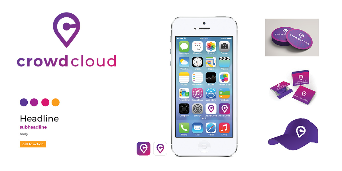
Purple color option
I thought at one point that maybe the predominate user might be female. And wanted to provide an option in that direction.
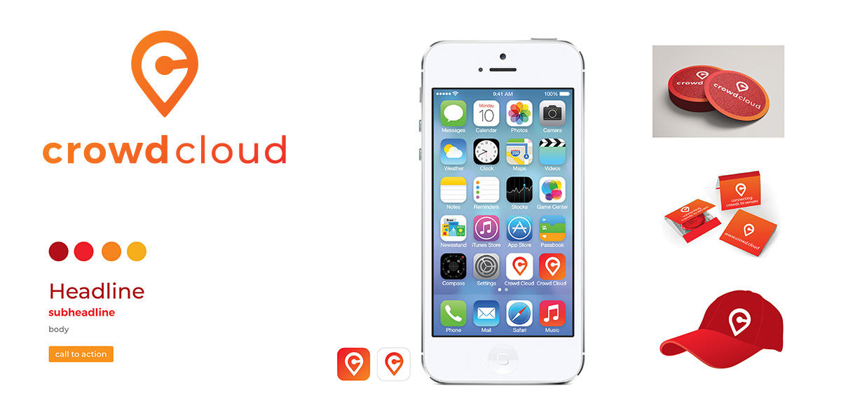
Red & Orange color option
The buck the idea of every tech company using blue I wanted to provide a bright aggressive red option.
Final solution
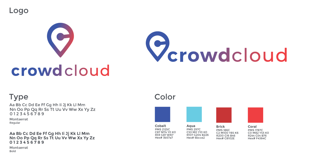
Ultimately, the client picked the blue and red option with a couple modifications. The logo uses the well-known location icon and “C” of the name to create its mark. The colors are bright and neutral. We are both happy with the outcome.
