Brief
The Splainers founders and creative directors reached out in need of a new website that better showcased their work and services. Amber Design collaborated with Splainers to create a new responsive WordPress website. The work included site map updates, sales funnels for services, page flows strategies, design and development.
Discovery
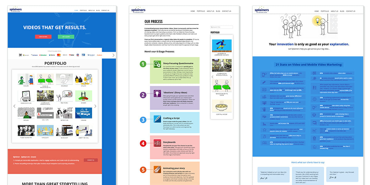
Through our discovery process we learned what Splainers does and why they are better than their competition. We took inventory of what their current website was offering and how we could rearrange the content to better service thier prospects’ usability. We then looked at their competion and inspiration websites for design guidance.
Round 1
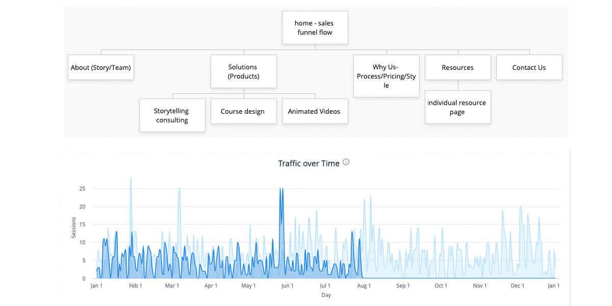
After the kick-off, our team got a benchmark of site analytics, rearranged their current site map and offered page flow suggestions. We collaborated to create strategic page flows for their business and service offerings.
Competion research
It is always good to research the competition to either cherry-pick good ideas to improve upon or have an awareness as to not copy or imitate.

High-Fidelity Website Mockups
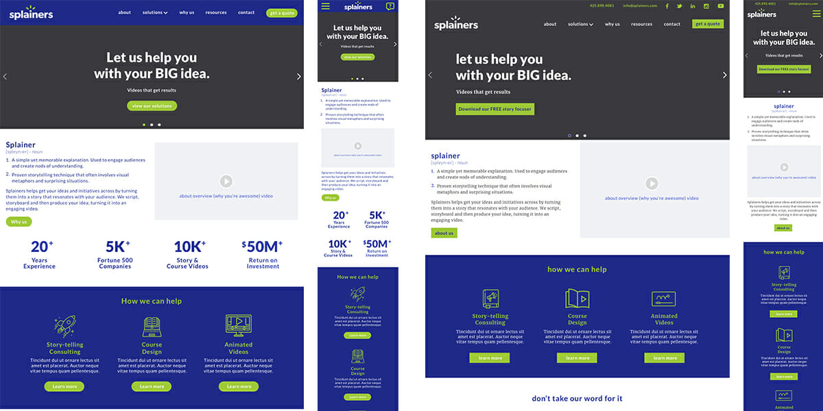
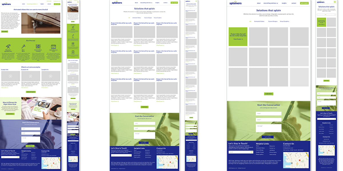
The Splainers team and I selected a few key pages to mock up for round one. We are focused on page flow, top navigation, content and footer design.
Rounds of Review
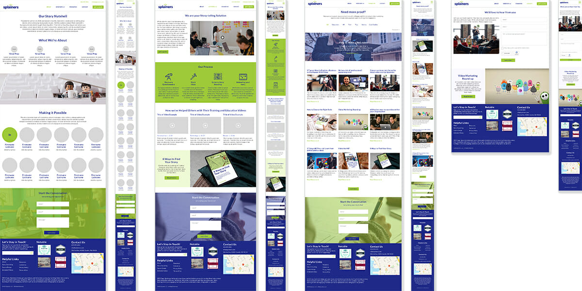
Our teams do several rounds of review, refining previous rounds and adding more pages as well as mobile views.
Flows & Functionality
We work through page flows and functionalities to make sure the website is accomplishing what the client sets out to do.
Final Solution
Once the Splainers team approved, we produced all the images needed for the developer, FizzPop Media to build in WordPress. Once the website was in staging, we all reviewed together. We then trained the Splainers team on how to add and update pages and sent them a Zoom recording of it for future use. After the Splainers team filled in the video, image and copy content we launched the new website live. Check it out >


