Brief
Schroeder Design Build is a second-generation, family-owned remodeling company based in Virginia, known for delivering exceptional service, thoughtful design, and reliable construction.
Schroeder Design Build and iMarc Consulting approached Amber Design mid-way through a logo project that had originally been started with another agency. Unsatisfied with the creative direction, they turned to us for a professional evaluation and ultimately asked us to lead the branding effort.
Together, we developed a logo that feels friendly and welcoming, while capturing the artistic flair they envisioned. The goal was to create a visual identity that feels professional, trustworthy, and sophisticated, with a strong sense of connection and unity. We worked to strike the right balance between the feminine design sensibility and the masculine strength of their construction services—reflecting the full scope of who they are and what they do.
Professional Design Consulting Analysis
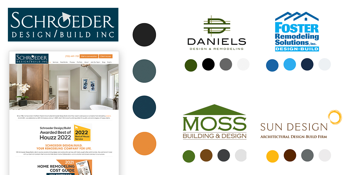
The first thing we had to do was understand the home remodeling industry and clientel. With that, Amber Design was able to give a detailed SWAT report around Schroeder’s current logo and color scheme, as well as a quick analysis of their local competion to show their opportunity.
Continuing the process
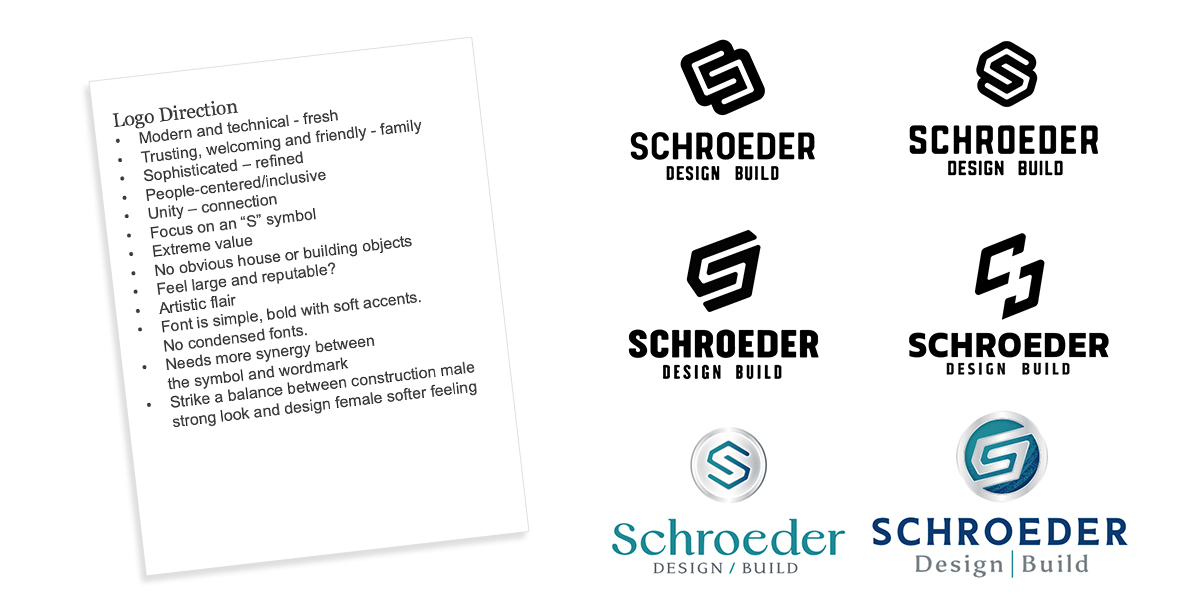
Next, we reviewed both Schroeder and iMarc Consulting’s original direction, as well as the designs from the current agency. We concluded that the designs didn’t reflect the company’s culture or personality. They leaned too heavily into the construction side of the business, making the logo feel overly angular, masculine, and closed-off—lacking the friendly, welcoming tone Schroeder was hoping to achieve.
Additionally, the agency was not as receptive to client feedback suggesting a softer approach or exploring the idea of not enclosing the “S.” The typography also felt disconnected from the logo marks being developed, resulting in a lack of synergy between the symbol and the wordmark. Overall, the concepts didn’t feel distinctive or aligned with Schroeder’s brand vision.
Concepts
Color exploration
The client knew they wanted to explore blues/teals and corals/oranges. We explored lots of shades and tints! We believe a color pallette should be flexible having a primary, tint and a shade of a core brand color.
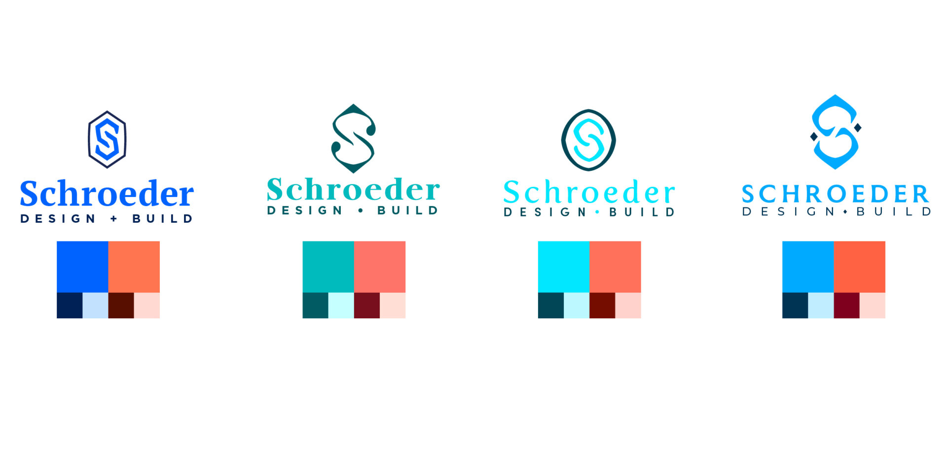
Color refinements
Ultimately, the client felt comfortable with their old color palette and wanted to freshen it up. We compared it to the refreshed options.
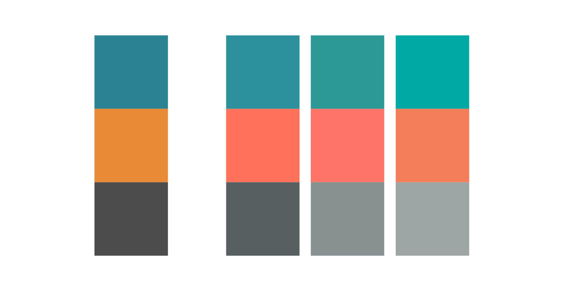
Logo refinements
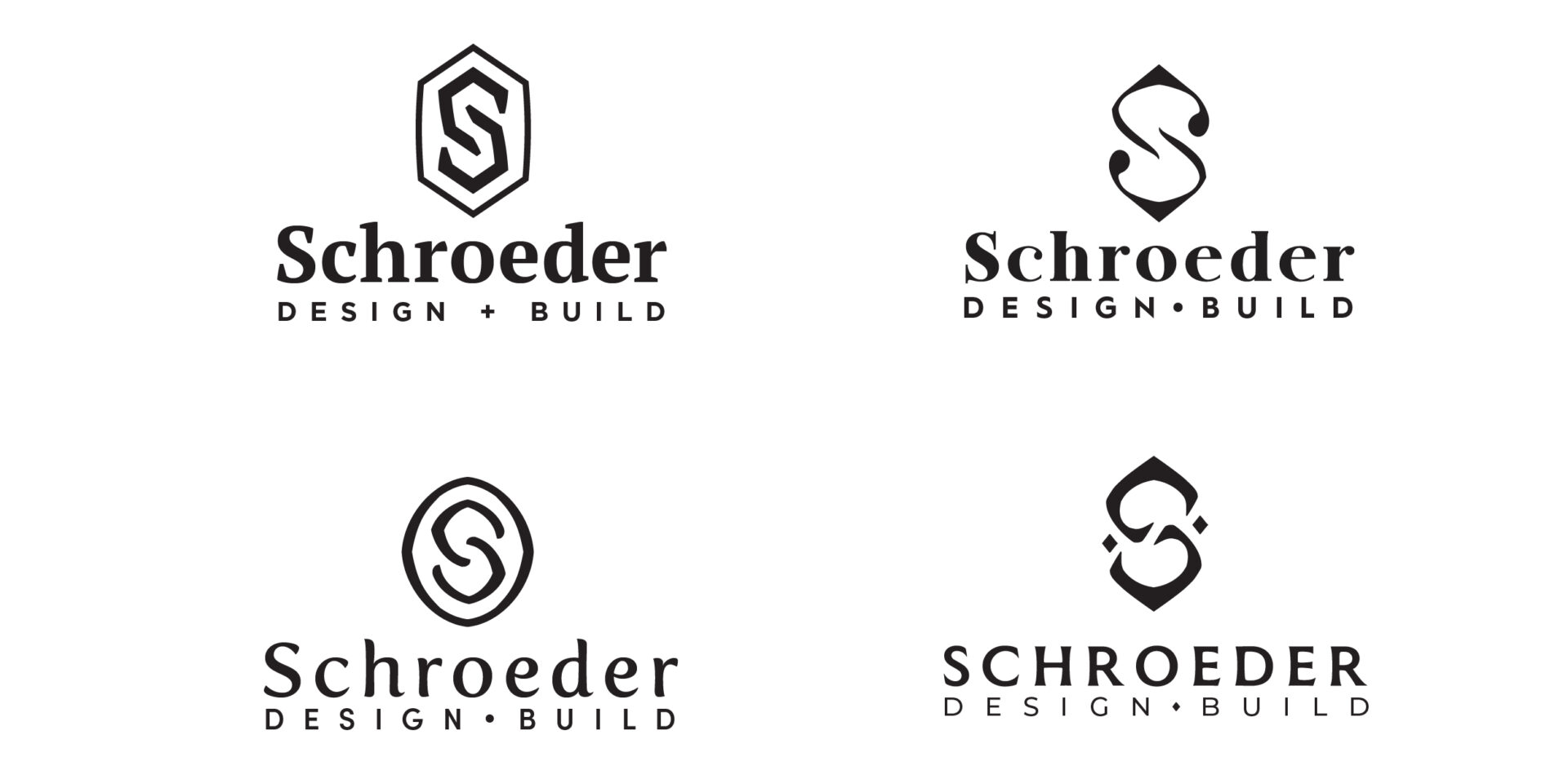
We explored title and all-capped options for the wordmark as well as thickening the symbol. There is synergy between the symbol and workmark. It is friendly and delights and has a timeless vintage home feeling.
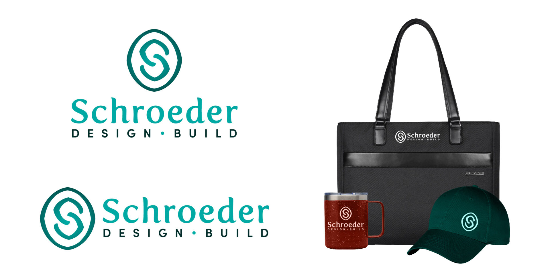
Final logo
The client couldn’t wait to order hats, decals and new polos!
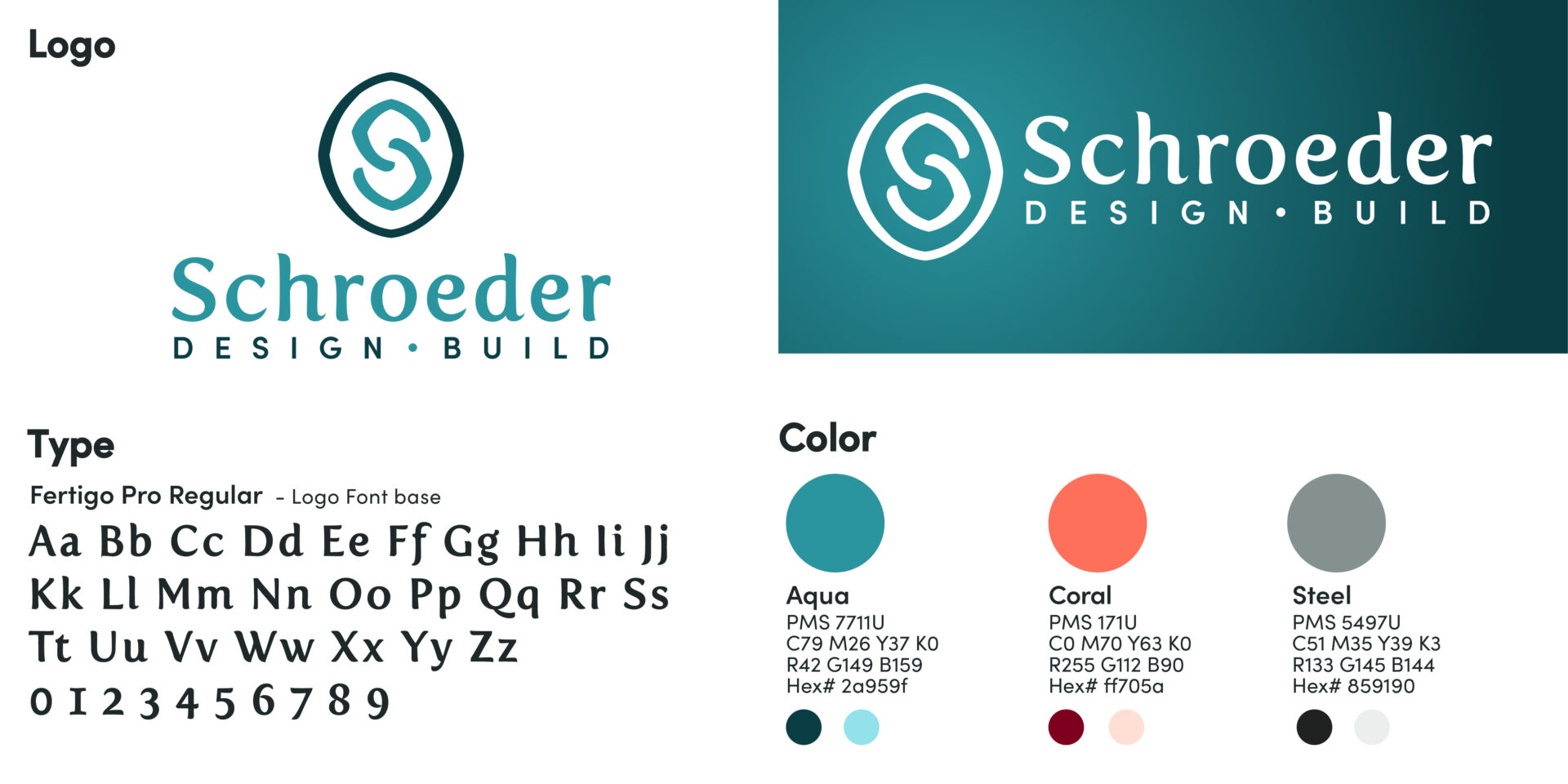
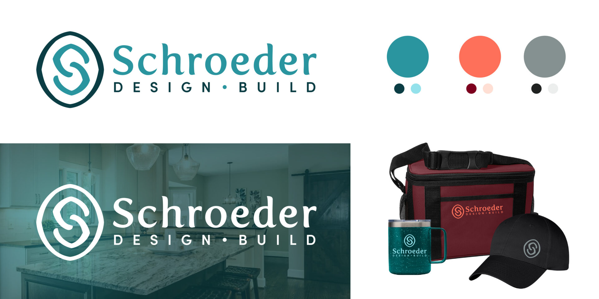
Logo update
What a great collaboration! Their new look sets them apart from the competition and will set them up for success for years to come.
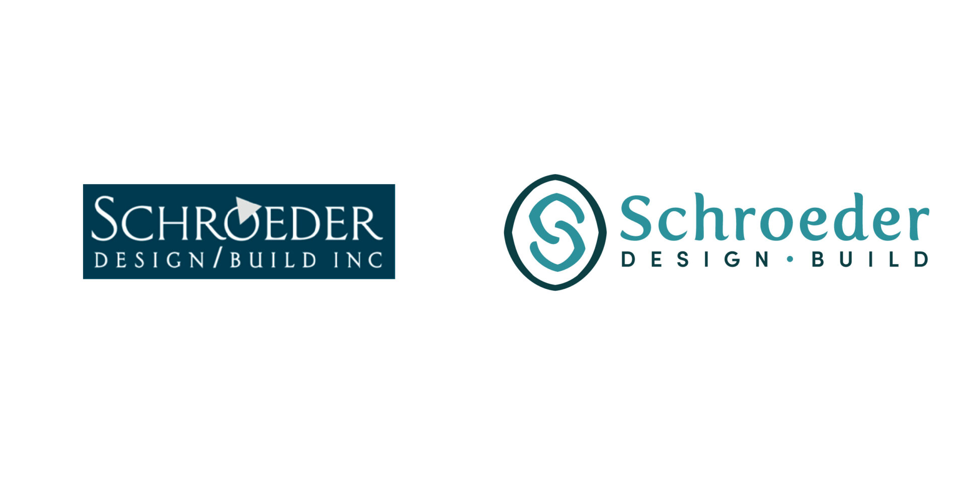
Client Review
From Google Review. “We came to Amber Jacobs in a predicament. We’d already contracted with another logo designer who had taken us only so far in the process, and not over the finish line. Salvaging some of the initial art progress, we hired Amber to help us finalize the logo. What impressed us immediately was her thoroughness, professionalism, and impressive logo development process. She listened to our needs in Discovery, researched our competitors, flushed out several logo concepts, and provided many color palate options within a reasonable turnaround time. She was also faced with the task of working with two dynamic leaders as decision-makers, who have two completely different strengths. She helped us come to agreement on the logo, exhibiting confidence in the final direction.
Amber also conducted every meeting with purpose, guiding decision-making, and leading us to the finish line. By the end of December 2022, we received a full set of deliverables, as she had promised. We are now proudly launching a new brand that better reflects our culture and our unique differentiation.
Thank you, Amber, for your valued services.”
