Brief
CreativeMind offers an elevated personal growth system, developed by Debra Berndt Maldonado and Robert Maldonado, Ph.D., based on the latest research of consciousness, Jungian concepts, time-tested spiritual wisdom traditions, and the new findings in neuroscience. We train life coaches to become their most evolved and extraordinary selves through our transformational psycho-spiritual process and help them live their passion and share their wisdom.
CreativeMind wanted a logo, brand and website refresh. We collaborated together to create a beautiful brand that resonates with their target customers.
Original Logo
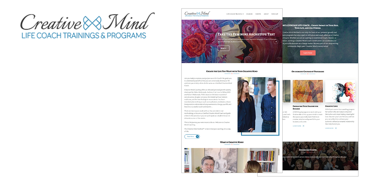
CreativeMind’s logo lacked balance and needed to feel more empowering, luxurious, inspirational, enlightened and wearable.
Logo Activity
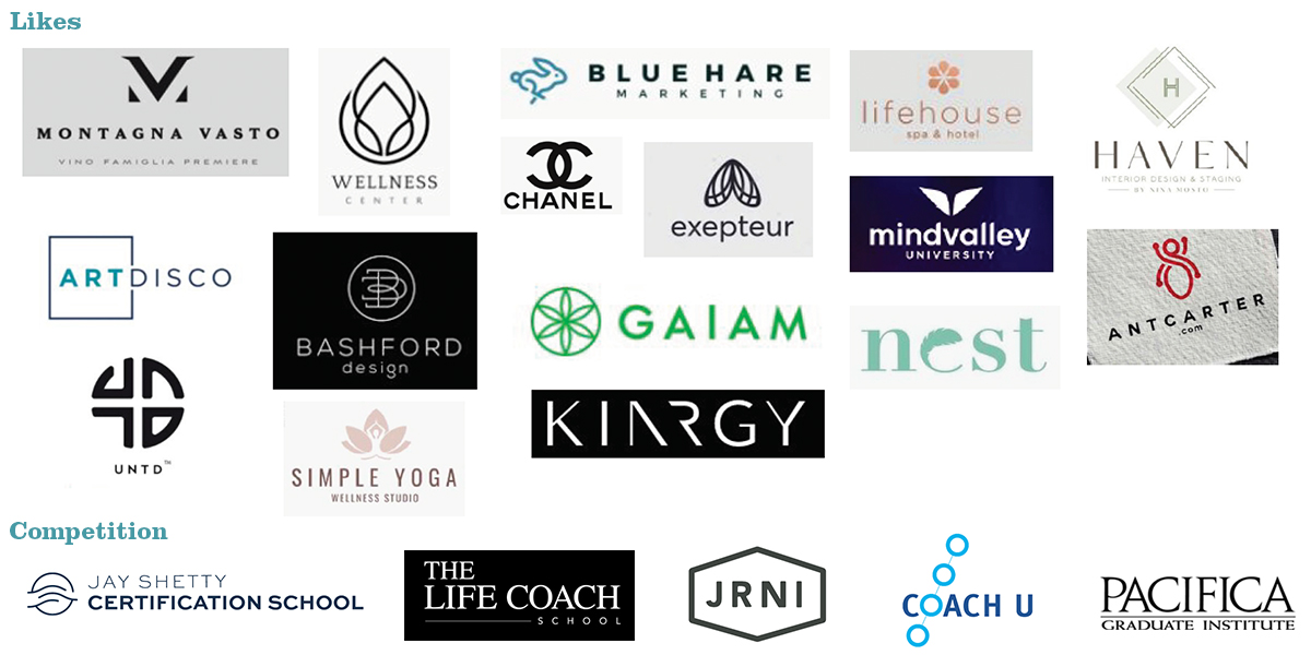
To help focus my logo solution efforts, I ask my clients to engage in a logo activity.
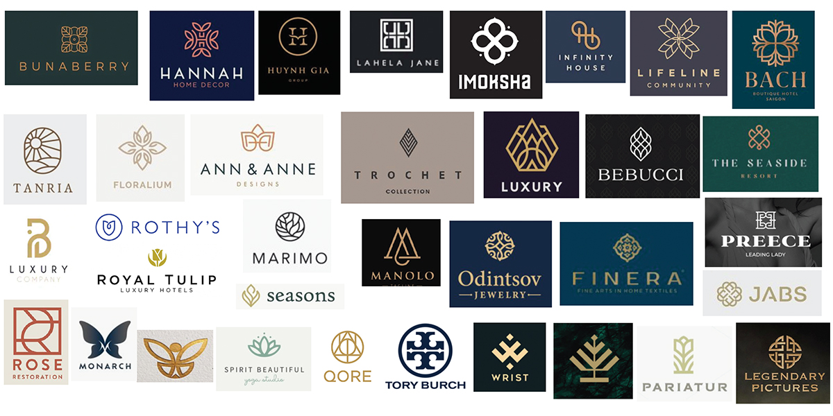
Research – Competition
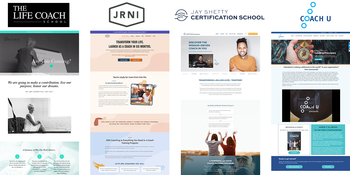
I have to get an idea of the industry before I can create a logo for them. I looked at the branding and messaging of their competition.
Research – Method
CreativeMind uses Eastern Philosophy with Western Psychology to create courses that truly help people with fulfillment to achieve their goals.
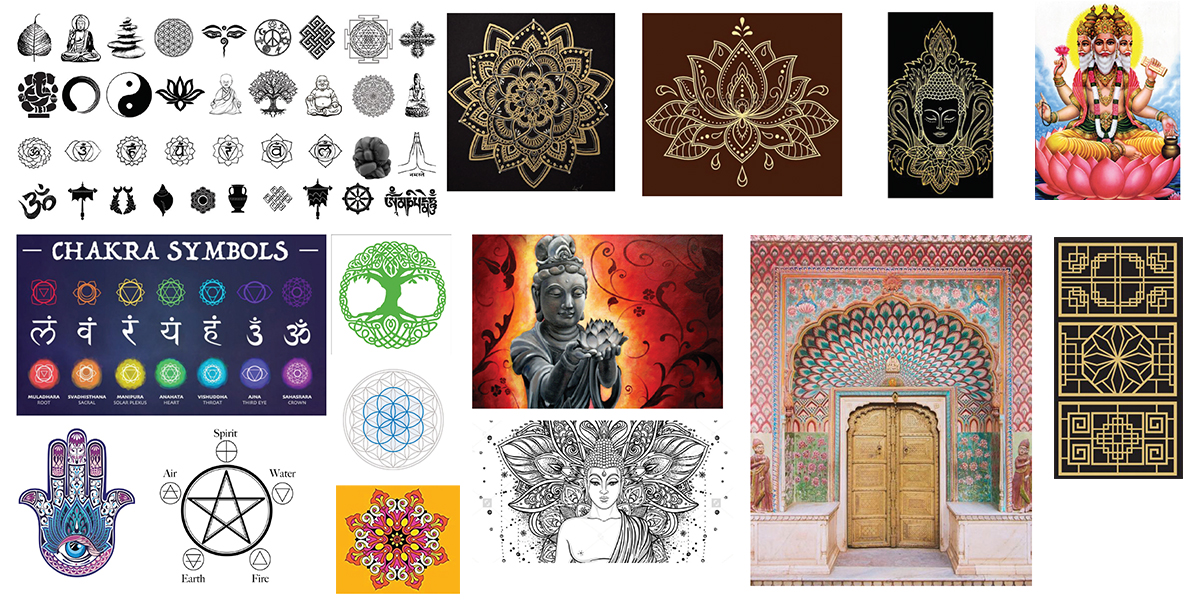
Inspiration
Finally, I went out into the world to get inspired.
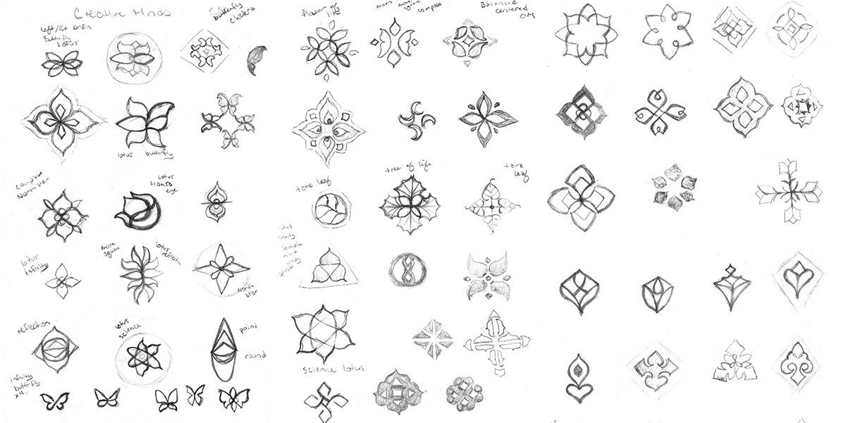
Sketches
With the thought of a logo refresh in mind, I presented sketches inspired by science, Eastern Religion and art.
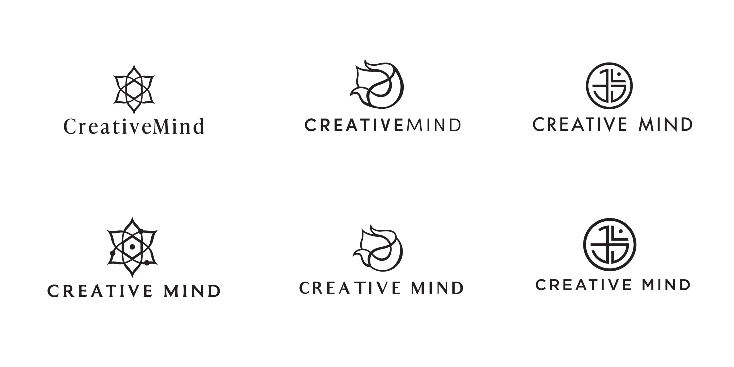
Digital Options
CreativeMind moved forward with the science lotus, abstract Hamas eye and a geometric OM symbol. I paired them with classic, beautiful fonts.
Refinements
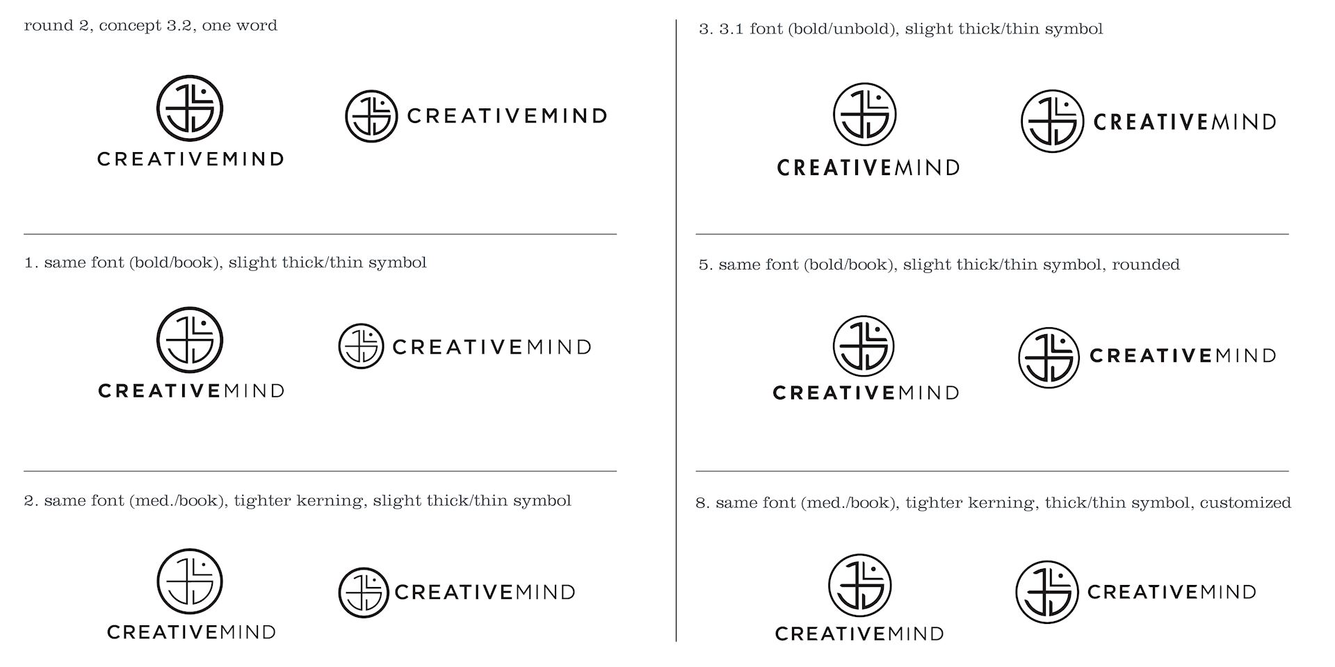
CreativeMind moved forward with the geometric OM symbol but wanted to see symbol and font refinements.
Color Options
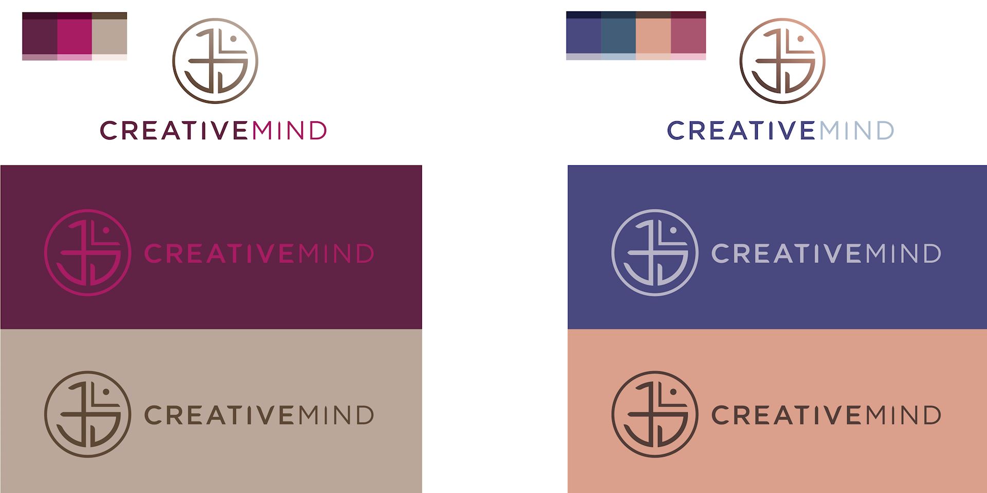
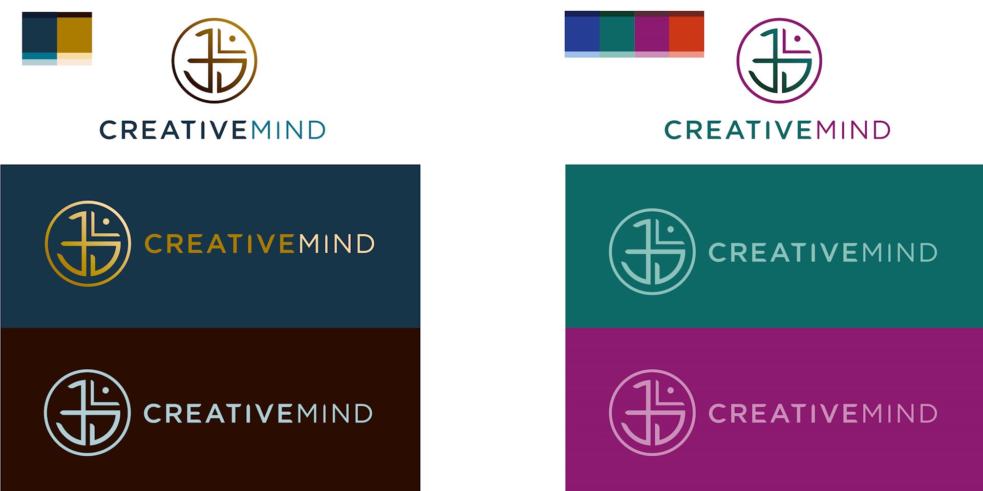
I picked colors based on the knowledge of their target demographic. I wanted to pick options with a luxurious, high-end feel. I looked at feminine, skincare, earth and art inspired palettes.
Refinements
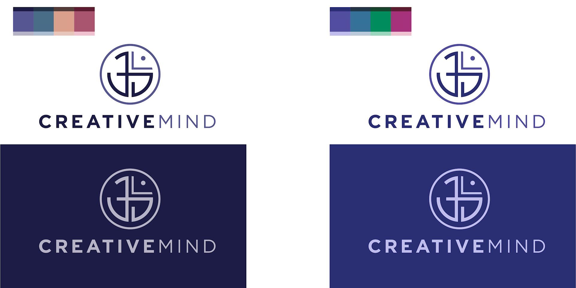
We catered to the client’s attention to detail by showing them additional color periwinkle combinations and ensuring the logo was geometrically perfect.
Logo Solution
Together CreativeMind and I created a beautiful logo we will be proud to show off for years to come.
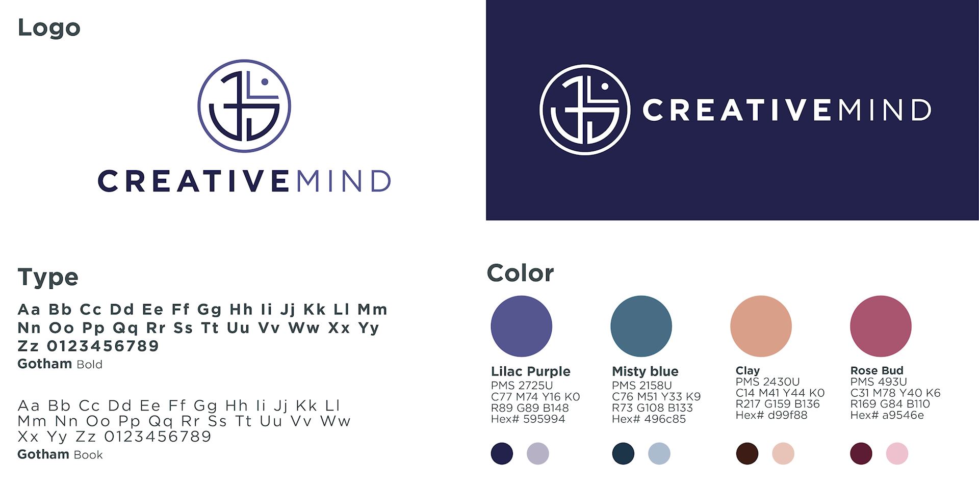
Program & Podcast Logo Additions
Next, we looked at spacing to add and create program and podcast logo additions. We settled on these colors and layouts.
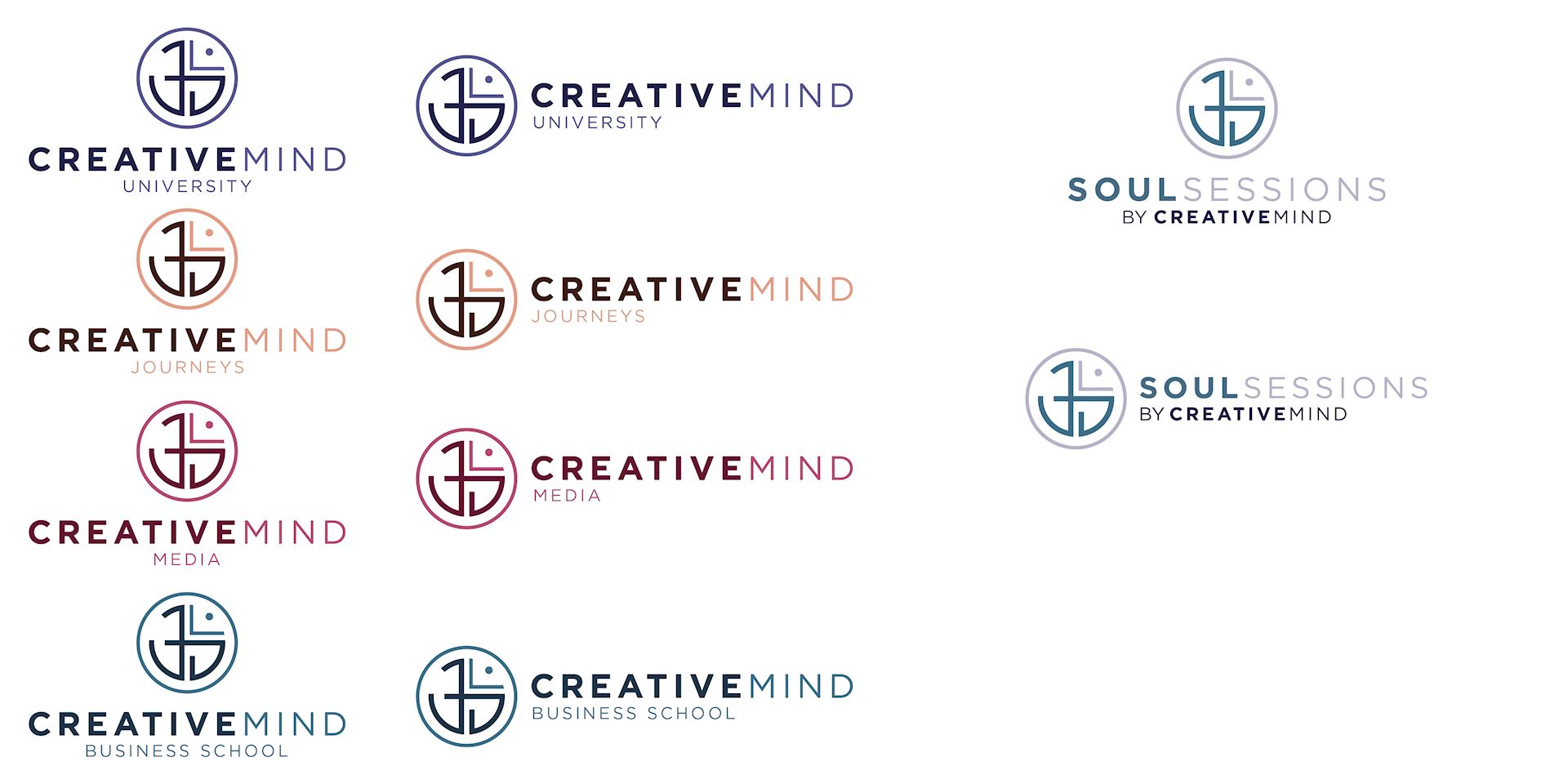
Final Logo
The symbol is a modern geometric version of the OM symbol. The font pairs well by feeling grounded. The color pallet feels sophisticated and luxurious.
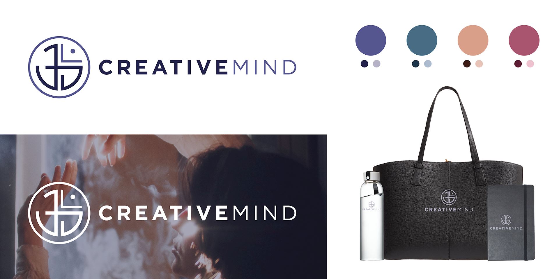
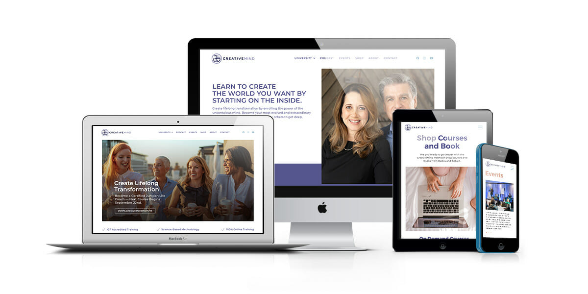
WordPress Website
We worked together to select a WordPress template to support their needs, update the site map, sales funnel and page flows. Using the selected Salient theme we designed their new website through several rounds of review and refinements. Check it out >
