Brief
They came to us needing a brand refresh so they could make a splash in their industry and enter new markets. They needed a consistent way to talk about themselves internally and externally.
Discovery
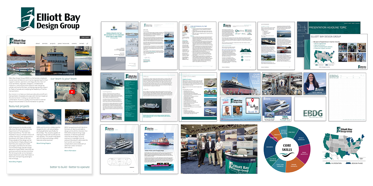
We first took inventory of what they had and conversed around company morale, audience, goals and painponts. We needed to know how these pieces were being used and when they were used in the buyers journey.
Understanding the competition
Messaging
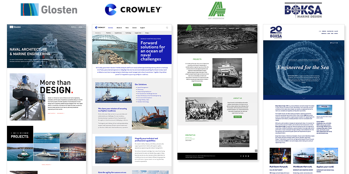
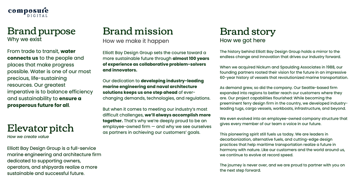
After over 100-years you can imagine how fragmented their messaging might have been. We enlisted the services of Composure Digital to help us. Through an employee survey, market reserach and a card sorting workshop with the Open Book Management Leadership team we were able to collaborate to craft the perfect mission, values, story, elevator pitch, personality, pillars and messaging.
Research
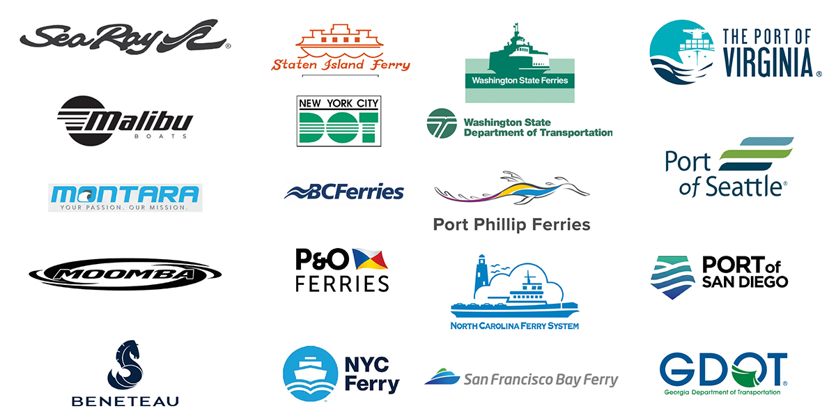
Amber Design likes to really understand the industry. They reserched and looked at hundreds of logos in the engineering, manufacturing, shipping, ports and ferries.
Inspiration
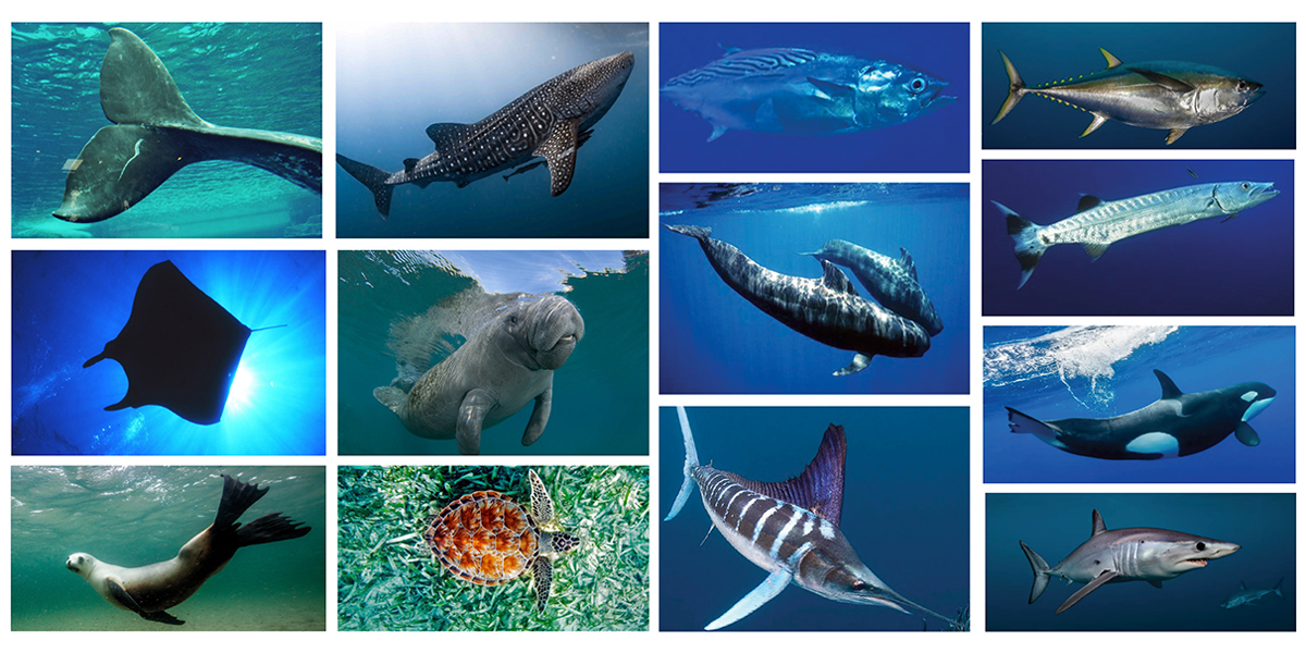
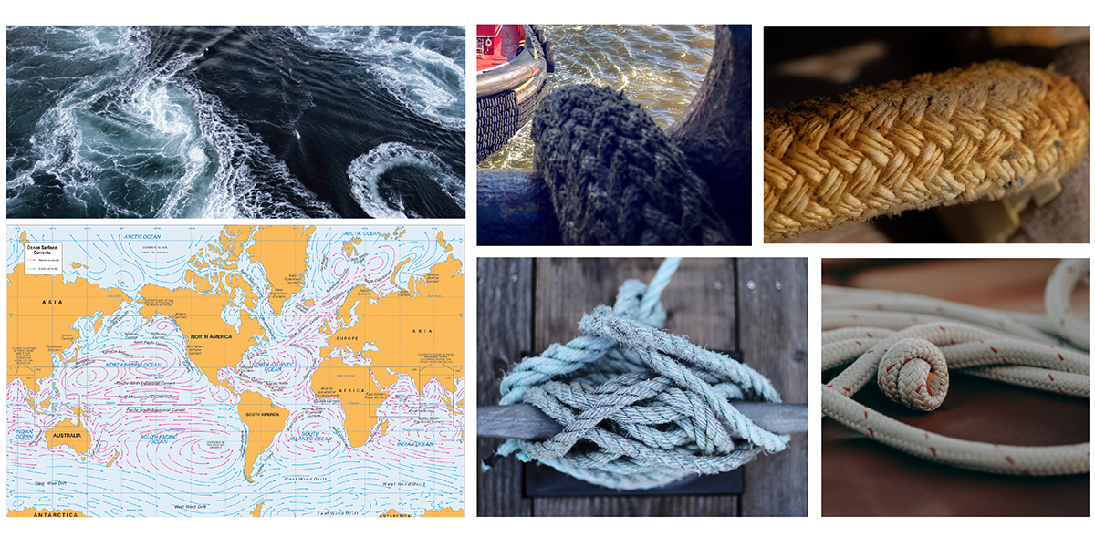
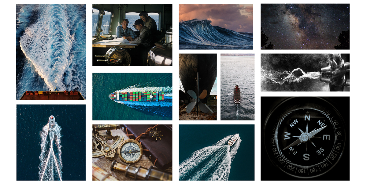
Words, icons and imagery can inspire a creative in so many ways. We looked at words inspired by their business, icons of water and logistics, fast and freindly aquatic animals, natical equipment and waves. All of this helps to inspire sketches.
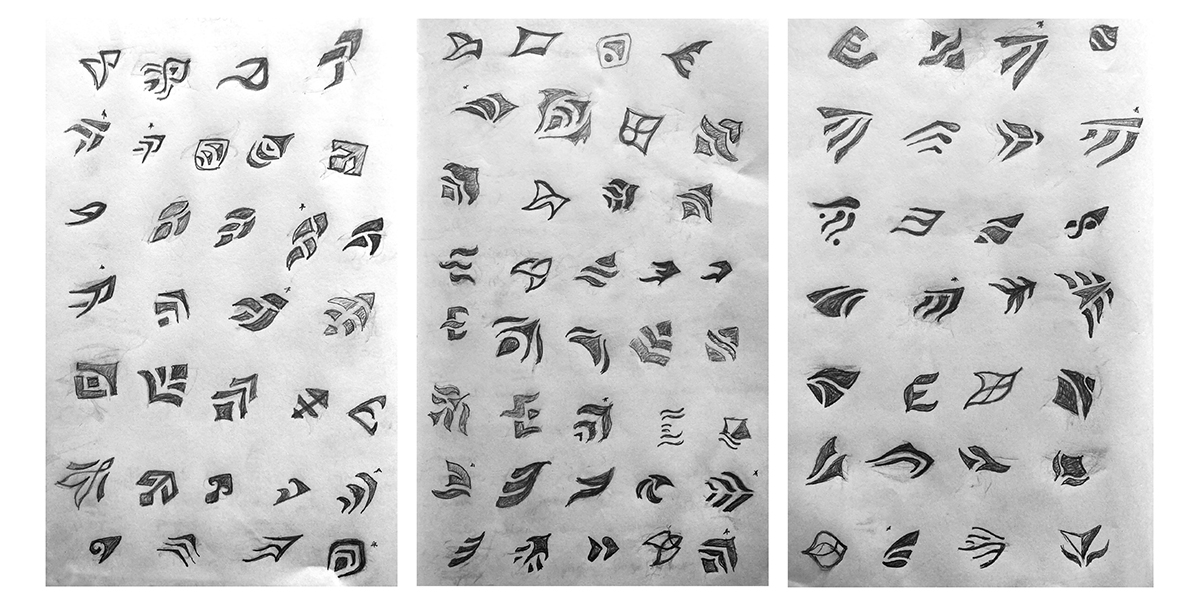
Round 1 sketches
Now to take everything we’ve discovered, researched and were inspired by to create custom sketches. The logo needed to convey knowledgable and capable, forward-thinking and modern with a nautical and marine vibe.
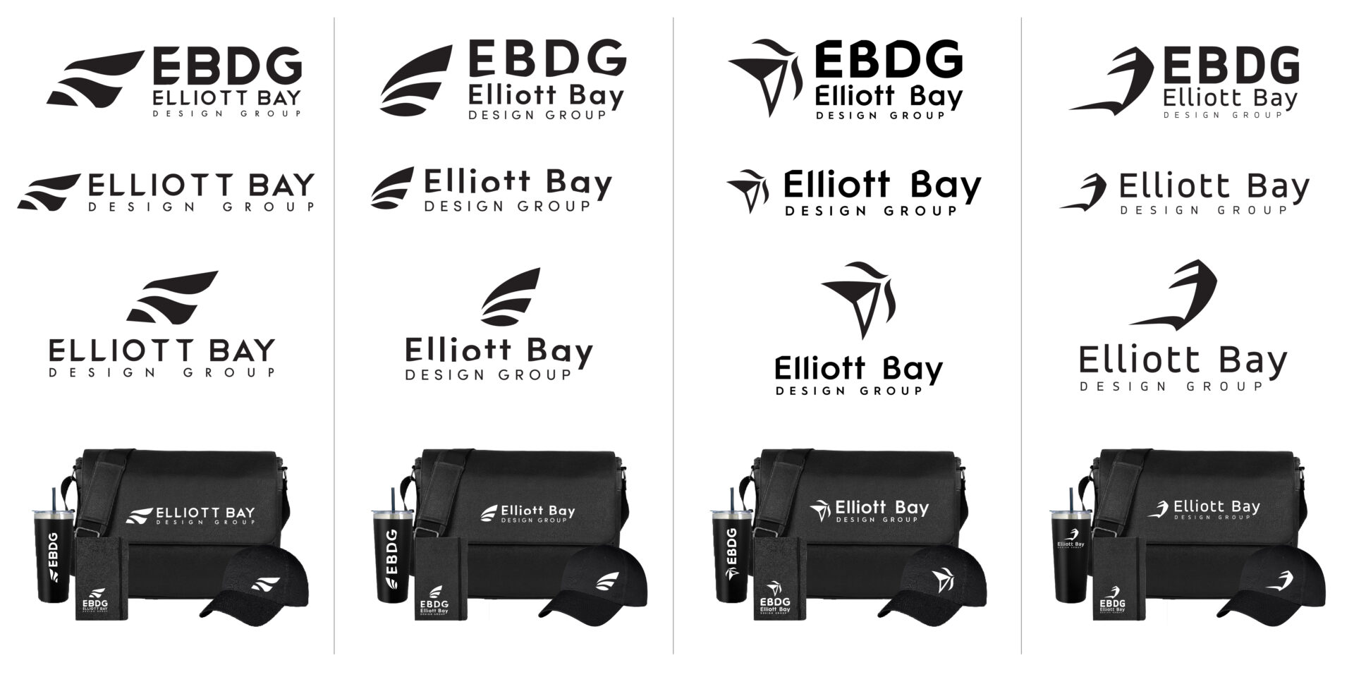
Round 2 Digital phase
This first design phase I keep as black and white so color doesn’t influence the selection. The client is given symbol and font options. To help them visualize their brand I apply their future logo to swag.
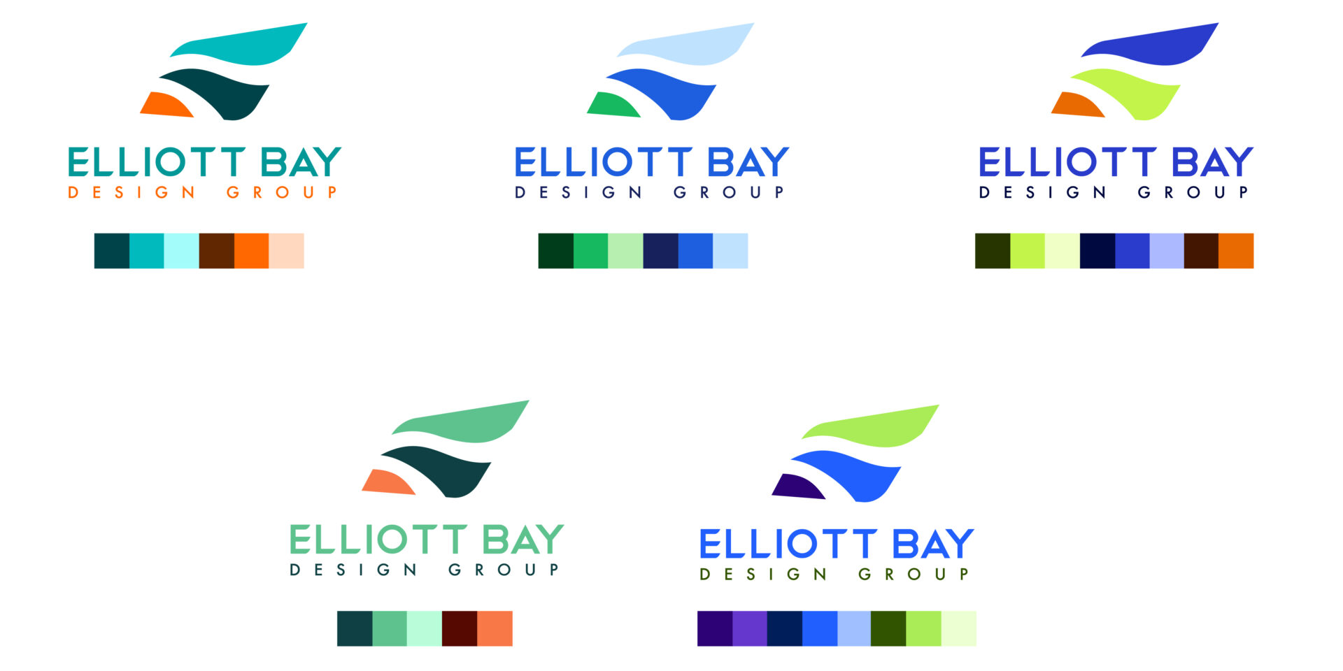
Round 3 Color Exploration
Next we talk about color theory, their personality, their demographic and geographical vibe. We explored lots of expected and untypical color palette options.
Final Solution
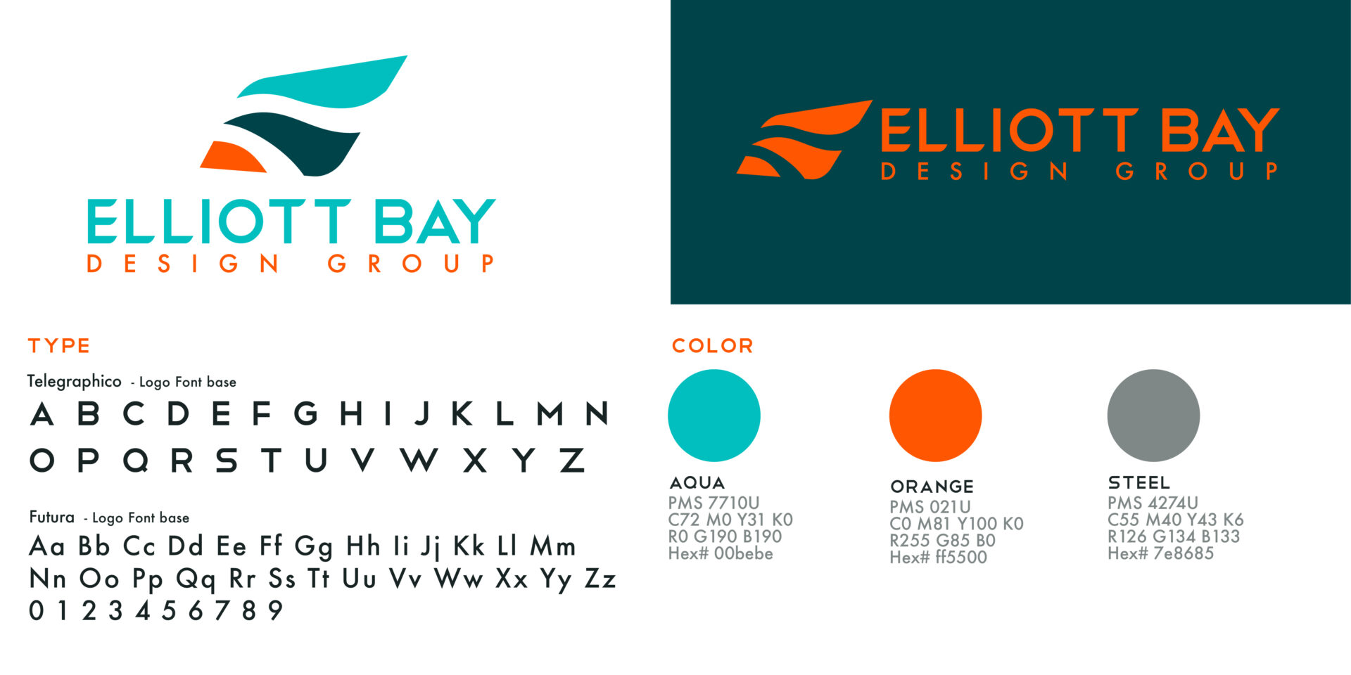
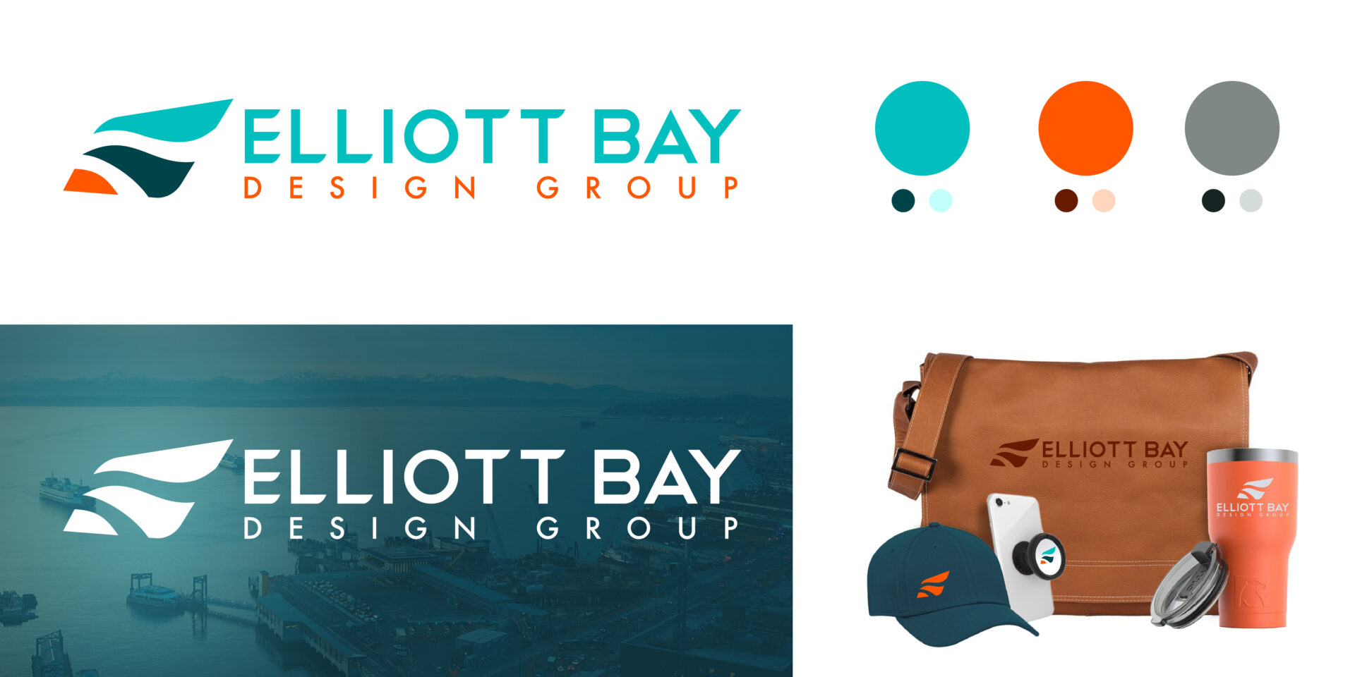
Together, we created a logo that is memorable. It illudes to a boat without having a vessel in the symbol. There is synergy between the symbol and wordmark by using the same curves throughout. We choose a solid geometric typeface that embodies engineering. The ocean teals are friendly but sophisticated and the punch of orange really brings this logo to life by saying they are bold and brilliant.
Business Stationary
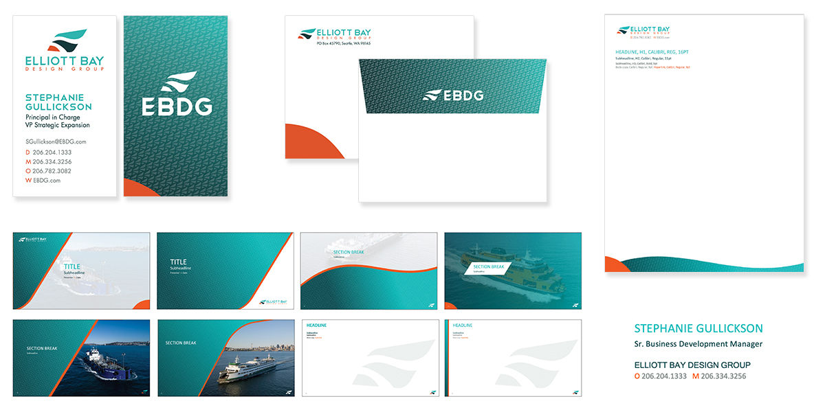
We looked at several branding options. The team felt most confident with this selection. Delivery included business cards, envelopes, letterheads, PowerPoint template and email signature.
Before & after
Their old logo served them well and their new logo will carry them onward.

