Brief
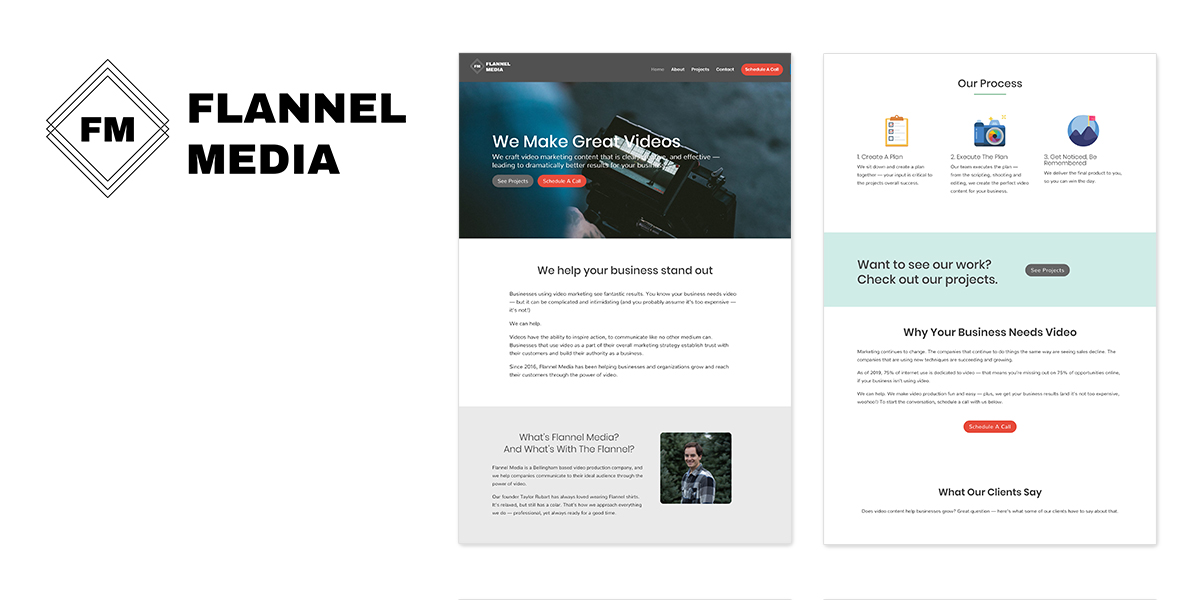
Flannel Media is a video production company that creates result driven videos. They had a logo that was “minimum viable” when they began business. After several years of a lack luster logo they approached me to refresh them. With their currently logo, it was unclear at-a-glance what they did.
They asked me to come onboard to redesign their logo, colors and font. They wanted something more modern and unique.
Original logo and website
Their original logo reminded me of an FM radio logo with the overlapping diamonds. The font was unoriginal, the symbol didn’t describe with they do and the colors were lacking luster.
Logo Activity
When I engage with a client I ask them discovery questions and participate in a logo activity. I ask them to find 5 logos they love and connect with from a business perspective and tell me why then I ask them the same for logos they dislike.
Competitive analysis
I looked up local and national competition to Flannel Media. I made branding observations, noticing color, tone and layout. This helps me understand the industry landscape and cherry pick things that are working well as well as what to avoid and get inspired.
Research
I took a moment to look at other popular video and photography logos. I wanted to make sure I didn’t copy anything for trademark infringement issues.
Inspiration
Time to get inspired and look at Pacific Northwest, plaid and videography elements.
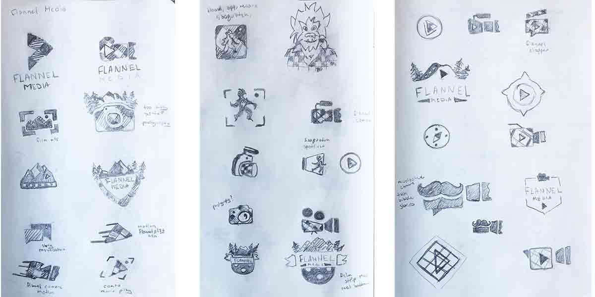
Round 1 sketches
Now to take everything I’ve discovered and was inspired by and hit the sketchbook. I do several sessions and sleep on the creations before I share them with the client.
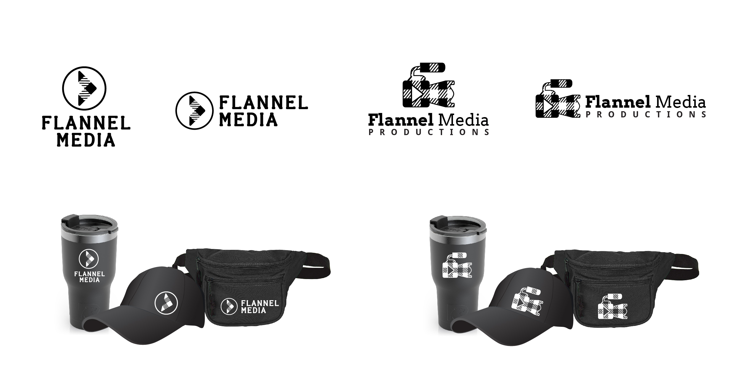
Round 2 Digital Phase 1
The client selected some sketches and items in my process to bring to the next phase. This first design phase I keep as black and white symbol and font options as to not influence their selection by color. To help them visualize their brand, I put their new logo on possible marketing items they might use.
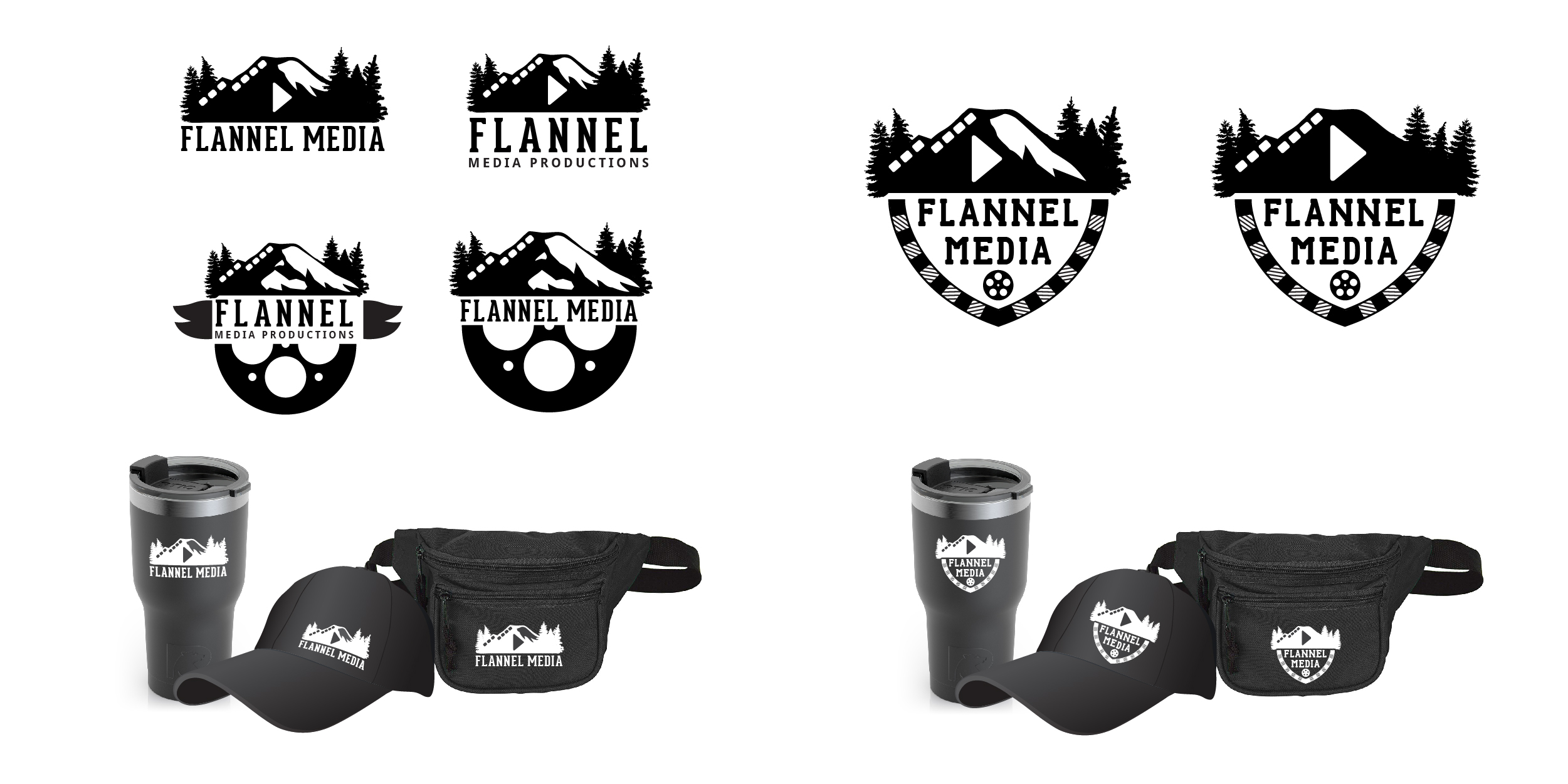
Round 2 Digital Phase 1
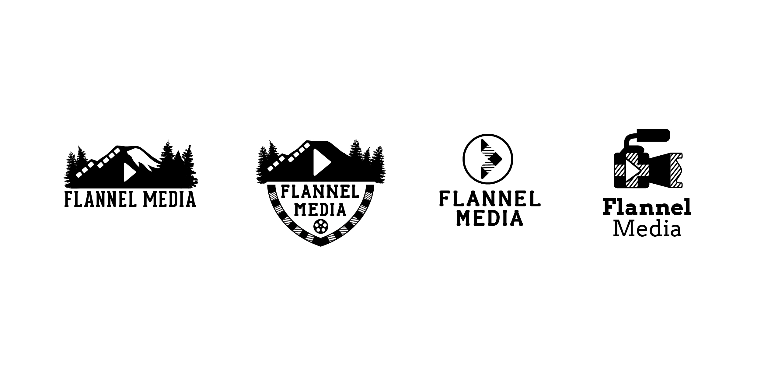
Logo line up
I made it hard on my client. These options all have their validity.
Round 3 color palette options
When picking colors, it’s good to think about your target demographic. Option 1 is inspired by the Pacific Northwest and option 2 is inspired by other large video companies.
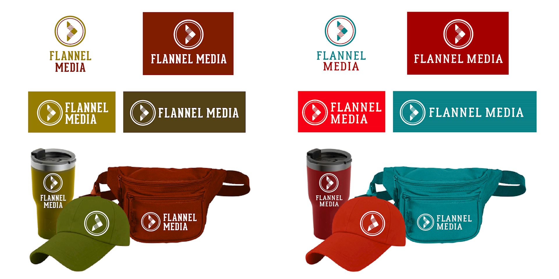
Round 3 color palette options
Option 3 is inspired by the forest, rivers and oceans and option 4 is a unique and memorable palette.
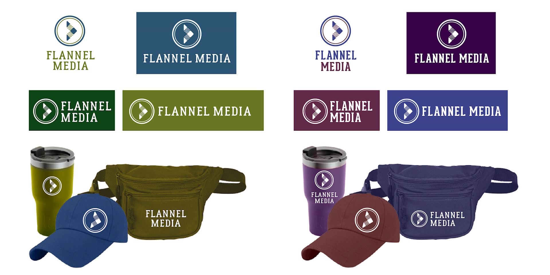
Color options
Again, making it hard on my client. All are great options.
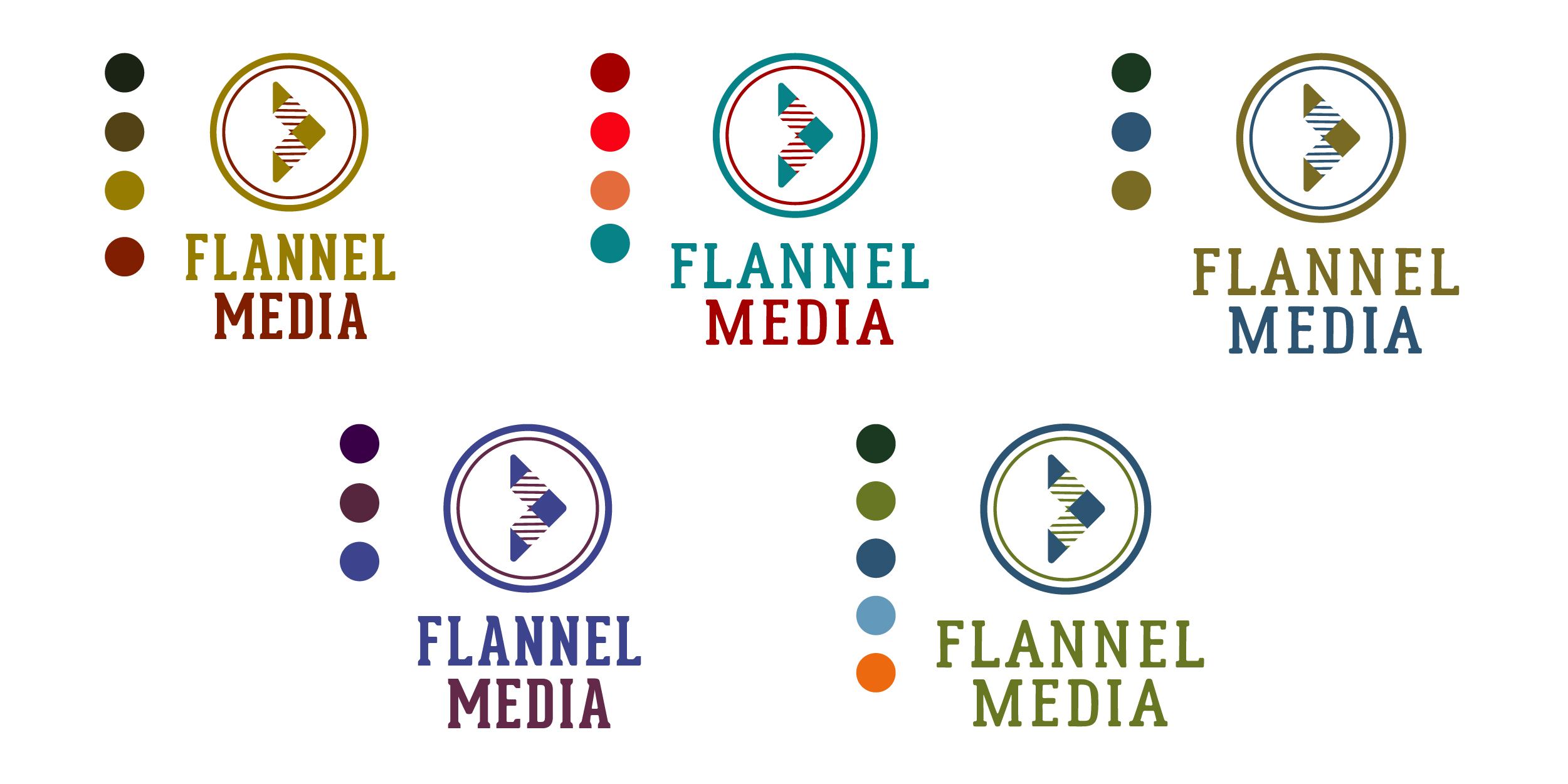
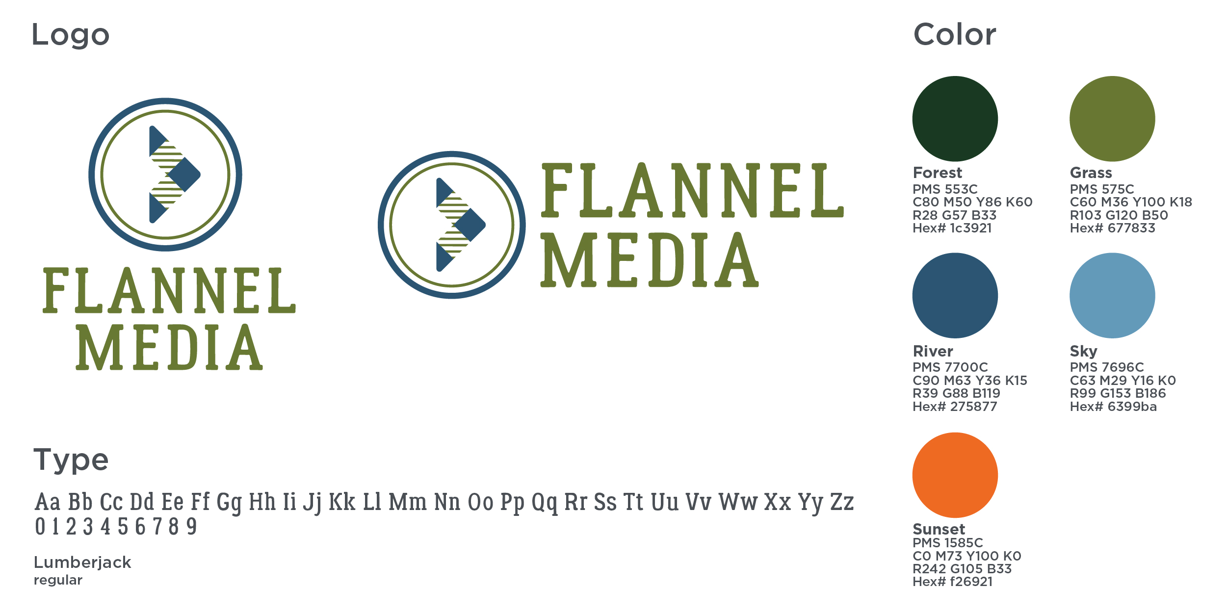
Final logo solution
I’m happy with the Pacific Northwest inspired color palette with a pop of sunset orange. I can’t wait to see this translated to their website and marketing collateral.
