Brief
Full Speed Ahead and Vision Tech sell world-class bike parts to OEM’s such as Cannondale and Redline as well as separately to shops and consumers. FSA Pro Shop came to me with a unique request of designing, building and marketing their new North American focused website with parameters from separate branding sites. My team needed to build a responsive Shopify e-commerce website integrating with NetSuite inventory and sales tools.
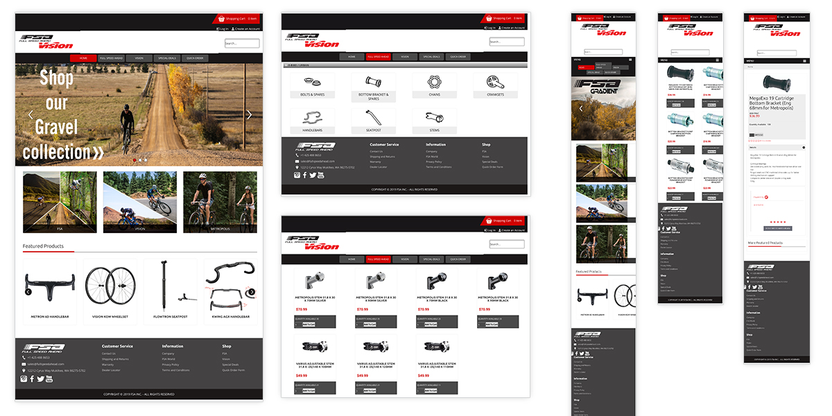
Current Pro Shop
FSA Pro Shop new they needed a new shopping experience. This website’s backend was hard to make edits, was unresponsive, had poor filter, navigation, search and menu functionality.
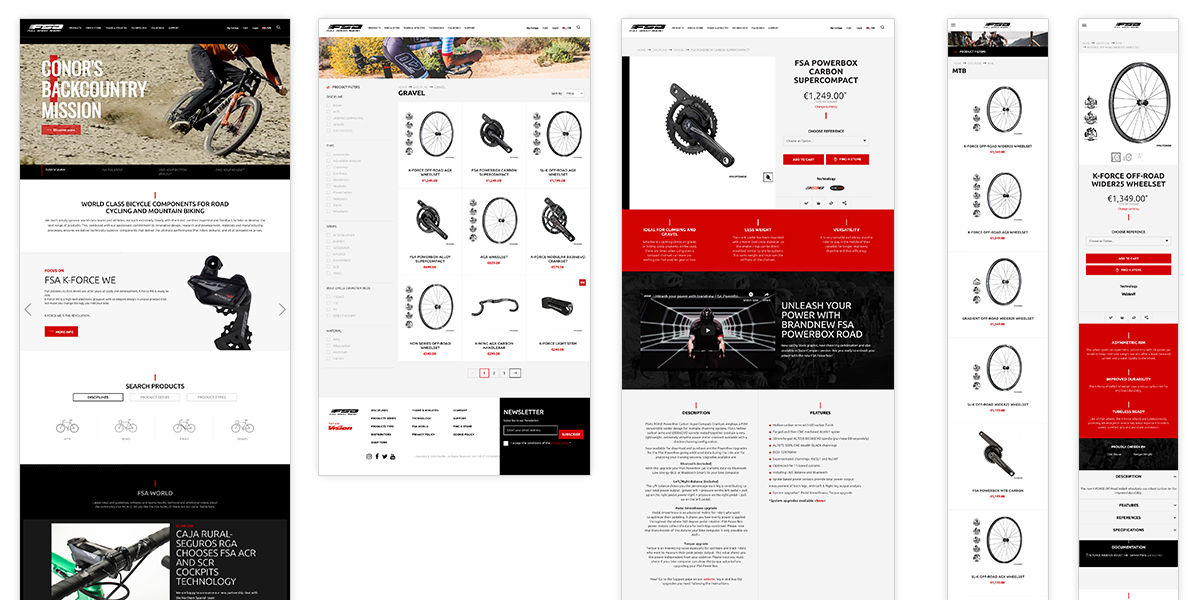
Full Speed Ahead Brand Website
To better understand this global brand I needed to understand the industry, goals, brand and parameters.
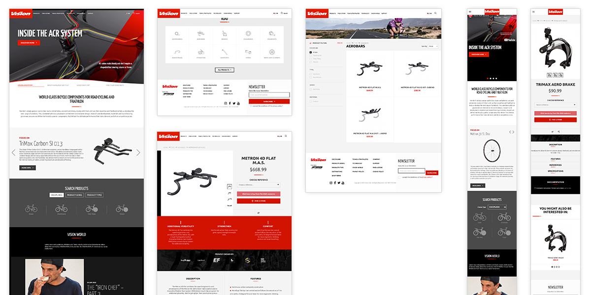
Vision Brand Website
I needed to understand the differences between the sister brands. Full Speed Ahead focuses on mountain, gravel, e-bike and road disciplines and Vision directs its attention to road, triathlon, time trials and track.
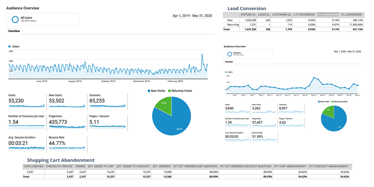
Website analytics
I needed a based line to compare this site to our new website.
Competition
I researched these brands from a design and messaging perspective. I checked out their websites for user flow, menu styles and category descriptions. I wanted to cherry-pick what was working for FSA Pro Shop’s new site.
Inspiration
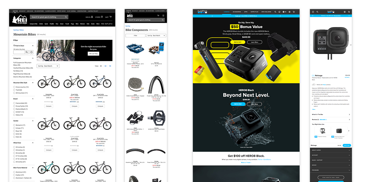
Next, I looked at some inspiration. I wanted to look at how a complex inventor system like REI handles their menu, tiles, filters and search. I wanted to see their category landing pages and product description pages (PDPs). Contrasty, I wanted to see how a video product brand like GoPro handled their sales flow.
Wireframe Concept 1
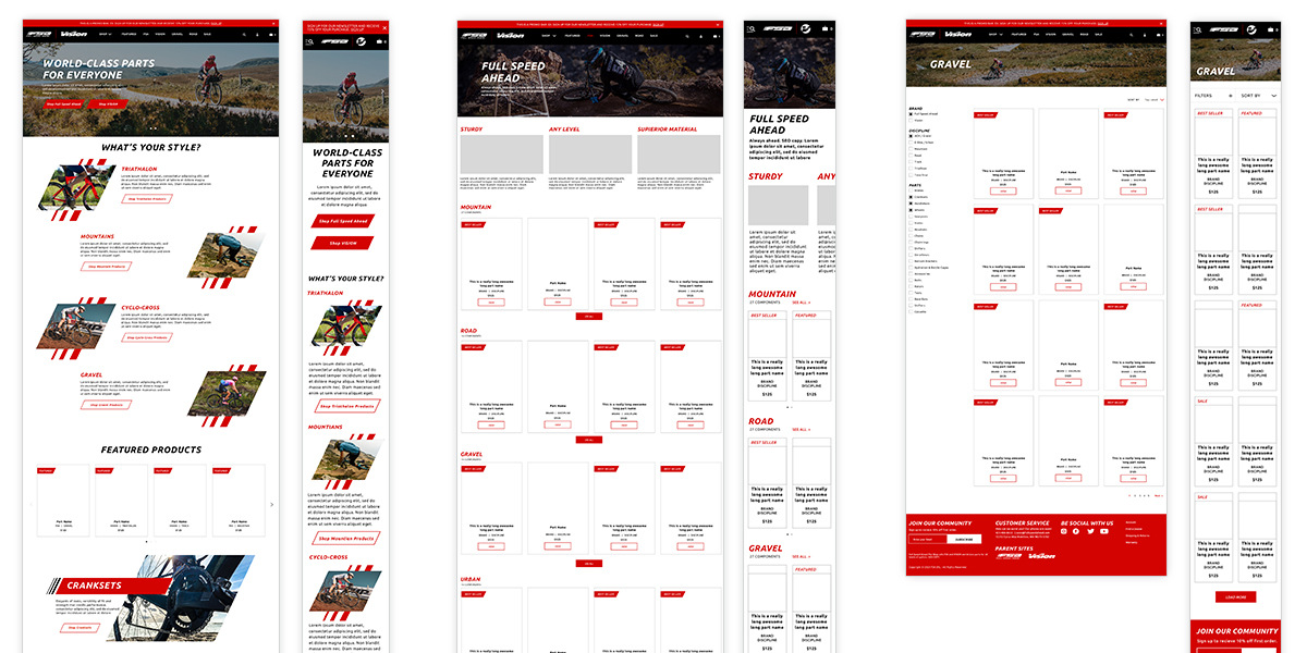
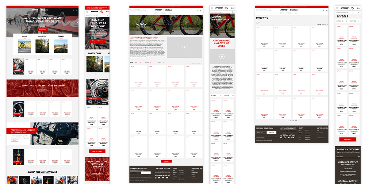
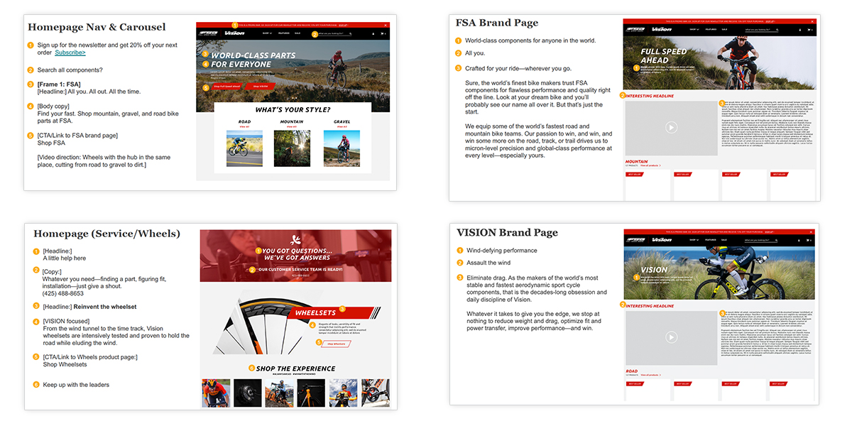
With our launch date in mind, I decided it would be best to combine the wireframe and design phases together for less rounds of review. I created high-fidelity wireframes with loose design elements to get the team to a solution faster.
Wireframe Concept 2
There was design elements, navigation, filter styles and subtle layout differences between these two concepts.
Website Design Delivery
After a few rounds of review, I delivered Sketch and InVisionApp files to the developer team, Helpful Human. The FSA Pro Shop team combined the two concepts to create an eye-catching, modern e-commerce website.
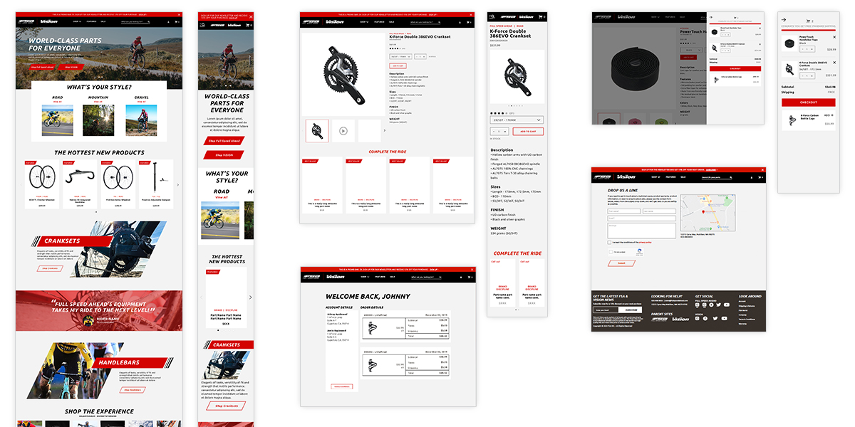
Image Content
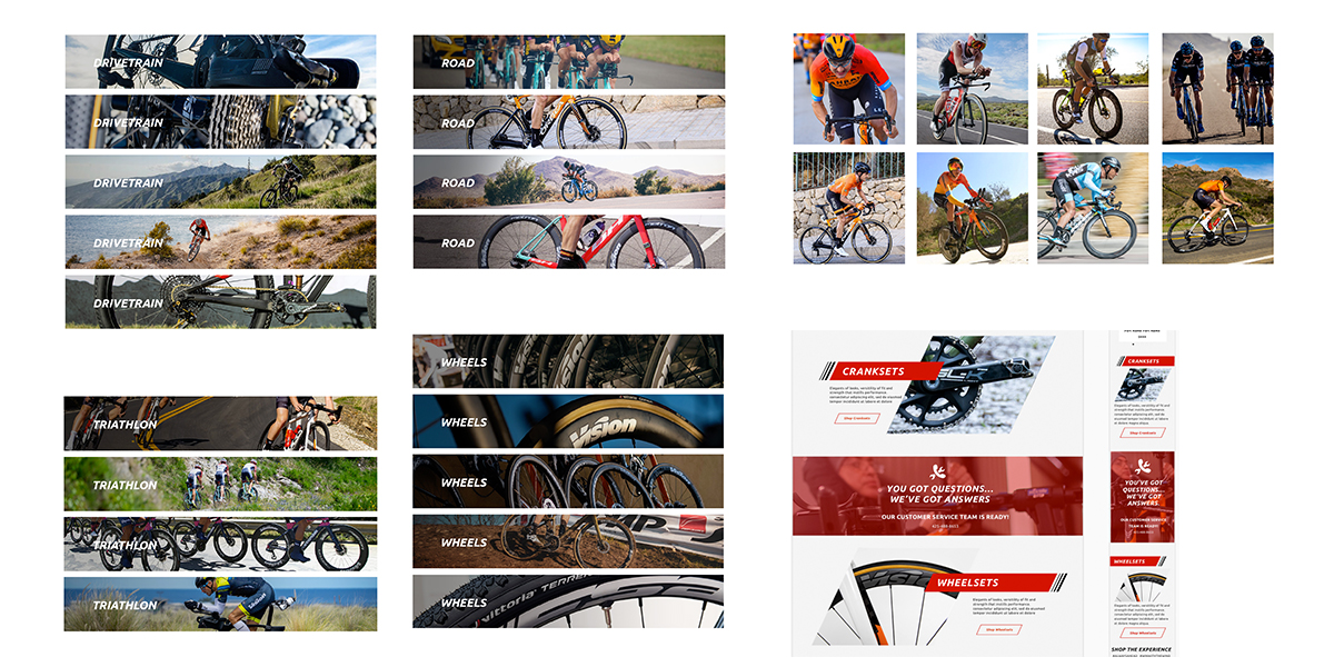
Now that the design was done; we needed to create the content. I enlisted the services of a strategic messaging specialist, a videographer and an advertising agency to support the marketing efforts. I worked with the FSA team to provide image options for all the banners of the site then produced and delivered them to the developing team.
Video Content
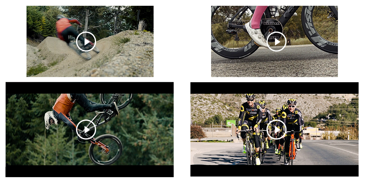
Video is king in sales. I knew I needed to enlist the services of Flannel Media to help with the task. Unfortunately, with covid we couldn’t shoot new footage but we were able to splice up existing footage to create FSA and Vision sizzle reels for their pages and short clips for the homepage. We were also able to use these video assets for emails and social media.
Copywriting Content
We went through several rounds of review to create the perfect North American tone and messaging for FSA Pro Shop’s B2B and B2C markets.
Marketing Strategy
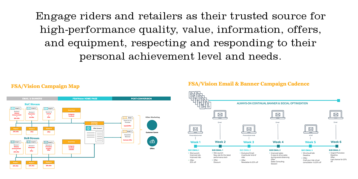
Get Paul Ford didn’t disappoint us with his sensational strategic messaging campaign map and cadence. From this targeted messaging we created email nurture streams, display ads and social media posts for B2B and B2C.
Email Nurture Streams
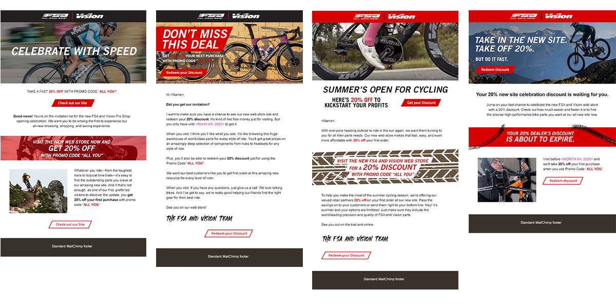
Paul and I worked together create beautiful emails that will convert. We did three emails for each of the demographics and recommended sending them on an every two-week cadence. I delivered copy and sliced email assets for their marketing manager to build in MailChimp.
Display ads
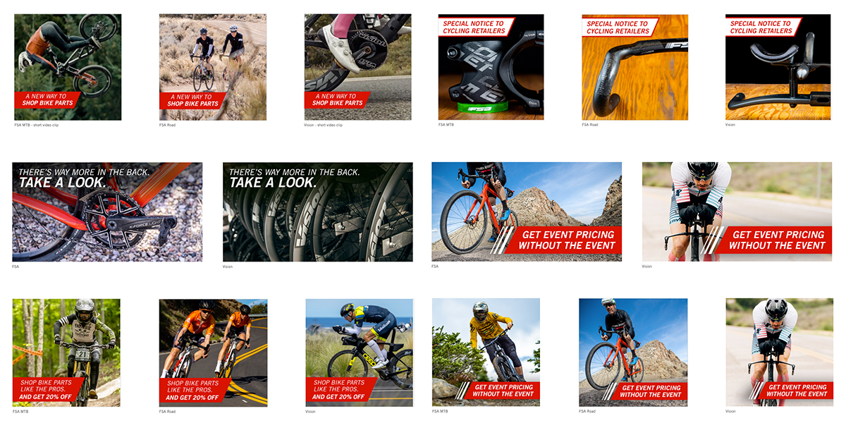
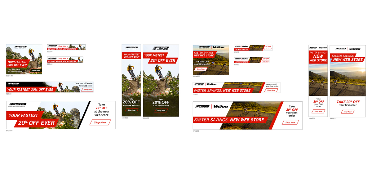
We enlisted the services of Thrive Advertising to help with programmatic retargeted ads. This is more successful than buying space on a few amount websites. We created ad sets for B2B and B2C.
Social Media
On the same cadence as the email nurture streams their social media channels will reflect similar messaging. The copywriter, Paul and I created Instagram and Facebook posts for their three channels. I worked with them to provide image and copy options.
