Brief
NetBlaze is an online and app digital marketing tool for small businesses. The tool helps owners with google rankings, website analysis, social media, reviews and email/text promotions. Their platform UI is intuitive which saves you time and has precise features that target your growing small business needs.
They asked me to come onboard to redesign their brand logo, colors, website, tradeshow material and social media. They wanted something more modern and unique.
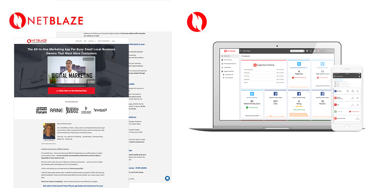
Original logo, website and app
My first job was to create a new logo with colors and fonts then apply the brand to their website. Their original website was a long scrolling page with tons of copy that read like an infomercial. It was my job to read the content and create a new flow keeping in mind the sales funnel process.
Logo Activity
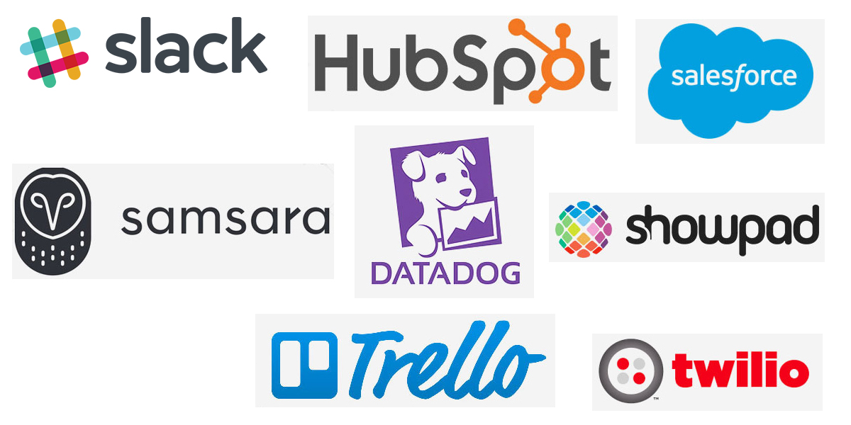
When I engage with a client I ask them discovery questions and participate in a logo activity. I ask them to find 5 logos they love and connect with from a business perspective and tell me why then I ask them the same for logos they dislike.
Color analysis
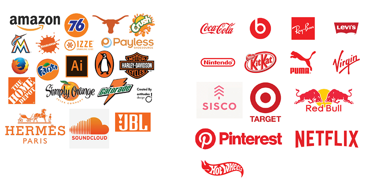
Color inspires human emotion. The word “blaze” lends itself to be orange and red. I wanted to see what other orange and red logos looked like for inspiration.
Competitive analysis
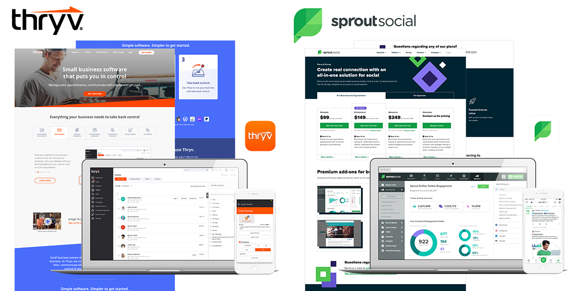
I looked at the top three competition that NetBlaze mentioned; Thryv, Sprout Social and Main Street Hub. I made branding, features and pricing observations for their website, app and social. This helps me understand the industry landscape and cherry pick things that are working well as well as what to avoid and get inspired.
Word game
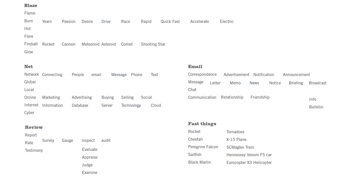
To help me think of visual elements for NetBlaze’s new symbol I look to the thesaurus. Playing a word game sometimes sparks great visuals.
Research
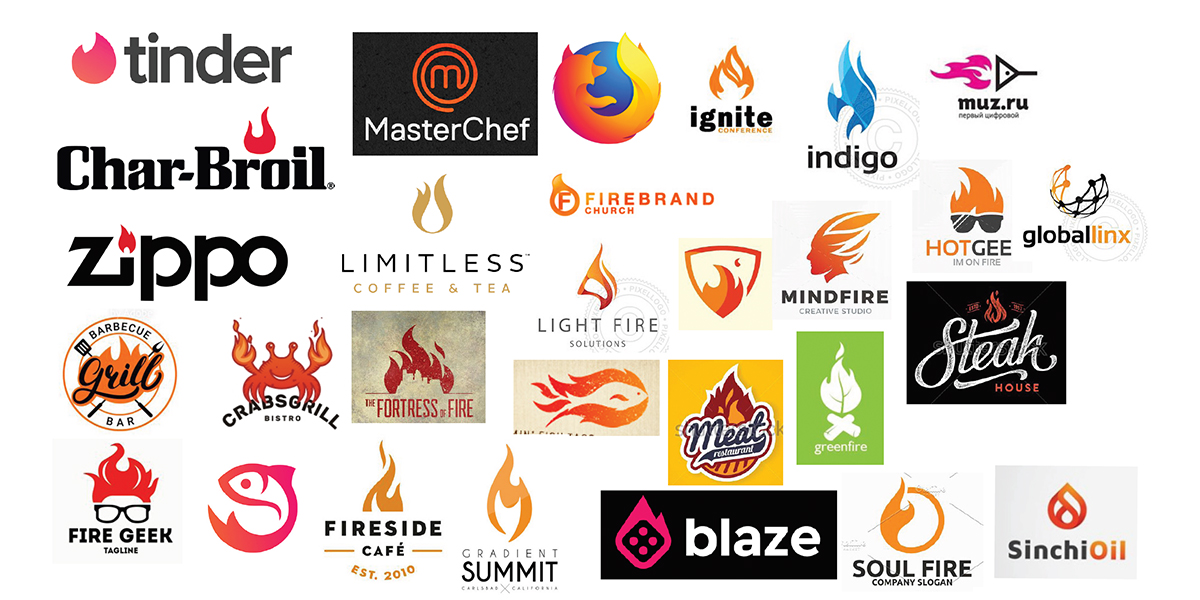
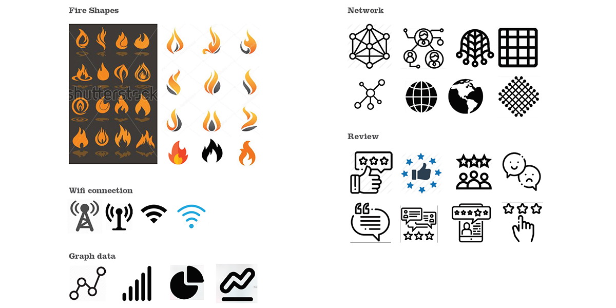
I took a moment to look at other popular fire logos. I wanted to make sure I didn’t copy anything for trademark infringement issues.
Inspiration
Time to get inspired and look at successful mobile apps and logos.
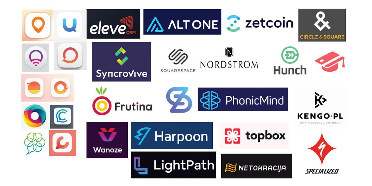
Putting it all together
I knew I needed to combine fire, connecting, network, review, graphs and charts icons into an interesting way.
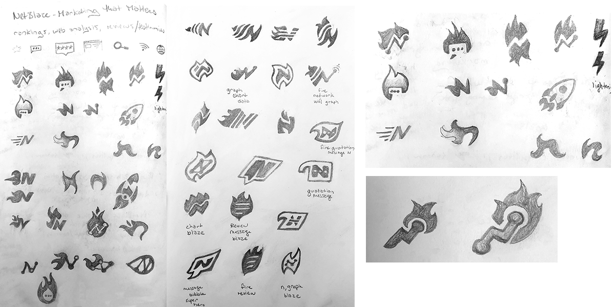
Round 1 sketches
Now to take everything I learned, discovered and was inspired by and hit the sketchbook.
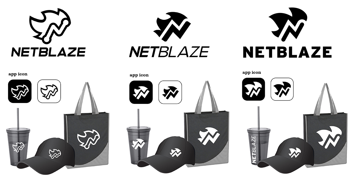
Round 2 Digital phase
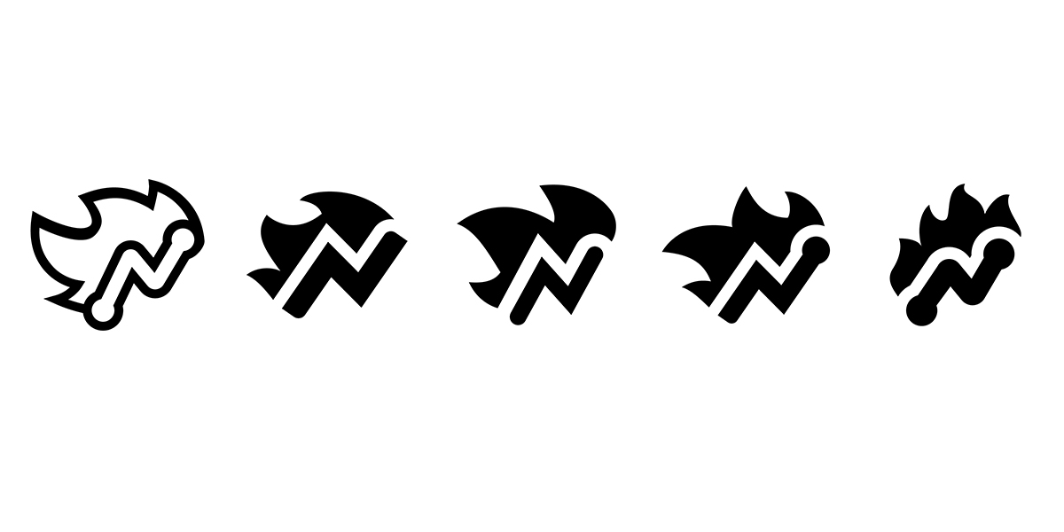
The client selected some sketches and items in my process to bring to the next phase. This first design phase I keep as black and white so color doesn’t influence the selection. The client is given symbol and font options. To help them visualize their brand, I applied it to an app and marketing collateral.
Symbol line up
I try to make it hard for my clients.
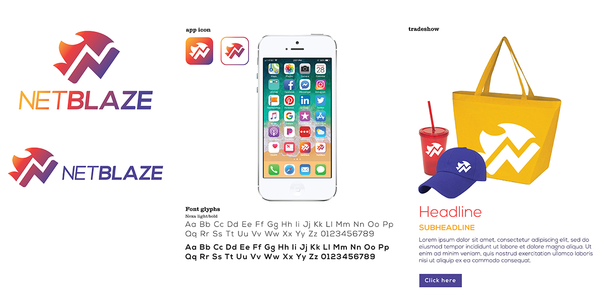
Round 3 color option 1
When picking colors, it’s good to think about your target demographic. This color combo is yellow, red and purple. I chose purple because of the hot burning ember part of a flame.
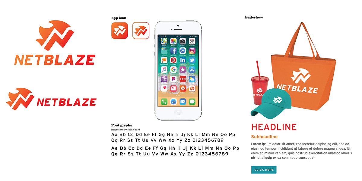
Round 3 color option 2
Orange, Red and teal. Teal makes a great contrasting color for CTAs.
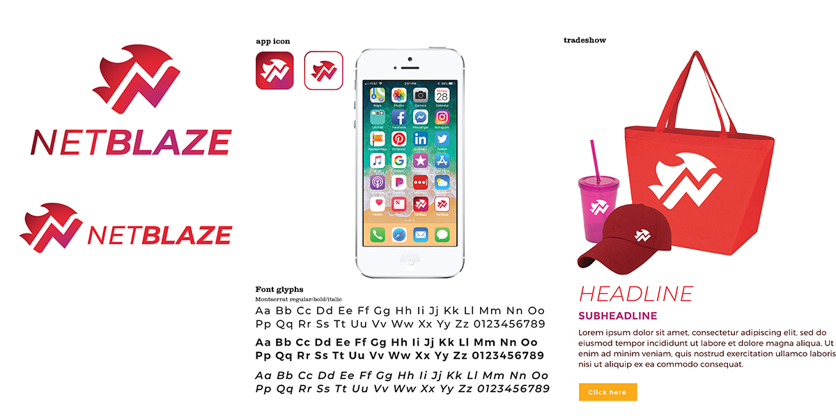
Round 3 color option 3
Fuschia, red and maroon. This is slightly more female focused in color. But the red and maroon are typically masculine.
Round 3 color option 4
Red, orange and blue. Red and orange are expected with the word blaze. The blue adds a nice highlight color.
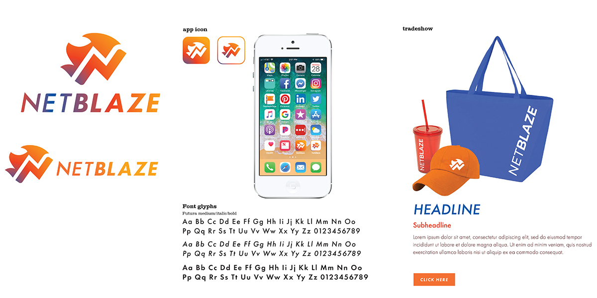
Color options
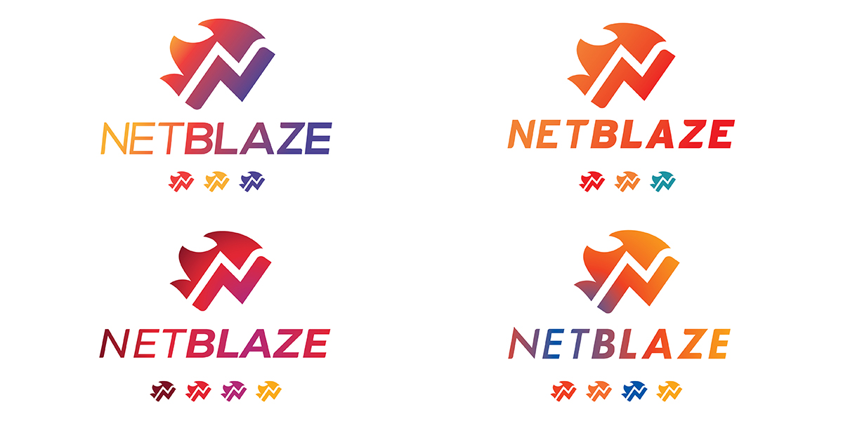
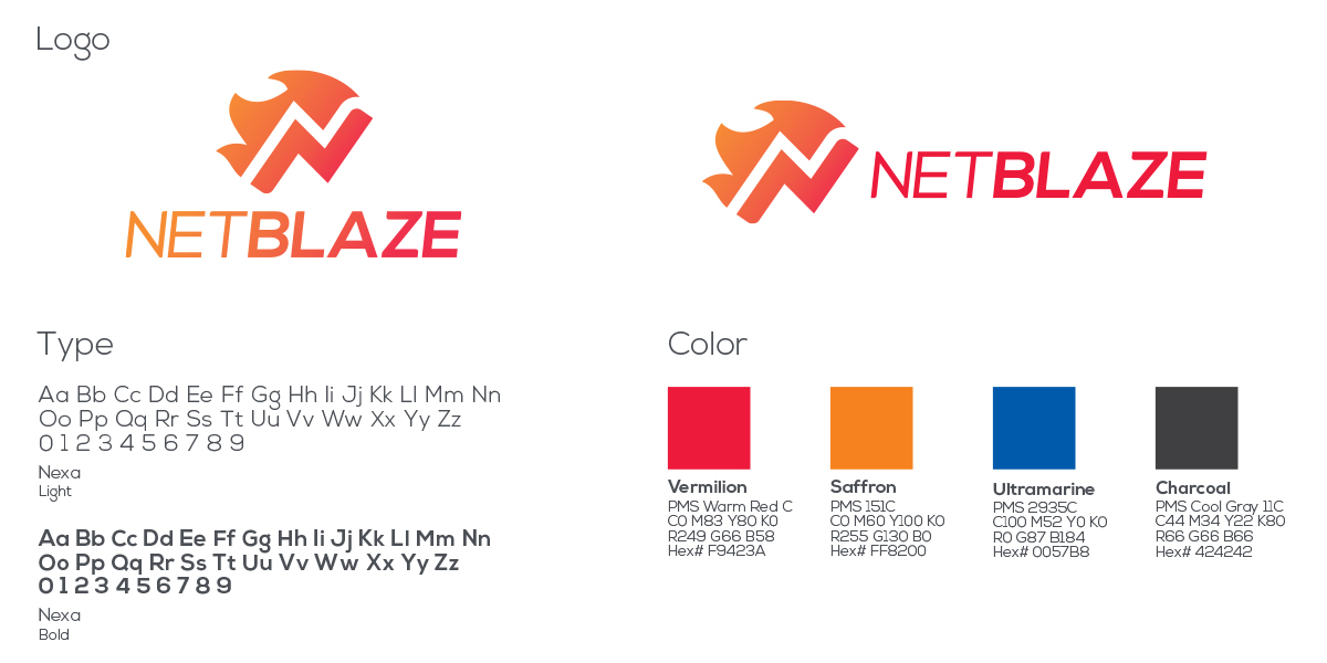
Final logo solution
I’m happy with the shade of red they chose with the orange and blue. This is a nice neutral color palette.
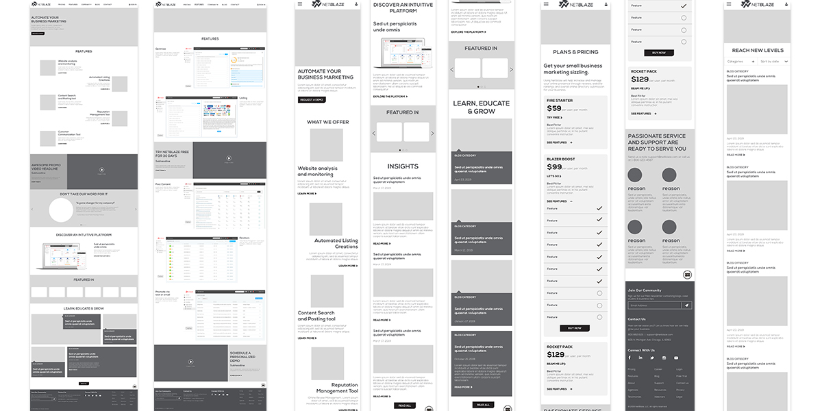
Website wireframes
Next was taking the long scrolling website and divide into tasty chunks. I created the flow and navigation from their site map.
What business problem we solve
Features we have
Video story
What others are saying testimonials
Check out the UI
Featured in magazines
Blog
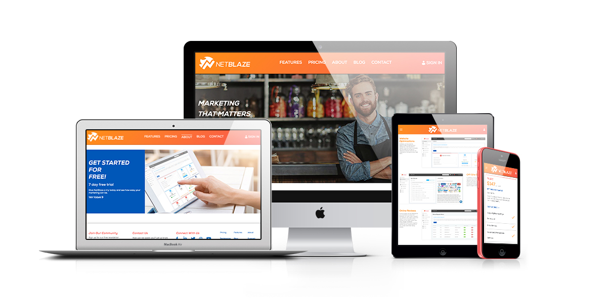
Website design
Once the wireframes were approved I applied their new brand to the mix providing content blocks as well as icon and image options. Check out their responsive site!
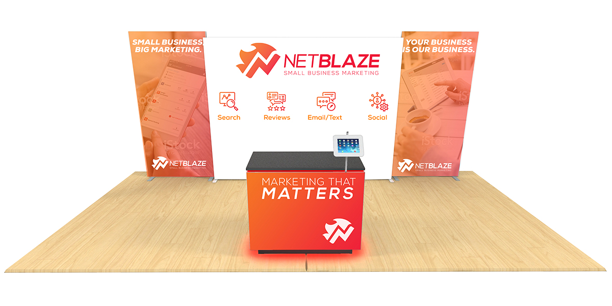
Tradeshow booth
Now equipped with a new brand they wanted to take their show on the road announcing it. Awesome product and brand!
Marketing collateral
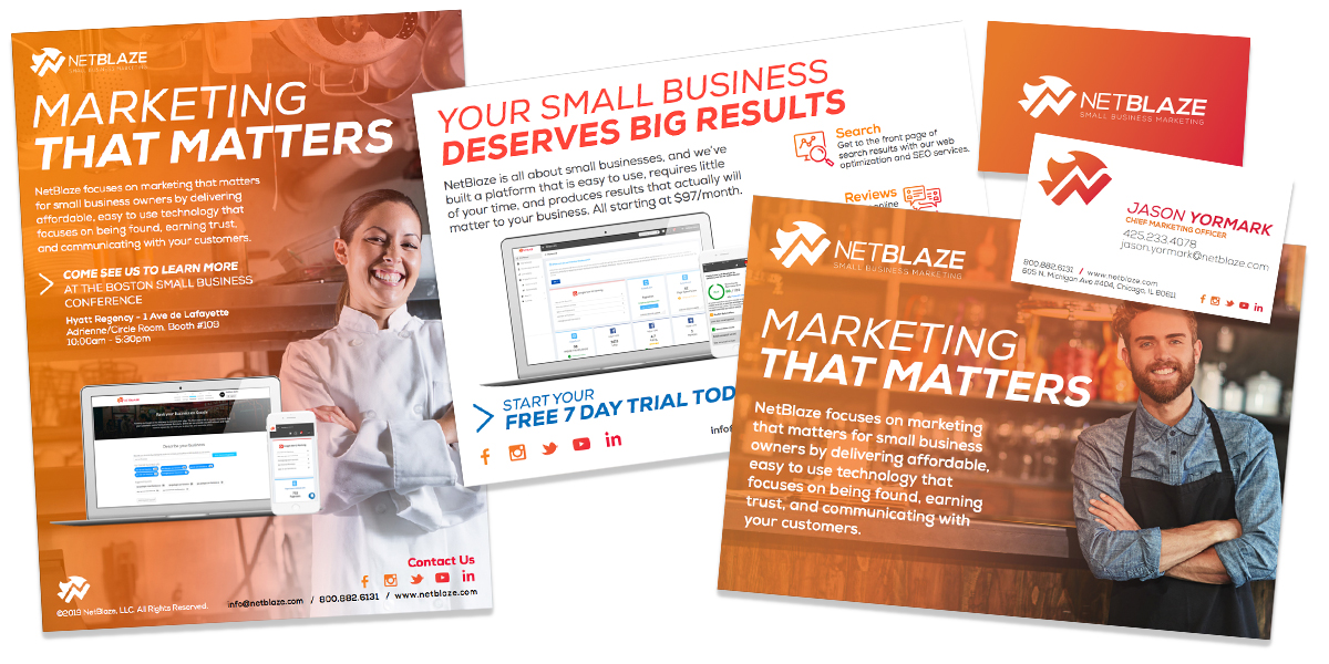
Then taking it and applying it to other collateral such as magazine ads, trade show hand out, social media banners and business cards. Check out their facebook, twitter and instagram.
