Brief
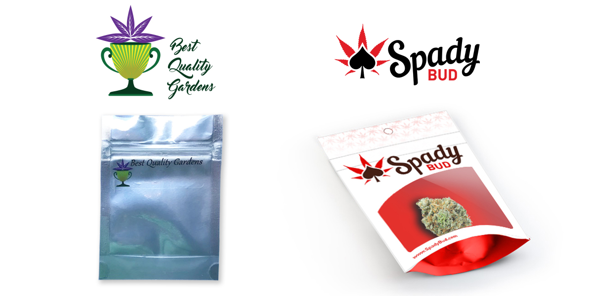
Best Quality Gardens is a company that cultivates and produces premium cannabis since 2016. They sell flower, extracts and joints. Based on their consumers they knew they needed to update their name and rebrand themselves after hitting the market. After much consideration and redirection we went with the DBA of SpadyBud. Together we created a custom logo and packaging.
Before & After
The current name Best Quality Gardens, logo and packaging was not hitting it off with stores, budtenders and consumers. They knew they needed to have a catchier name and more modern logo to gain support from their target audience.
Logo activity
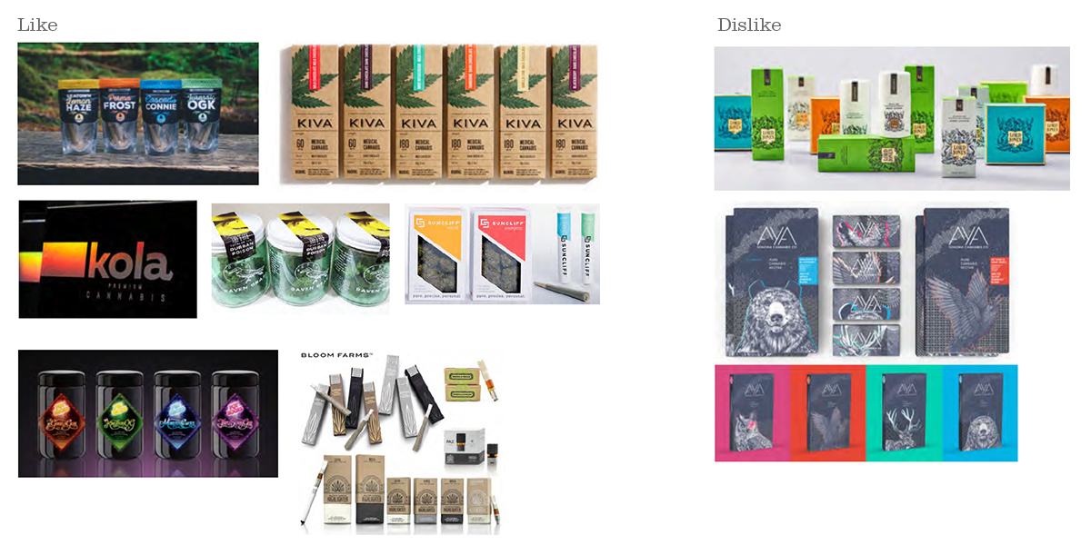
After getting to know a little bit about their story, I asked them to find logos and packaging they liked and disliked. This is always a good discovery for clients and for me.
Recon
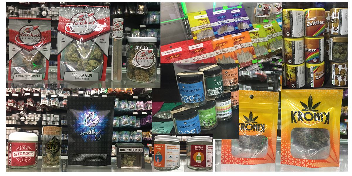
In our consultation I made it very clear I do not use cannabis products but understand branding and marketing. As with any new client and project, I needed to acquaint myself with the industry. I went to several local bud shops in the area. I asked many questions of the bud tenders and took lots of photos.
Research
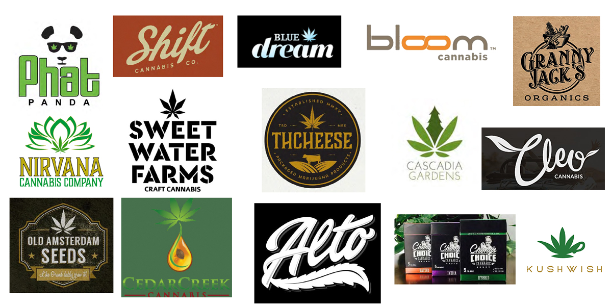
Next, I looked at other brands in Washington and nationwide that are popular or interesting to look at.
Inspiration
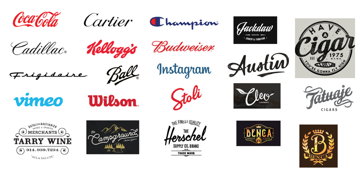
Based on our initial conversations with the owners, I felt compelled to provide a script vintage logo but wanted to provide the client with my inspiration and other classic examples.
Ace of Spady
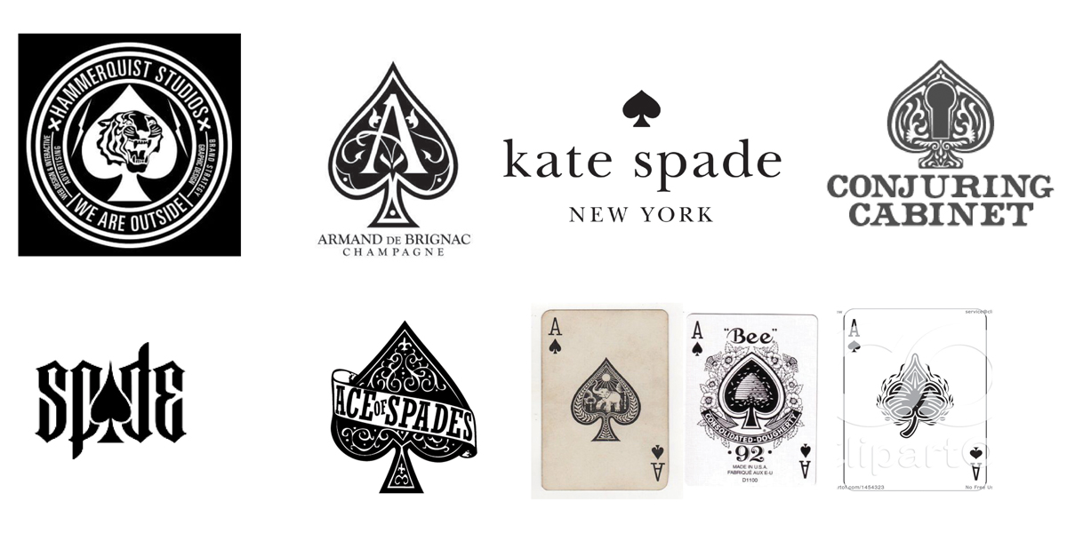
Initially, the owners went with the name Ace of Spady. In namesake of their master grower Mike Spady. There was a fun thought with the idea of playing cards and suits and how that could be a fun marketing visual.
Alcohol industry
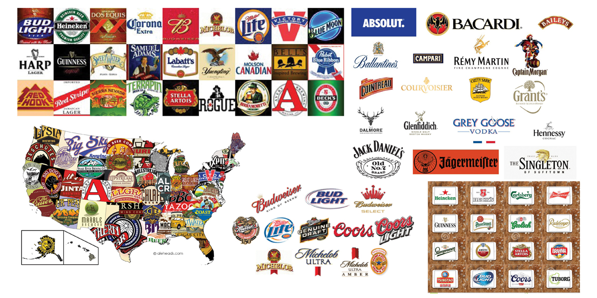
Next I looked for inspiration to the other “sinful” industries. Many alcohol logos and brands are beautiful and unique.
Cigarette and cigar industries
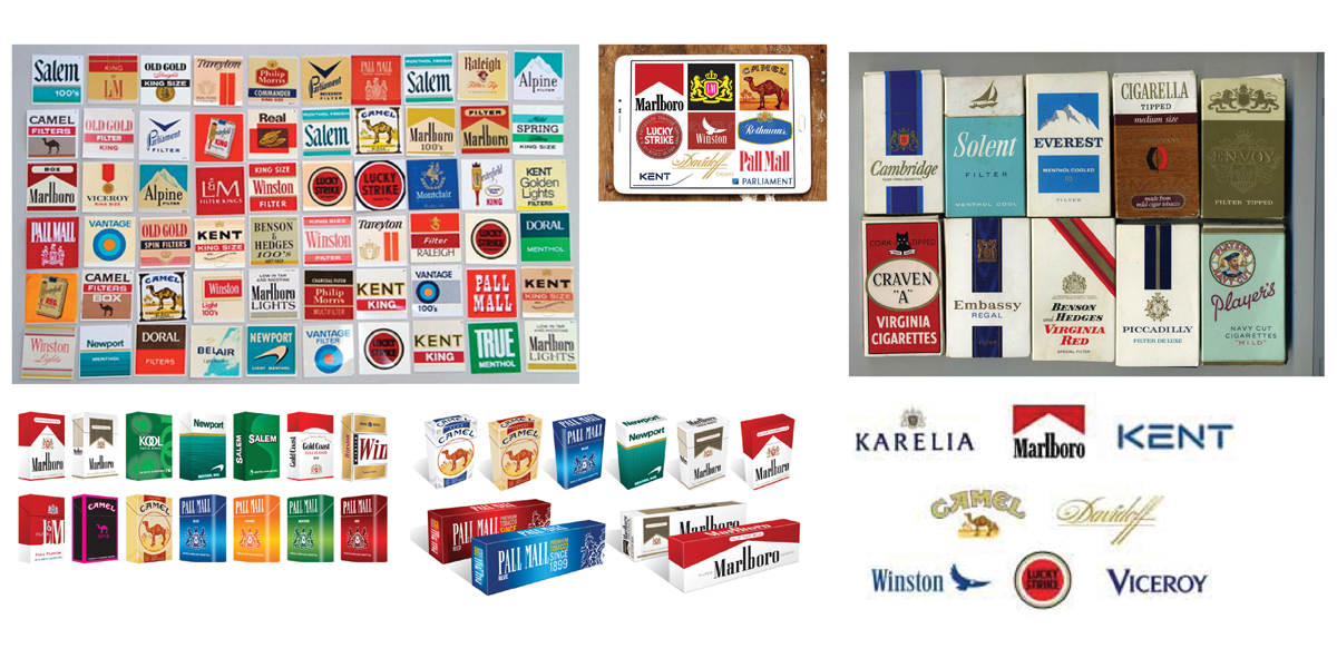
Finally, I looked to the other smoking industries. Many are old brands. If I was going to create a vingate feeling logo, I wanted to look at how these brand treated their symbol, wordmark and colors.
Sketches
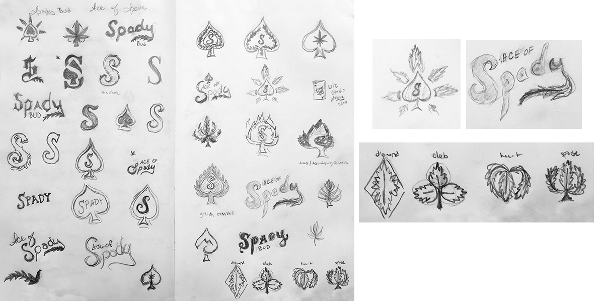
With all this research, recon and inspiration I was finally ready to sit down and sketch out some ideas.
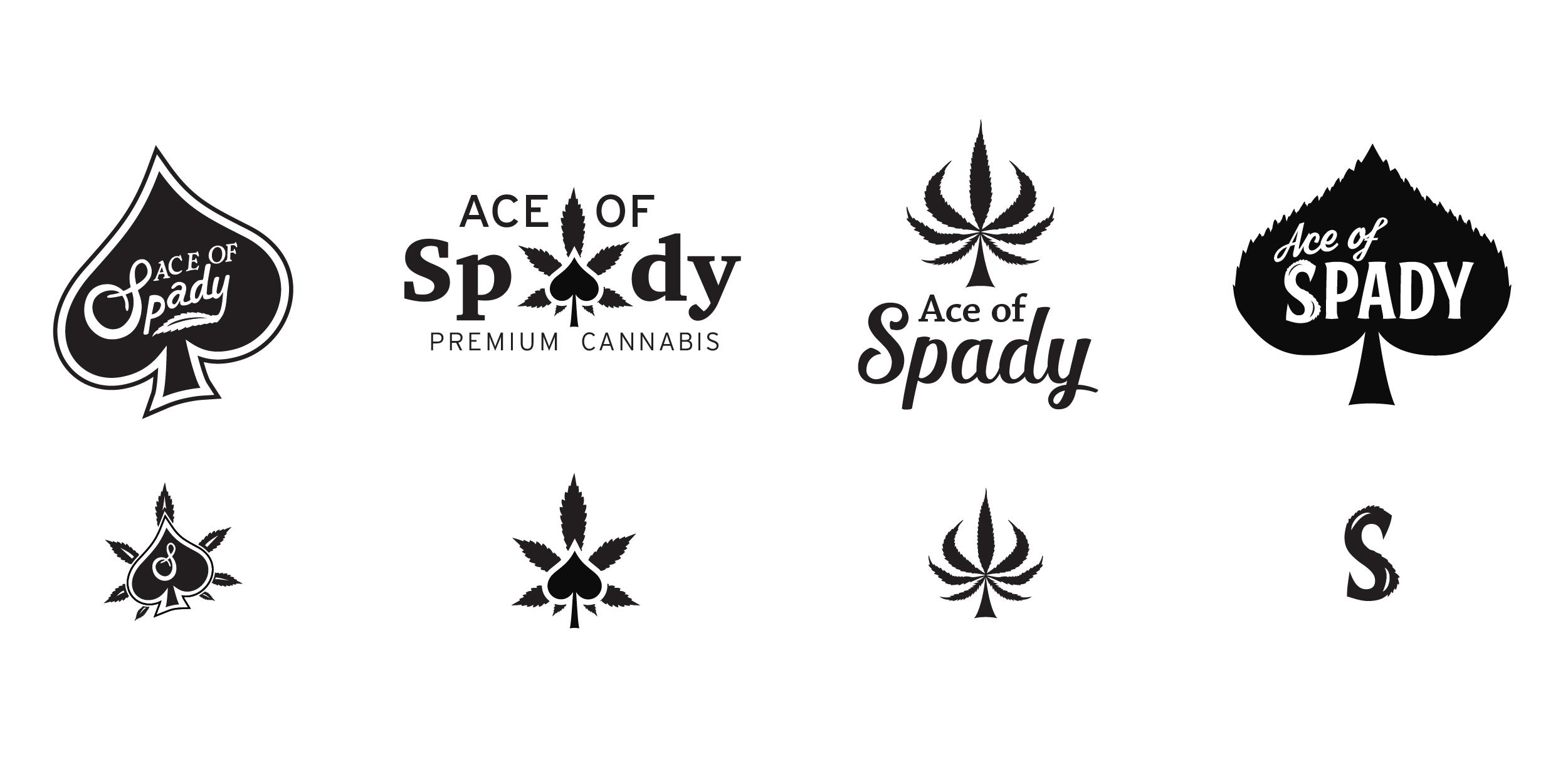
Digital phase 1 – Ace of Spady
Based on feedback and selections in the research, inspiration and sketches, I created digital black and white options for the client to choose from. I also shared unselected fonts.
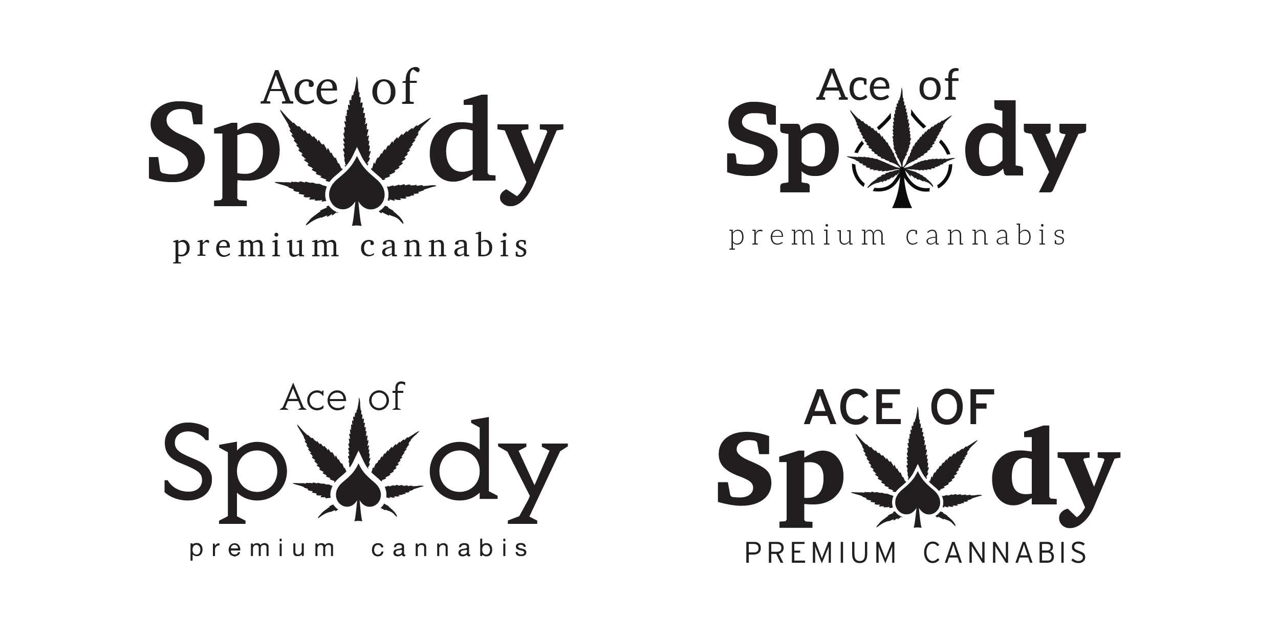
Digital phase 2 – font exploration
Based on the selection and fonts provided in digital phase 1, BQG decided they wanted to see a few more font and symbol options.
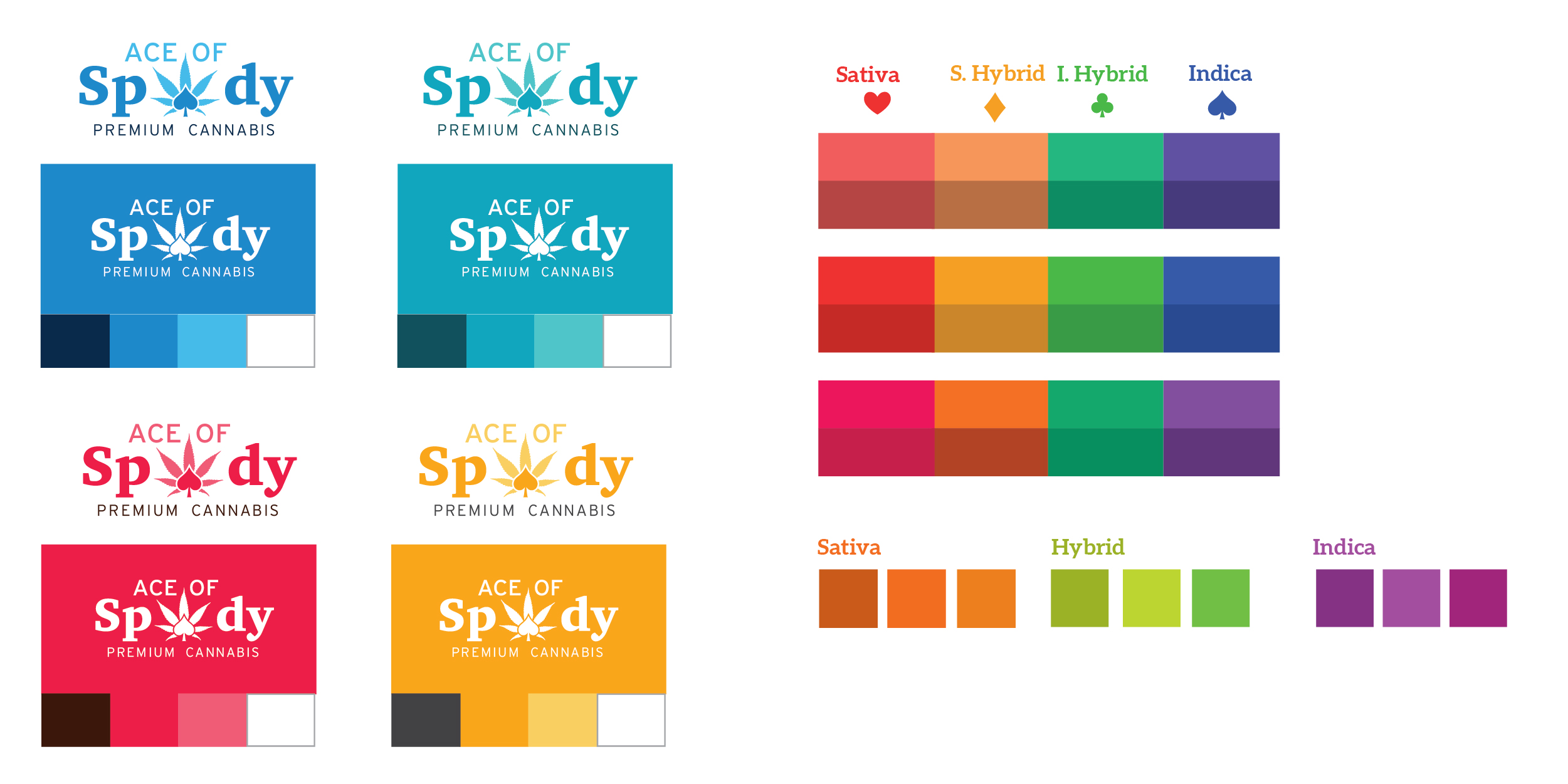
Digital phase 3 – color
Now that the client selected the black and white logo option, it was time to look at color. They wanted bright options so they logo and packaging would “pop” off the shelf and grab consumers attention.
Digital phase 4 – Redirect
After sitting with the name and sharing it with partners, Best Quality Gardens ultimately decided to change the name we had been working with but keep many of the elements.
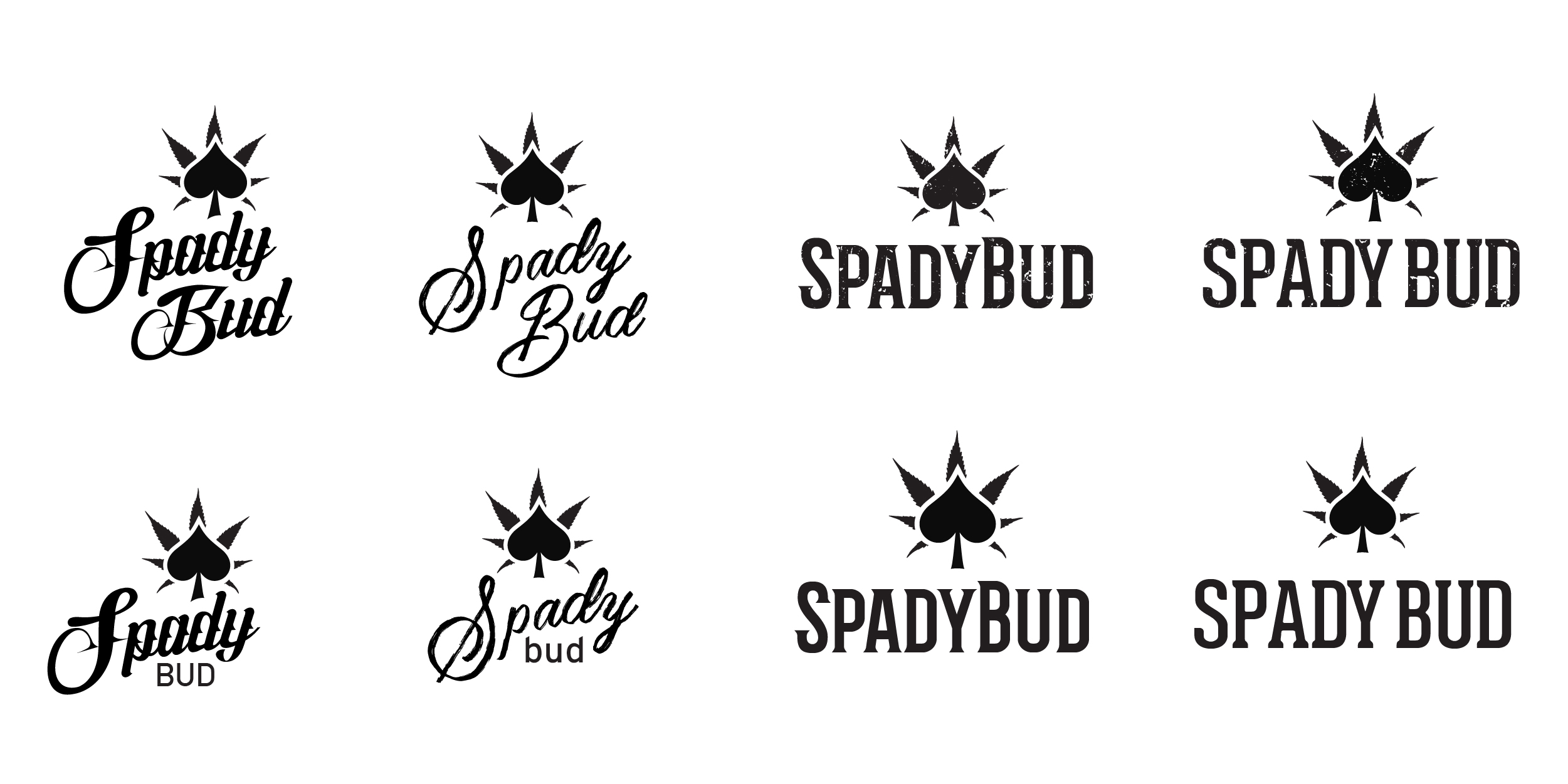
Digital phase 5 – Script logo
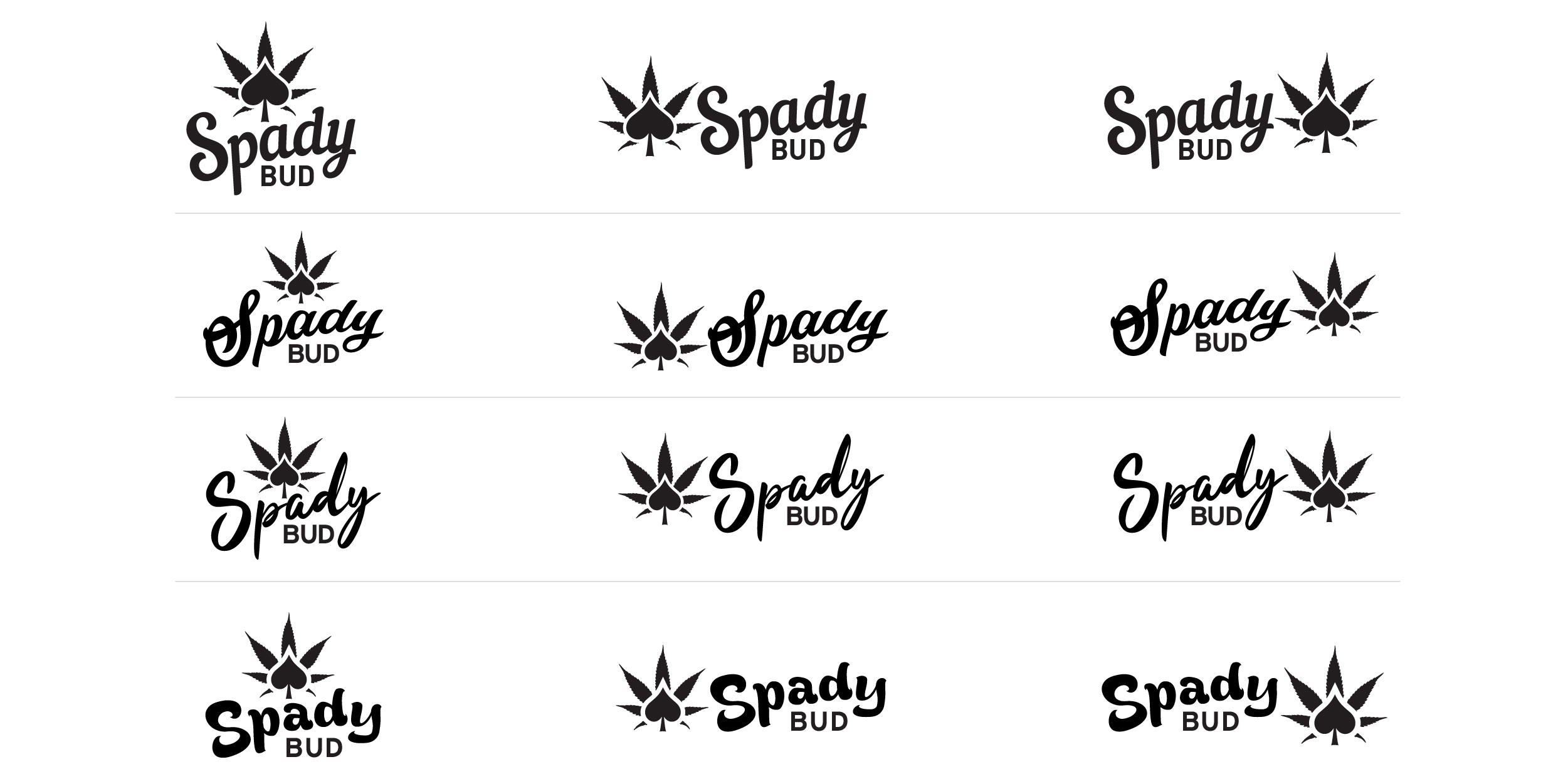
The owners decided it was best to go with a script options without the distress look. They also wanted to look at many variations of the spade to cannabis leaf ratio sizing and symbol to wordmark layout.
Final solution
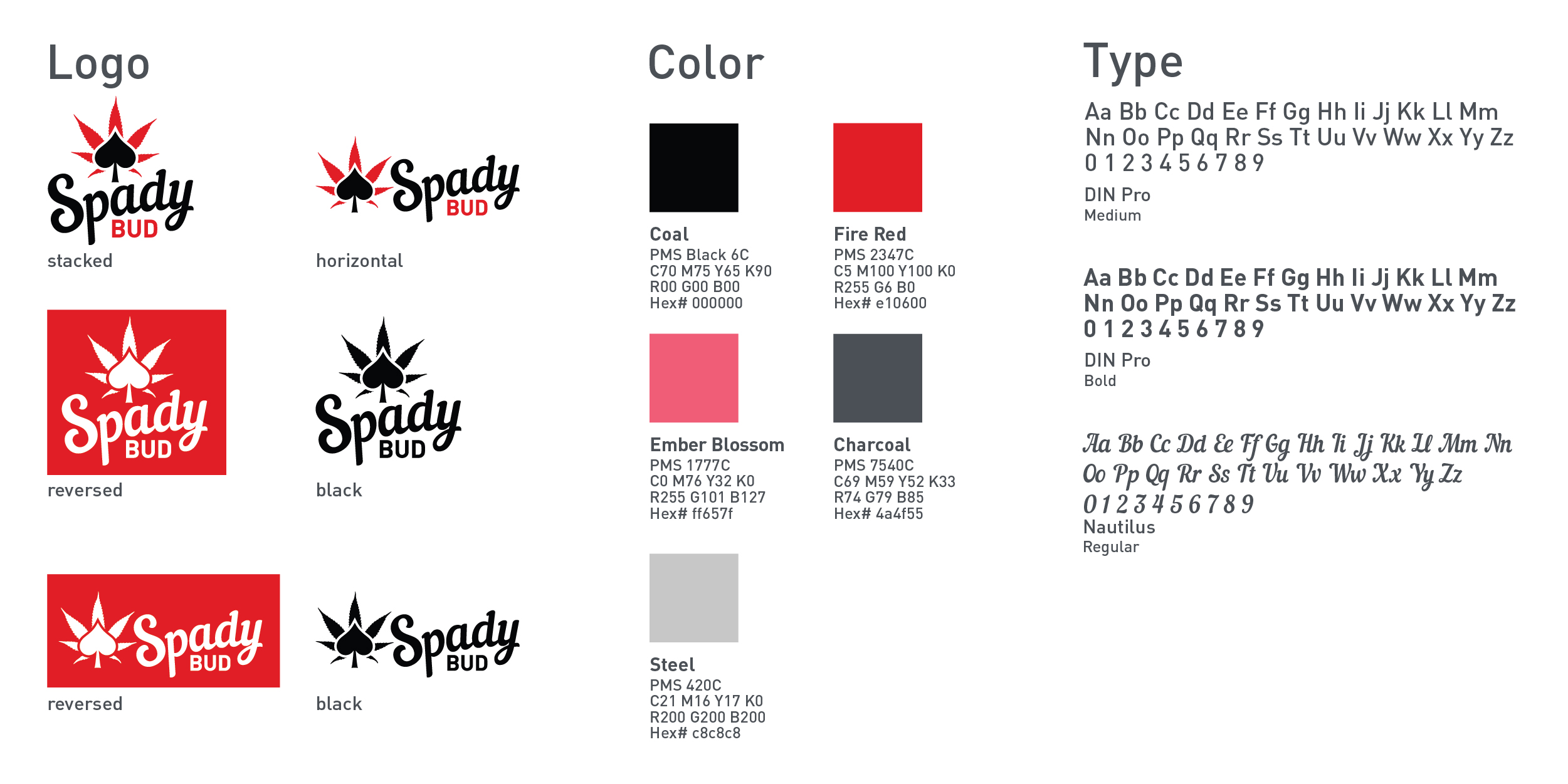
After much deliberation on using brand colors verses strain colors we landed on black and fire red.
Bag packaging
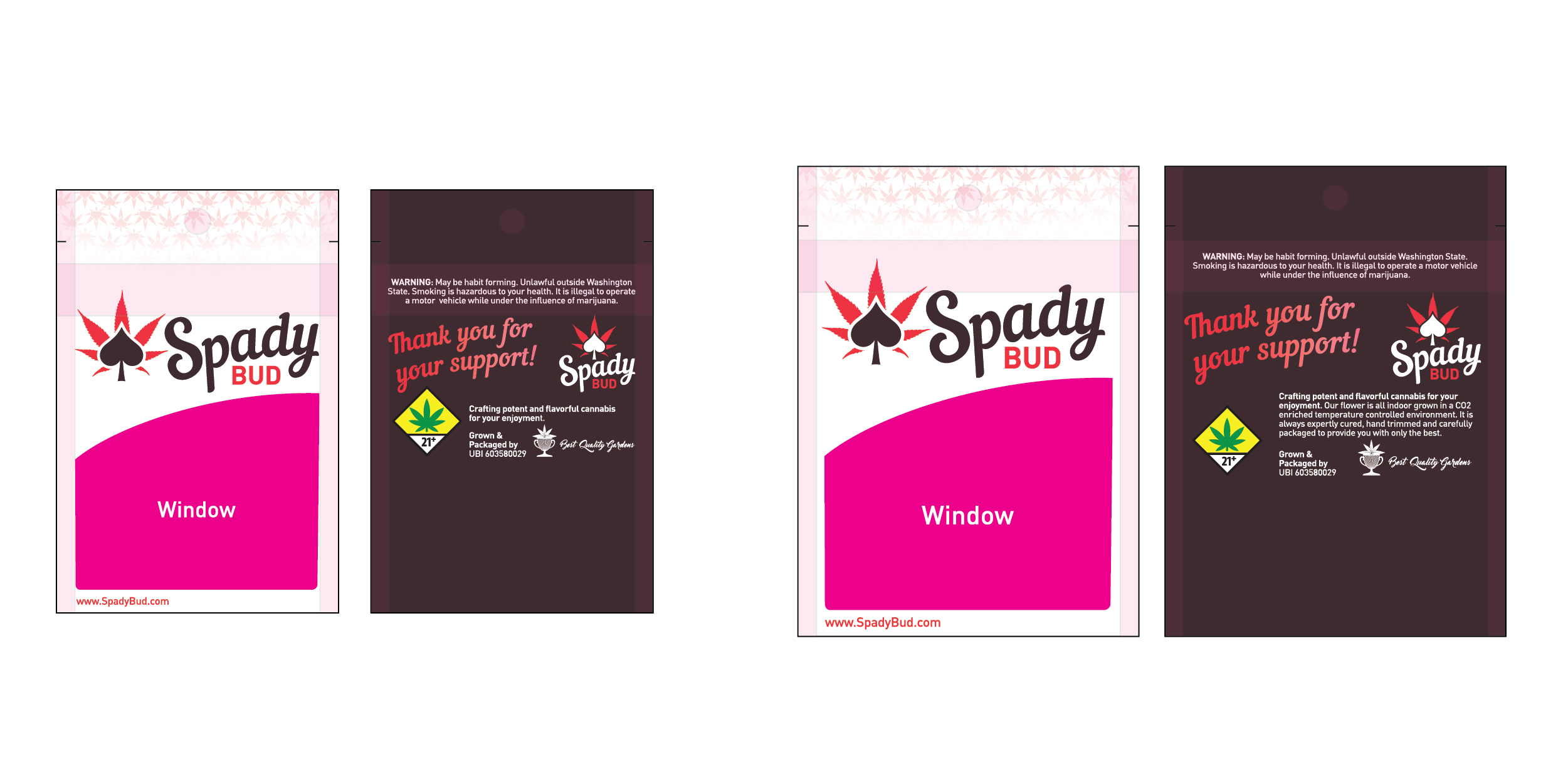
After a few rounds we were able to decide on a bag layout. I helped the client find and interview printers. The client decided they wanted to have 2 bag sizes and not have a bag for each variety of strain. Considering the cost of printing bags and potentially coming up with 20+ “flavors” of flower in the various realms of sativa and indica with hybrids. Adding sticker badges seemed like the best route.
Loose Flower Jar labels
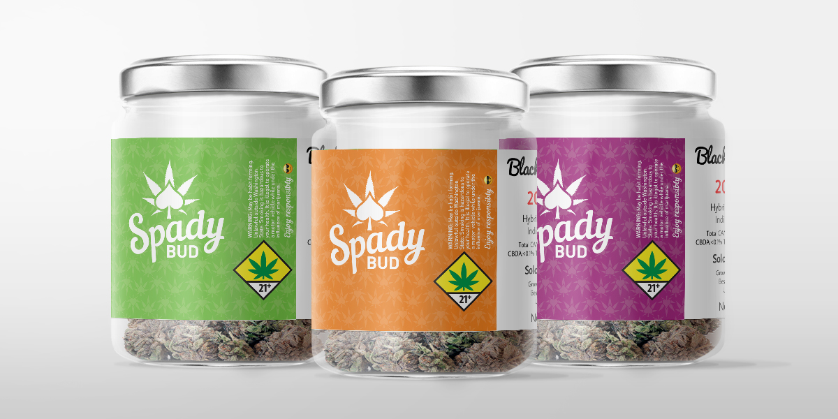
Next, SpadyBud needed jar labels for their online label making software. We worked together to come up with what would be easy for bud tenders and consumers to spot what type of strain they’d like to consume. Each label has many mandatory elements.
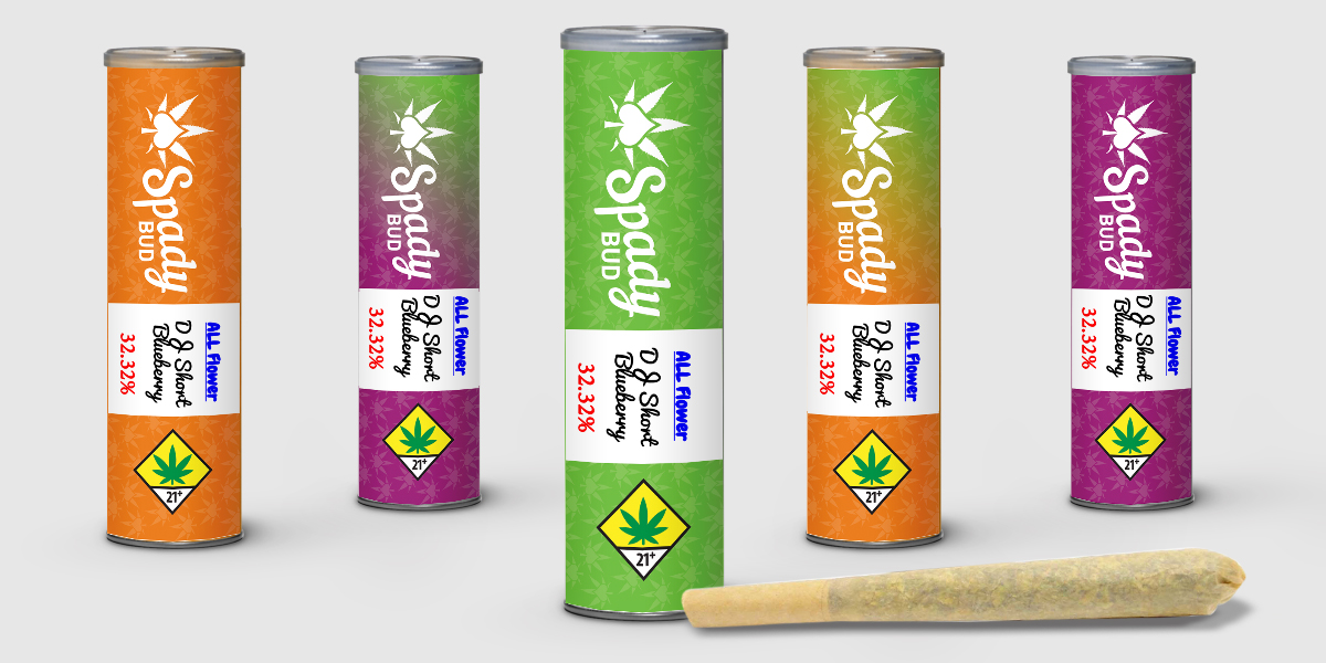
Pre roll joint tube label
Prerolls offer consumers a relatively inexpensive, disposable, all-in-one experience that caters to individuals and to groups alike. We needed to create a label that jumped off the shelf against their competition, include the state requirements and still be able to see the pre roll through the clear tube.
