Brief
TartanHub combines global logistic data in a simple easy to use dashboard. They provide provide reliable and predictable insights and details about the customer’s shipments. Their API engine gathers the data from ports and carriers and enhances it so customers can preview and visualize their cargo information.
Original Logo
We first need to learn a little about the company’s history, mission, values, services, goals and aspirations. We have all my clients complete a discovery questionaire.

Logo Activity
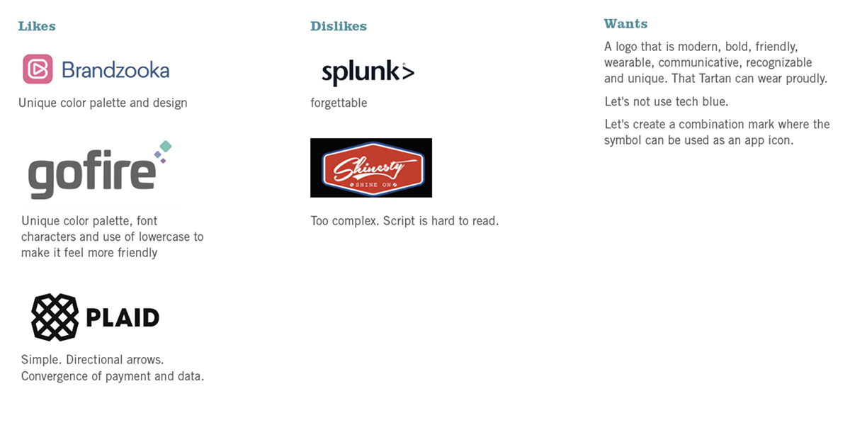
To help focus our logo solution efforts, we ask our clients to play a logo activity. We learn a lot about their preferences.
Research – Competition
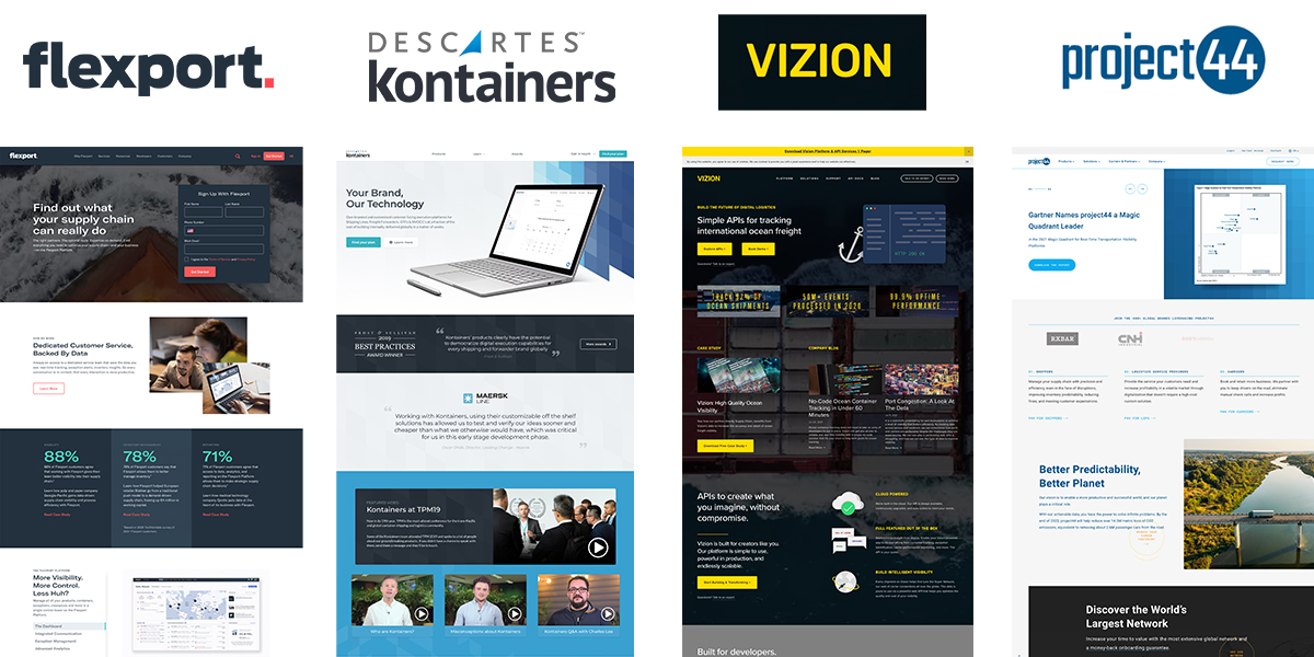
We researched national and global data and logistics companies so we could better see how they portray themselves. We look to see how we can differinciate ourselves from them.
Research
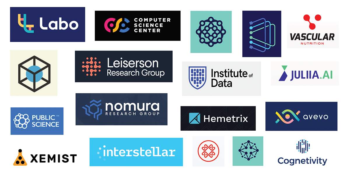
Next, we looked at the logistics logos to see what those looked like.

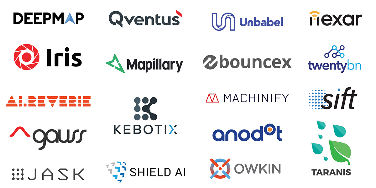
Next, we looked at common AI company logos, as well as general science, data logos and icons.
Inspiration
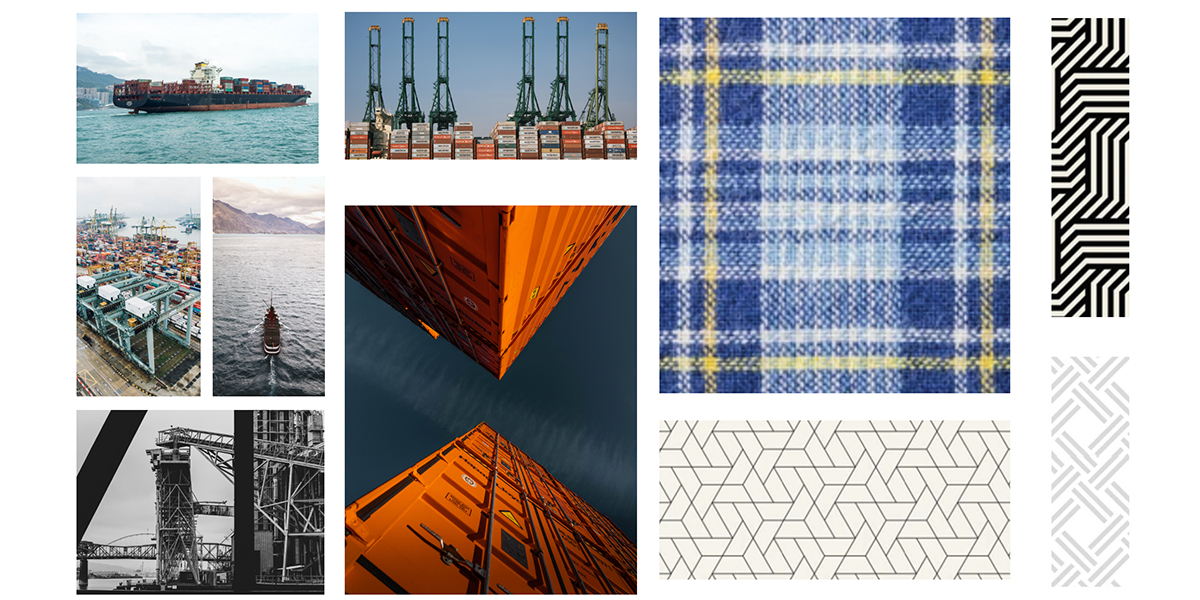
After chatting with the client, we looked at what we want to inspire the sketch phase of the logo process; shipping containers, freight, and weave patterns. We also looked at a large array of words that related to their industry and mission.

Sketches
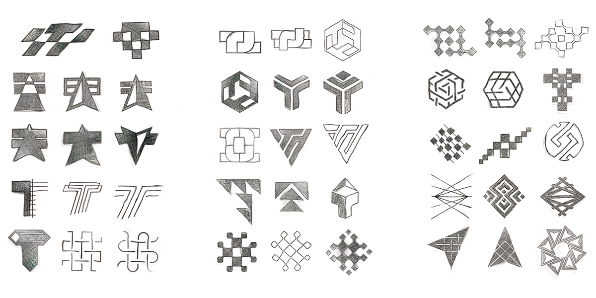
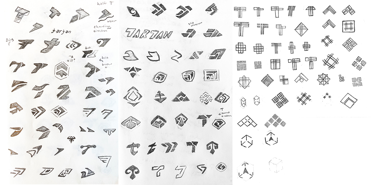
We looked at our inspiration material and got to sketching–we always start with rough pencil sketches and work with the client to pick some favorite before we digitize them.
Digital Concepts
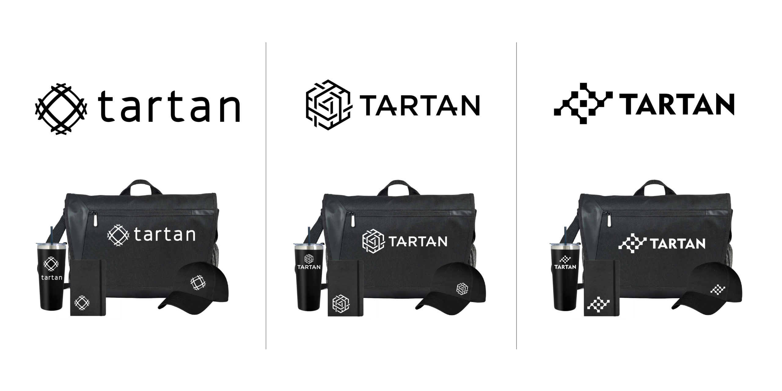
Tartan selected a few different weave and textured ideas. They liked having some curvature representing a global feel, with navigational and tech elements. We paired each of the favorites with complementary fonts and placed the concepts on some swag in order to visualize using the logo.
Color options
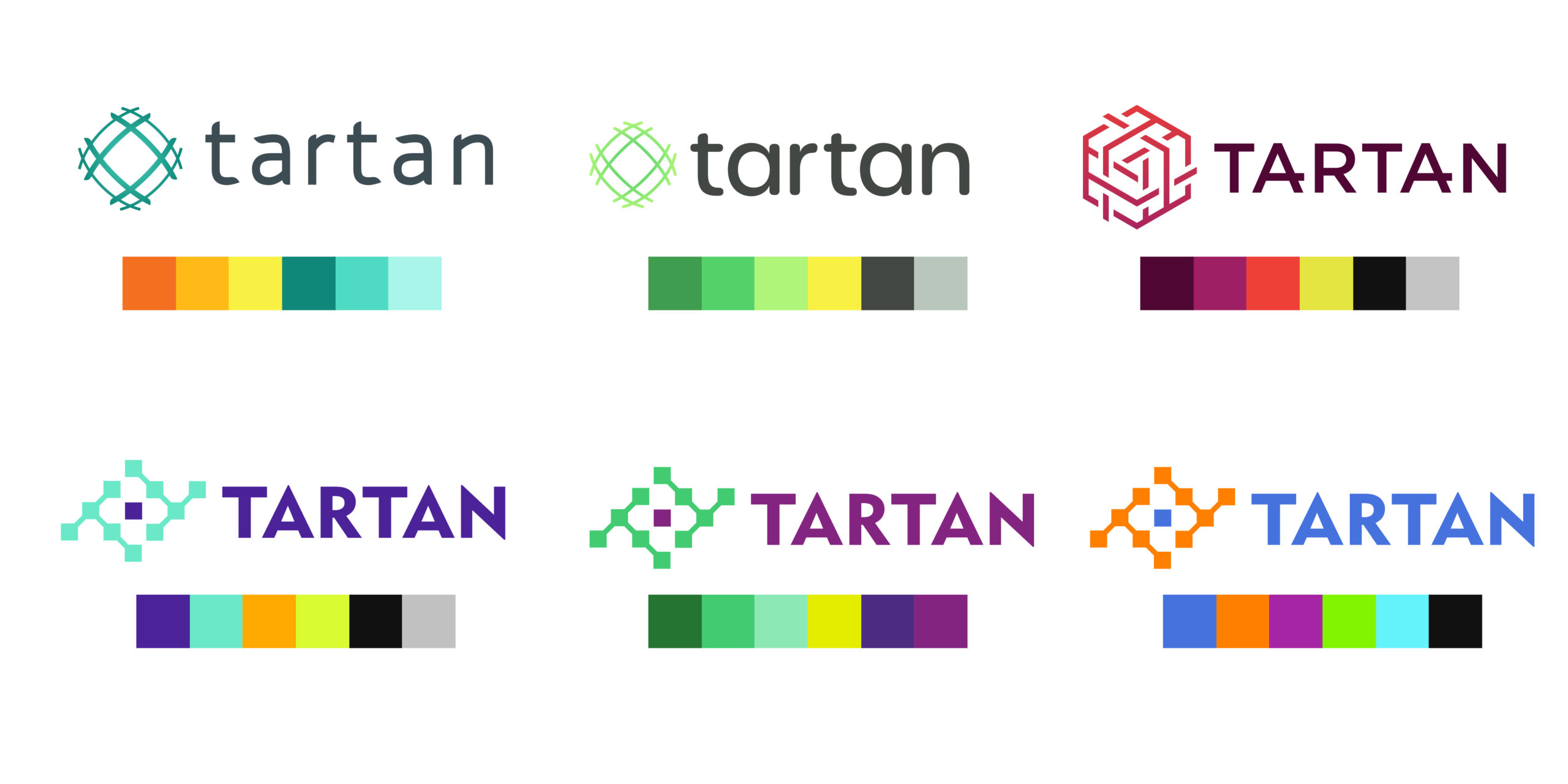
The client looked at multiple color combinations with their favorite logo concepts. They wanted unexpected technological colors that were friendly at the same time, without any traditional blue.
Approved Logo
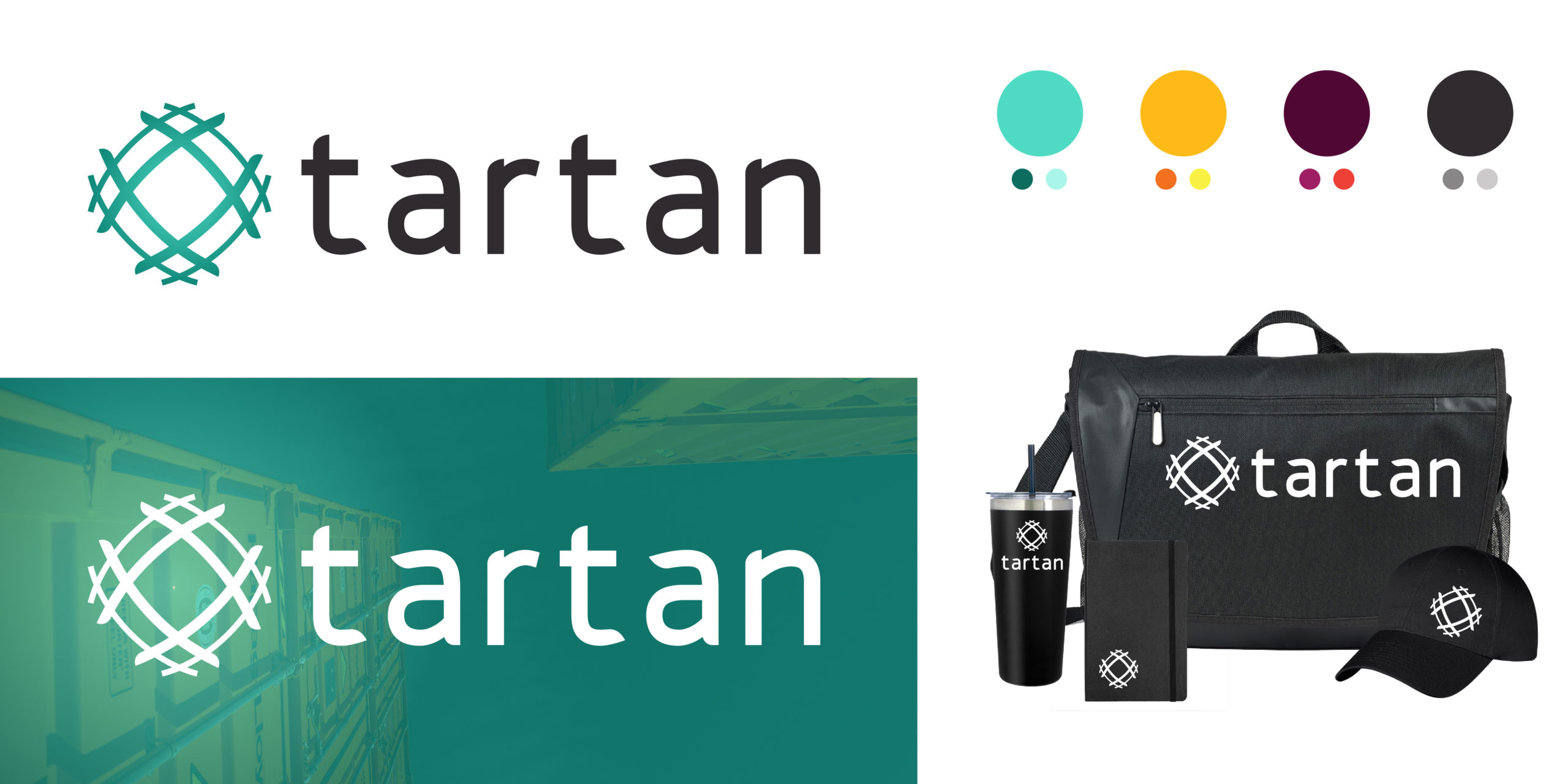
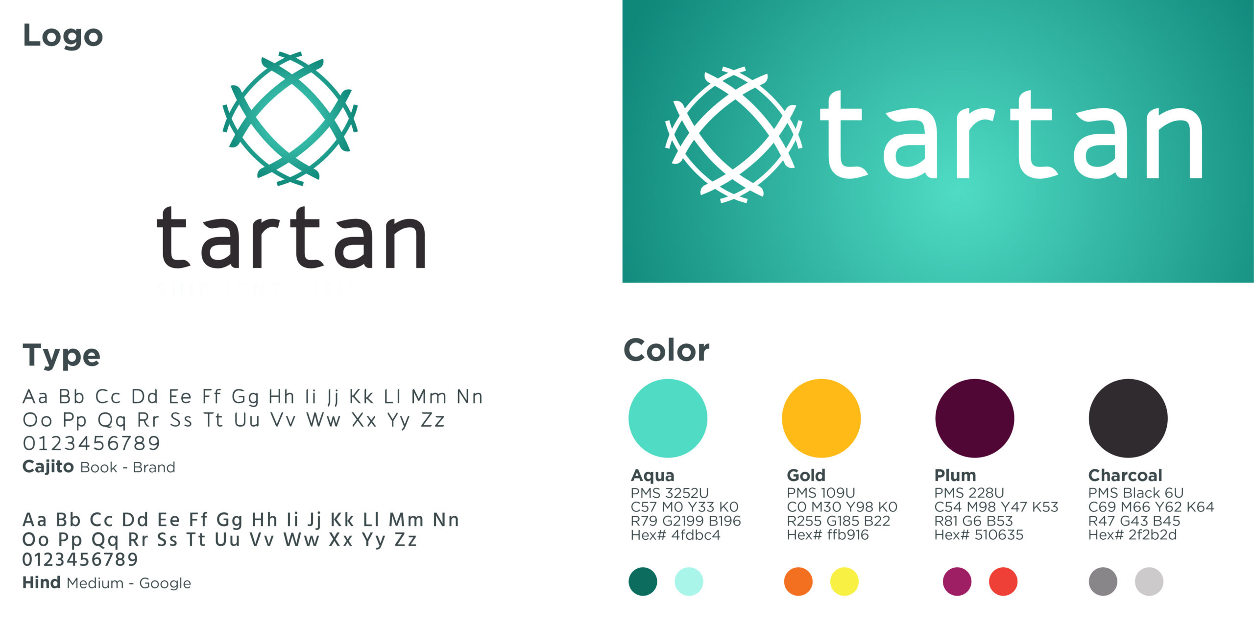
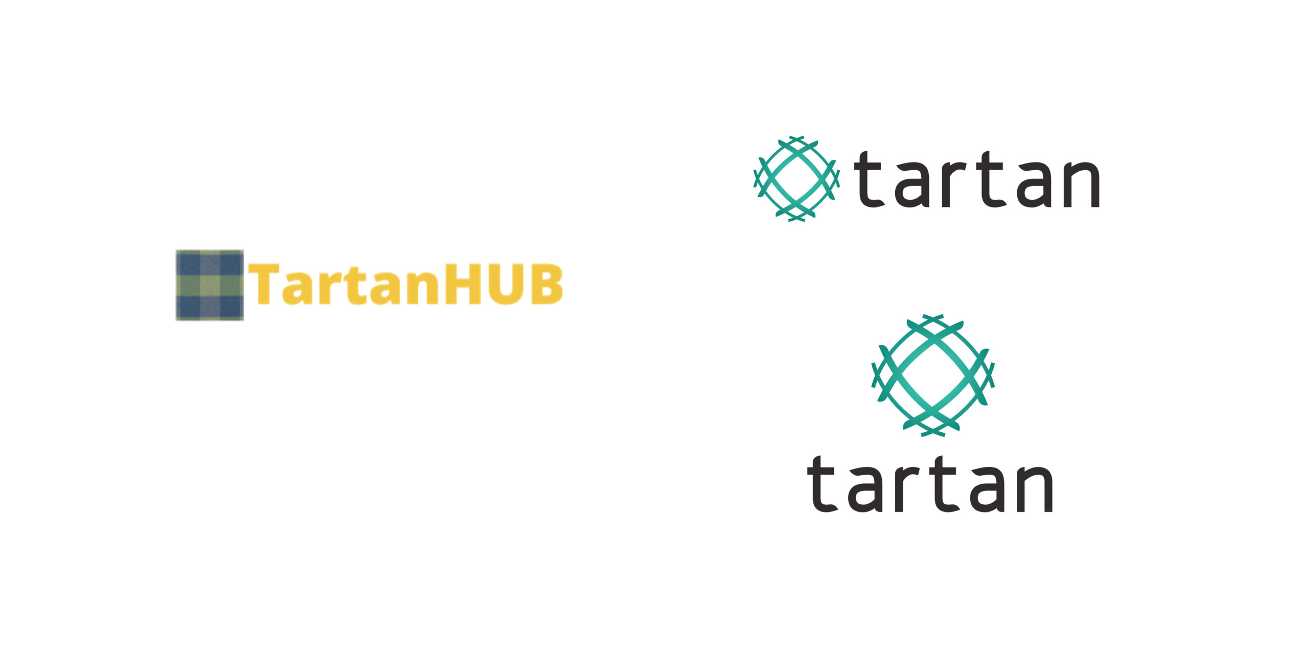
Tartan went with the curved globe/weave concept with a gradient aqua color scheme. They liked that it felt like an evolution of their old tartan plaid idea with a modern twist. The decided to keep with a stylized lowercase wordmark that pairs nicly with they symbol. It’s professional and friendly.
Responsive Logo Set
This is a responsive logo that will look sleek on wearables and represent what Tartan does perfectly. This logo is sure to impress prospects and capital investors.
