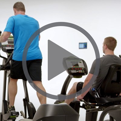
Brief
Discovery
Understanding the competition
We also like understanding and researching the competition, so we can ensure our new brand stands out from the crowd.
Logo Activity
Our goal is to get on target as quick as possible. Learning about the clients preferences is key to a successful logo project. Asking lots of quesions here really midigates friction later in the process.
Research
Inspiration
Inspiration by words & icons
Words are just as impactful to our visual sences. We crack out our thesaurus to discover interesting words that lead to interesting sketches.
We also like to explore icons, you never know where they will lead you for inspiration of a logo symbol.
Round 1 sketches
Now, to take everything we’ve discovered, researched and were inspired by to create unique sketches. We also shared lots of wordmark concepts to help get us on point quickly.
Our goal was to create a sophisticated, bold, timeless & friendly logo that hints at design, architecture, construction & transformation with a nature connection in a smart & simple way. The logo needed to symbolize mountains, rivers, connection, relationships, journey, process, hospitality & joy.
Round 2 Digital phase
After we present round one sketches, the client makes sketch selections as well as provide any feedback. The client provided their own sketch for us to collaborate on. We then create digital versions and concepts.
Round 3 Color Exploration
Next, we talk about color theory, their personality, their demographic and geographical vibe. We explored lots of expected and untypical color palette options. We focused on colors found in the Pacific Northwest.
Final Solution
Together, we created a logo that is timeless & memorable. It hints at many elements such as a “V” for VanderBeken, a “book” for education & their teaching background, pointing upward to the sunrise, the roof top pinnacle for homes & mountains is still present, in the negative space we see streams and rivers. The color palette is calm and luxurious. The wordmark feels like a quality craftsman, strong but feminine.
Business & Marketing needs
We looked at several pocket folder and tri-fold brochure ideas based on the business card and website design that the VanderBeken’s had created with the help of iMarc Consulting.
Before & after
Their old logo served them well and their new logo will carry them onward.